
After attempting a recovery this AM, the market fell in late trading, making new lows for this recent decline. As a counterpoint to the late bearishness today, allow me to point out a few perspectives:
* Across the broad universe of operating company stocks, we made 2026 new 20-day lows today--fewer than the day before.
* My Demand/Supply Index, which tracks stocks with very strong and very weak momentum, shows greatly reduced downside momentum. Demand was 42 today; Supply was 37.
* Today we had 13 new 52-week lows in the S&P 500, down from 23 the day before. We had 13 new lows in the S&P 600 small cap issues, down from 18 yesterday. We also had 12 new lows in the S&P 400 midcaps, down from 14 yesterday.
* Finally, a total of 15% of NYSE issues are trading above their 20 day moving average. The last times we've had readings below 20% have been October, 2005; April, 2005; August, 2004; and May, 2004. Those were excellent intermediate-term buying opportunities.
Yes, this may be the start of a new bear market. If so, we should see an *expansion* of new lows and *increasing* downside momentum. If we do not see a continuation of the late weakness tomorrow and continue to see new lows and downside momentum dry up, the odds of a market bounce will be greatly enhanced.
I will be following the new highs/lows and momentum studies carefully on the Trading Psychology Weblog in my next post Saturday.
Thursday, May 18, 2006
What the Relative Range is Telling Us About This Decline
Recall that the relative range is a measure that compares the range of the last day or week with the median range for the past 20 days or weeks. The logic behind this is that people's psychological responses are to relative events, not absolute ones. They will, for instance, react differently to a 40 degree afternoon in summer than to a 40 degree day in mid January.
Yesterday, we had dropped 4.3% on SPY for the past five trading sessions. The five-day relative range was 2.39, which means that the range was more than twice the median five-day range for the past twenty days.
Since March, 1996 (N = 2551), when SPY has been down 4% or more for a five-day period (N = 120), the next five days in SPY have averaged a gain of 1.03% (75 up, 45 down). When we look at occasions when SPY was down more than 4% *and* the relative range was twice or more its median (N = 36), the next five days in SPY averaged a gain of 2.31% (25 up, 11 down). Conversely, when SPY was down more than 4% and the relative range was less than twice its median (N = 84), the next five days in SPY averaged a gain of only .48% (50 up, 34 down).
What this suggests is that periods such as the current one, in which a steep drop is accompanied by a sizable expansion in the relative range, yields superior returns in the near term. Perhaps this is because the large drop on a large range represents panic selling of short-term traders, creating value for longer timeframe market participants.
Yesterday, we had dropped 4.3% on SPY for the past five trading sessions. The five-day relative range was 2.39, which means that the range was more than twice the median five-day range for the past twenty days.
Since March, 1996 (N = 2551), when SPY has been down 4% or more for a five-day period (N = 120), the next five days in SPY have averaged a gain of 1.03% (75 up, 45 down). When we look at occasions when SPY was down more than 4% *and* the relative range was twice or more its median (N = 36), the next five days in SPY averaged a gain of 2.31% (25 up, 11 down). Conversely, when SPY was down more than 4% and the relative range was less than twice its median (N = 84), the next five days in SPY averaged a gain of only .48% (50 up, 34 down).
What this suggests is that periods such as the current one, in which a steep drop is accompanied by a sizable expansion in the relative range, yields superior returns in the near term. Perhaps this is because the large drop on a large range represents panic selling of short-term traders, creating value for longer timeframe market participants.


Wednesday, May 17, 2006
What to Expect After a Big Drop on a Big Relative Range
Today's market, as measured by SPY, dropped about 1.9% on a range that was over 2.3 times its average daily range from the past twenty sessions.
Since March, 1996 (N = 2553 trading days), when SPY has dropped 1.5% or more in a single day with a daily range of twice or more its 20-day average, the next day in SPY has averaged a gain of .55% (30 up, 19 down). When SPY has dropped 1.5% or more in a day with a range of less than twice its average, the next day in SPY has averaged a gain of .15% (99 up, 81 down). It thus appears that a single day drop on a large range tends to bounce the following day.
Finally, combining this analysis with my last one, I found 24 occasions in which we had a one-day drop of over 1.5%, a five-day decline of over 3%, *and* a one-day relative range greater than twice its twenty-day average. Two days later, SPY was up by an average 1.02% (17 up, 7 down)--much stronger than the average two-day gain of .07% (1360 up, 1193 down) for the sample overall.
In all, it appears that we tend to get a bounce following a large decline during a weak week when the daily range is extended.
I will post details of the market drop later tonight in the Trading Psychology Weblog.
Since March, 1996 (N = 2553 trading days), when SPY has dropped 1.5% or more in a single day with a daily range of twice or more its 20-day average, the next day in SPY has averaged a gain of .55% (30 up, 19 down). When SPY has dropped 1.5% or more in a day with a range of less than twice its average, the next day in SPY has averaged a gain of .15% (99 up, 81 down). It thus appears that a single day drop on a large range tends to bounce the following day.
Finally, combining this analysis with my last one, I found 24 occasions in which we had a one-day drop of over 1.5%, a five-day decline of over 3%, *and* a one-day relative range greater than twice its twenty-day average. Two days later, SPY was up by an average 1.02% (17 up, 7 down)--much stronger than the average two-day gain of .07% (1360 up, 1193 down) for the sample overall.
In all, it appears that we tend to get a bounce following a large decline during a weak week when the daily range is extended.
I will post details of the market drop later tonight in the Trading Psychology Weblog.
What To Expect After a Weak Day and a Weak Week
Today's very weak market has given us more than enough material for an enlightening historical look at edges going forward. The edges are always greatest following extreme events, and the recent market drop--especially in the context of a market that had been low in volatility--qualifies as extreme.
I will post an initial analysis here and further analyses tonight and tomorrow AM. Tonight's Trading Psychology Weblog will also contain a large amount of material on the recent market weakness and what it means for the market's near-term course.
First off, we had a drop in SPY of approximately 1.9% today, with the last five sessions giving us a decline of 4.3%. Since March, 1996 (N = 2553 trading sessions), we've had 229 days in which SPY has dropped by 1.5% or more. Two days later, SPY has been up by an average of .43% (126 up, 103 down). That is stronger than the average two-day gain of .07% (1360 up, 1193 down) for the sample overall.
When we divide the weak S&P days in half based on the performance of the past five trading sessions, we see a clear pattern. When S&P is down by 1.5% or more *and* the five-day S&P is strong, the next two days in SPY average a loss of -.06% (53 up, 61 down). When S&P is down by 1.5% *and* the five-day S&P is also weak (as at present), the next two days in SPY average a gain of .91% (73 up, 42 down).
That suggests that a very weak S&P day only has obtained a bullish edge if it occurs in the context of a weak five-day period.
Stay tuned. I will be spitting out further studies later tonight.
I will post an initial analysis here and further analyses tonight and tomorrow AM. Tonight's Trading Psychology Weblog will also contain a large amount of material on the recent market weakness and what it means for the market's near-term course.
First off, we had a drop in SPY of approximately 1.9% today, with the last five sessions giving us a decline of 4.3%. Since March, 1996 (N = 2553 trading sessions), we've had 229 days in which SPY has dropped by 1.5% or more. Two days later, SPY has been up by an average of .43% (126 up, 103 down). That is stronger than the average two-day gain of .07% (1360 up, 1193 down) for the sample overall.
When we divide the weak S&P days in half based on the performance of the past five trading sessions, we see a clear pattern. When S&P is down by 1.5% or more *and* the five-day S&P is strong, the next two days in SPY average a loss of -.06% (53 up, 61 down). When S&P is down by 1.5% *and* the five-day S&P is also weak (as at present), the next two days in SPY average a gain of .91% (73 up, 42 down).
That suggests that a very weak S&P day only has obtained a bullish edge if it occurs in the context of a weak five-day period.
Stay tuned. I will be spitting out further studies later tonight.
A Momentum Pattern That Seems to Work: The Relative Range
Here's an interesting application of the relative measurement concept that I've been toying with during the past several posts:
Suppose we look at the day's trading range as a function of the median daily trading range for the past 20 days. This relative range statistic tells us when a market move is very large or small compared to recent volatility norms.
I focused especially on large relative range days, because those also had the potential to be breakout days and perhaps lead to some momentum follow through. I also focused on the relatively low volatility market we've had since January, 2004 (N = 595 trading days); later explorations will look at a wider timeframe.
Since January, 2004, we've had 32 days in which the two day relative range in SPY exceeded 1.70 (i.e., today's range exceeded the median two day range by 70% or more). This was the case at the end of last week with the large drop. Two days later, SPY was down by an average -.10% (13 up, 19 down), which is weaker than the average two-day gain of .05% (320 up, 275 down).
Here is the interesting part, however. When the second day of the large two-day range was up from open to close (N = 11), the market was higher two days later on 10 of those occasions. When the second day of the large two-day range was down from open to close (N = 21), the market was down two days later on 18 of those occasions.
It thus appears that a large relative range leads to short-term price continuation in the direction of the large range move. I will need to explore this over a longer time frame and under different market conditions to determine whether this is a general or local pattern.
===========================
An observation from the Weblog: Energy stocks are actually below their levels from last January. Could it be that the fortunes of major oil companies will increasingly diverge from oil prices as countries nationalize their reserves?
Suppose we look at the day's trading range as a function of the median daily trading range for the past 20 days. This relative range statistic tells us when a market move is very large or small compared to recent volatility norms.
I focused especially on large relative range days, because those also had the potential to be breakout days and perhaps lead to some momentum follow through. I also focused on the relatively low volatility market we've had since January, 2004 (N = 595 trading days); later explorations will look at a wider timeframe.
Since January, 2004, we've had 32 days in which the two day relative range in SPY exceeded 1.70 (i.e., today's range exceeded the median two day range by 70% or more). This was the case at the end of last week with the large drop. Two days later, SPY was down by an average -.10% (13 up, 19 down), which is weaker than the average two-day gain of .05% (320 up, 275 down).
Here is the interesting part, however. When the second day of the large two-day range was up from open to close (N = 11), the market was higher two days later on 10 of those occasions. When the second day of the large two-day range was down from open to close (N = 21), the market was down two days later on 18 of those occasions.
It thus appears that a large relative range leads to short-term price continuation in the direction of the large range move. I will need to explore this over a longer time frame and under different market conditions to determine whether this is a general or local pattern.
===========================
An observation from the Weblog: Energy stocks are actually below their levels from last January. Could it be that the fortunes of major oil companies will increasingly diverge from oil prices as countries nationalize their reserves?
Tuesday, May 16, 2006
Self-Inflicted Problems of Trading Psychology
I usually cover trading psychology topics on my personal site, but perhaps a heartfelt message on the blog will have a useful impact.
Many psychological problems I encounter among traders--professional as well as novice--are self-inflicted.
I say this, not to blame victims, but to call attention to the fact that two trading practices seem to lie at the heart of at least half of all the problems I see among traders:
* Quantum leaps in trading size - Traders increase their size in large proportional increments, creating P/L swings that feel large and that interfere with calm, rational decision making. It may not seem to be a large shift when you raise your size from five contracts to ten, but that doubling of size--and the resulting doubling of P/L swings--may feel much different than it looks on paper.
Tomorrow AM, I'll begin posting on the topic of volatility and its relationship to near-term price change.
Many psychological problems I encounter among traders--professional as well as novice--are self-inflicted.
I say this, not to blame victims, but to call attention to the fact that two trading practices seem to lie at the heart of at least half of all the problems I see among traders:
* Quantum leaps in trading size - Traders increase their size in large proportional increments, creating P/L swings that feel large and that interfere with calm, rational decision making. It may not seem to be a large shift when you raise your size from five contracts to ten, but that doubling of size--and the resulting doubling of P/L swings--may feel much different than it looks on paper.
* Departures from prudent risk management - This occurs particularly when traders are up or down a great deal of money on the day. Traders become overly aggressive to get their money back, or they become overly risk averse when they're down. Similarly, when up money, traders become risk-seeking with house money or fearful of losing their gains.
Very often, these problems go hand in hand. Large changes in trading size lead to outsized gains and losses and departures from prudent risk management. These large emotional swings are processed by the mind in a manner similar to psychological traumas, creating very negative (and difficult to change) conditioned responses (different in degree, but not kind, from post-traumatic stress reactions).
My heartfelt message: Treat size with caution. Increase size incrementally, ensuring that trades don't feel different when you enter and manage them. The best treatment for trading psychology problems is preventive medicine.
===================================================
We've had a flat two-day period in SPY, a pattern which we recently saw leads to modestly bearish expectations.Tomorrow AM, I'll begin posting on the topic of volatility and its relationship to near-term price change.
VIX and Put/Call Ratio: How Are They Related?
Note: Thanks for the positive comments regarding the expanded Trading Psychology Weblog, which now includes links to the day's interesting news features, a summary of intermarket relationships, and daily measures of market strength, weakness, and trend.
I received a few emails regarding the relationship between the put/call ratio and the VIX as measures of sentiment. I decided to create relative versions of both indicators, by evaluating each as a proportion of its 20 day moving average. Interestingly, the correlation between the relative VIX and the relative put/call ratio since March, 2003 (N = 805 trading days) has only been .41. That means that about 16% of the variance in the relative put/call ratio is attributable to the relative VIX and vice versa. While the two indicators are related, they are not measuring the same thing.
What has made the recent time period significant--particularly this past Friday--is that the relative VIX was quite high (19% above its average) *and* the relative put/call ratio was quite elevated (54% above its average). Since March, 2003, we've had 33 occasions in which the VIX was 15% or more above its average. The next day, SPY averaged a gain of .35% (23 up, 10 down)--much stronger than the average one-day gain for SPY of .06% (448 up, 357 down).
A median split of the data based upon the relative put/call ratio was instructive. When the VIX was more than 15% above its average and the relative put/call ratio was high, the next day in SPY averaged a gain of .49% (13 up, 3 down). When the VIX was elevated and the put/call ratio was low, the next day in SPY averaged a gain of .21% (10 up, 7 down). Clearly, the upside edge is greatest when VIX *and* the put/call ratio are elevated, as we've seen recently. Enhanced volatility and enhanced pessimism, when they occur jointly, seem to offer superior near-term rewards.
I received a few emails regarding the relationship between the put/call ratio and the VIX as measures of sentiment. I decided to create relative versions of both indicators, by evaluating each as a proportion of its 20 day moving average. Interestingly, the correlation between the relative VIX and the relative put/call ratio since March, 2003 (N = 805 trading days) has only been .41. That means that about 16% of the variance in the relative put/call ratio is attributable to the relative VIX and vice versa. While the two indicators are related, they are not measuring the same thing.
What has made the recent time period significant--particularly this past Friday--is that the relative VIX was quite high (19% above its average) *and* the relative put/call ratio was quite elevated (54% above its average). Since March, 2003, we've had 33 occasions in which the VIX was 15% or more above its average. The next day, SPY averaged a gain of .35% (23 up, 10 down)--much stronger than the average one-day gain for SPY of .06% (448 up, 357 down).
A median split of the data based upon the relative put/call ratio was instructive. When the VIX was more than 15% above its average and the relative put/call ratio was high, the next day in SPY averaged a gain of .49% (13 up, 3 down). When the VIX was elevated and the put/call ratio was low, the next day in SPY averaged a gain of .21% (10 up, 7 down). Clearly, the upside edge is greatest when VIX *and* the put/call ratio are elevated, as we've seen recently. Enhanced volatility and enhanced pessimism, when they occur jointly, seem to offer superior near-term rewards.
Monday, May 15, 2006
Relative Price
Here is the Trading Markets article on relative price movement. See also the entry in the Trader Performance section of my personal site for more on relative price. This is the blog post that kicked the topic off. By looking at price change relative to the price changes most recently observed, we may get a better sense for what traders might react to emotionally. More on this topic to come...
Do Trading Edges Last Forever? A Look at VIX
Recently, blogger Barry Ritholtz kicked off a discussion of the historical patterns analyzed on this blog. Most of the analyses extend from March, 2003 to the present, which tracks the recent low volatility bull market. Shouldn't we analyze over longer market periods? Would the historical patterns remain the same, or do they change over time?
As I indicated in my responses to these questions, the answer to this question differentiates those who are searching for universal relationships in the market (mechanical systems that will work in any market condition) from those who continuously model and remodel markets to find local regimes (relationships that wax and wane over time).
Here's a practical example: Let's say that I am trying to predict a person's behavior in response to a piece of news. I could take a large past sample of behaviors following receiving news and use this to make my prediction. That would be a linear approach, looking for a universal relationship between news and behavior.
A different approach might say: The person's behavior in response to news will depend on their moods, which come and go. So I will have one prediction if the person is in a good mood, another prediction if mood is neutral, and a different prediction when the person is in a bad mood. My samples for analysis will consist of only good mood occasions (for my first model), neutral mood occasions (for the second model) and bad mood occasions (for my third model). This would be a non-linear approach, finding different relationships between news and behavior as a function of mood.
Consider that volatility and trending are variables that define market mood. If that is the case, the non-linear historical modeler would argue, relationships between indicators (such as the VIX) and future price change should be specific to the mood (market conditions) at the time. There is no strong, universal predictive relationship across all moods (market conditions).
Because of this, no trading edges last forever in the view of the non-linear modeler.
Let's take the relative VIX as an example. In my previous post, I found that, when the VIX exceeds its 20 day moving average by 15% or more, there is a bullish edge going forward. That analysis covered March, 2003 to the present. But let's extend the analysis from January, 1998 to the present (N = 2124 trading days).
During that time, we have 159 occasions in which the VIX exceeds its 20-day moving average by 15% or more. If we divide the sample in half based solely on time, a pattern emerges. Between January, 1998 and March, 2001 (N = 80), after such a VIX spike the S&P 500 Index (SPY) was up by an average of .62% two days later (51 up, 29 down). This outperformed the overall sample, which shows a two-day average gain of .04% (1111 up, 1013 down).
From March, 2001 to the present, following a VIX spike (N = 79), the market was up by an average of only .05% (43 up, 36 down) two days later. This does not outperform the overall market.
In other words, the relative VIX gave us a bullish edge between 1998 and early 2001, but not afterward. From the earlier post, we saw that the VIX spike gave a bullish edge from 2003 to the present. As you might imagine, the same VIX spike provided no edge--and actually led to a slightly bearish outcome--during 2001 and 2002 (-.07%; 25 up, 25 down).
We could come to two conclusions about the VIX from this little investigation: 1) it is a poor indicator, since it does not yield consistent predictions over time; or 2) it is a good indicator, as long as we utilize it when current market conditions suggest it will be effective. Clearly, this site takes the latter approach. It's not a foolproof method--market cycles can possibly change without our being aware of it at the time--but until we find the perfect, universal indicator, it might just be the best we can do in the face of complexity and uncertainty.
As I indicated in my responses to these questions, the answer to this question differentiates those who are searching for universal relationships in the market (mechanical systems that will work in any market condition) from those who continuously model and remodel markets to find local regimes (relationships that wax and wane over time).
Here's a practical example: Let's say that I am trying to predict a person's behavior in response to a piece of news. I could take a large past sample of behaviors following receiving news and use this to make my prediction. That would be a linear approach, looking for a universal relationship between news and behavior.
A different approach might say: The person's behavior in response to news will depend on their moods, which come and go. So I will have one prediction if the person is in a good mood, another prediction if mood is neutral, and a different prediction when the person is in a bad mood. My samples for analysis will consist of only good mood occasions (for my first model), neutral mood occasions (for the second model) and bad mood occasions (for my third model). This would be a non-linear approach, finding different relationships between news and behavior as a function of mood.
Consider that volatility and trending are variables that define market mood. If that is the case, the non-linear historical modeler would argue, relationships between indicators (such as the VIX) and future price change should be specific to the mood (market conditions) at the time. There is no strong, universal predictive relationship across all moods (market conditions).
Because of this, no trading edges last forever in the view of the non-linear modeler.
Let's take the relative VIX as an example. In my previous post, I found that, when the VIX exceeds its 20 day moving average by 15% or more, there is a bullish edge going forward. That analysis covered March, 2003 to the present. But let's extend the analysis from January, 1998 to the present (N = 2124 trading days).
During that time, we have 159 occasions in which the VIX exceeds its 20-day moving average by 15% or more. If we divide the sample in half based solely on time, a pattern emerges. Between January, 1998 and March, 2001 (N = 80), after such a VIX spike the S&P 500 Index (SPY) was up by an average of .62% two days later (51 up, 29 down). This outperformed the overall sample, which shows a two-day average gain of .04% (1111 up, 1013 down).
From March, 2001 to the present, following a VIX spike (N = 79), the market was up by an average of only .05% (43 up, 36 down) two days later. This does not outperform the overall market.
In other words, the relative VIX gave us a bullish edge between 1998 and early 2001, but not afterward. From the earlier post, we saw that the VIX spike gave a bullish edge from 2003 to the present. As you might imagine, the same VIX spike provided no edge--and actually led to a slightly bearish outcome--during 2001 and 2002 (-.07%; 25 up, 25 down).
We could come to two conclusions about the VIX from this little investigation: 1) it is a poor indicator, since it does not yield consistent predictions over time; or 2) it is a good indicator, as long as we utilize it when current market conditions suggest it will be effective. Clearly, this site takes the latter approach. It's not a foolproof method--market cycles can possibly change without our being aware of it at the time--but until we find the perfect, universal indicator, it might just be the best we can do in the face of complexity and uncertainty.
Sunday, May 14, 2006
Spike in the VIX: Is There an Edge?
The VIX is a measure of option volatility, so when it spikes higher--as has happened in the past two trading sessions--it's a sign that market makers are pricing options for further movement. This typically occurs following market declines, which leads to the notion that an elevated VIX reveals trader fear, while a low VIX suggests complacency.
On Friday, the VIX closed 18% above its 20 day average--a substantial spike. Since March, 2003 (N = 804 trading days), we've had 32 occasions in which the VIX has closed 15% or more above its 20 day average. Two days later, SPY has averaged a gain of .58% (21 up, 11 down). That is much stronger than the average two-day gain of .12% (437 up, 367 down) for the sample overall.
This is consistent with Larry Connors' research, which suggests that VIX elevations lead to superior returns in the near term.
On Friday, the VIX closed 18% above its 20 day average--a substantial spike. Since March, 2003 (N = 804 trading days), we've had 32 occasions in which the VIX has closed 15% or more above its 20 day average. Two days later, SPY has averaged a gain of .58% (21 up, 11 down). That is much stronger than the average two-day gain of .12% (437 up, 367 down) for the sample overall.
This is consistent with Larry Connors' research, which suggests that VIX elevations lead to superior returns in the near term.
Saturday, May 13, 2006
Two Consecutive Broad Declines: What Comes Next
We had two consecutive days on Thursday and Friday in which 70% or more of traded issues declined on the day. Since 1990 (N = 4124 trading days), that has only occurred 13 times.
The next day, the S&P 500 Index ($SPX) was up by an average .59% (9 up, 4 down)--much stronger than the average daily gain of .04% (2174 up, 1950 down) for the sample overall.
Two days later, the S&P was up by an average 1.37% (10 up, 3 down)--considerably stronger than the average two-day gain of .08% (2209 up, 1915 down) for the 1990-2006 sample.
What that tells us is that two consecutive down days of very negative breadth is a rare occurrence. It is also interesting that 7 of the 13 next day occurrences led to price changes of greater than 1%, suggesting that volatility follows broad two-day declines. Looks like it might be worth looking for buying setups on Monday and watching for a carryover of volatile action.
The next day, the S&P 500 Index ($SPX) was up by an average .59% (9 up, 4 down)--much stronger than the average daily gain of .04% (2174 up, 1950 down) for the sample overall.
Two days later, the S&P was up by an average 1.37% (10 up, 3 down)--considerably stronger than the average two-day gain of .08% (2209 up, 1915 down) for the 1990-2006 sample.
What that tells us is that two consecutive down days of very negative breadth is a rare occurrence. It is also interesting that 7 of the 13 next day occurrences led to price changes of greater than 1%, suggesting that volatility follows broad two-day declines. Looks like it might be worth looking for buying setups on Monday and watching for a carryover of volatile action.
Friday, May 12, 2006
Ten Questions That Go Bump in the Night
Why do the gurus who proclaim a "feel" for the market tell us to eliminate emotions from trading?
Would 80% of traders make money instead of losing it by placing trades through "enrichers" instead of "brokers"?
Why do people who offer programs on making a living from trading make their livings from offering programs?
Why do beginners think they'd have an easier time beating professionals at trading than at golf, boxing, racecar driving, or chess?
Why are so many market newsletters bullish or bearish, when the most common market outcome is little or no change?
Why, in Dr. Brett's surveys, do three-quarters of all traders rate themselves above average?
Why are there no books on mastering the mental game of surgery or ballet?
What happens when contrary opinion is the dominant school of thought?
Why do trend followers follow trend following once it goes out of favor?
If exchanges make more money than brokers; brokers make more money than market makers; and market makers make more money than traders, is the answer to success in the markets to always have people who are your customers?
===========================
I want to thank readers for their interest in the new highs/new lows stats mentioned in my recent article. I'll continue to post those on my Weblog. Have a great weekend--
Brett
Would 80% of traders make money instead of losing it by placing trades through "enrichers" instead of "brokers"?
Why do people who offer programs on making a living from trading make their livings from offering programs?
Why do beginners think they'd have an easier time beating professionals at trading than at golf, boxing, racecar driving, or chess?
Why are so many market newsletters bullish or bearish, when the most common market outcome is little or no change?
Why, in Dr. Brett's surveys, do three-quarters of all traders rate themselves above average?
Why are there no books on mastering the mental game of surgery or ballet?
What happens when contrary opinion is the dominant school of thought?
Why do trend followers follow trend following once it goes out of favor?
If exchanges make more money than brokers; brokers make more money than market makers; and market makers make more money than traders, is the answer to success in the markets to always have people who are your customers?
===========================
I want to thank readers for their interest in the new highs/new lows stats mentioned in my recent article. I'll continue to post those on my Weblog. Have a great weekend--
Brett
Big Drop, Little Fear: What It Means

Interestingly, Thursday's drop of over 1% on SPY occurred with an equity put/call ratio of only .65, one of the lowest readings we've seen on a day with such a drop since March, 2003 (N = 803).
When we've had a down day in SPY of more than 1% (N = 73), the market two days later has averaged a gain of .28% (37 up, 36 down). That is stronger than the average two-day gain of .12% for the sample overall (437 up, 366 down).
When we divide the sample in half based on equity put/call ratios, however, a pattern emerges. A large SPY drop with a low put/call ratio, such as we saw on Thursday, results in an average gain of only .02% (17 up, 20 down) two days later. When the SPY drop occurs with a high put/call ratio, we see an average change in SPY of .56% (20 up, 16 down).
Returns appear to be superior when declines are accompanied by fear and pessimism--something we didn't see on Thursday.
Thursday, May 11, 2006
Relative Movement: A Different Way of Looking at Strength and Weakness
Today's market fell sharply, declining over a full percent. But what does that really mean? A one percent decline in a highly volatile market is fairly routine. In a low volatility market, such as the one we've had recently, a one-percent move is large.
One way to adjust for these volatility differences is to measure a day's movement in standard deviation units. What I did was create a moving 60-day window for SPY and calculate the standard deviation of daily market moves. I then calculated each day's movement as a multiple of that 60-day standard deviation.
It might surprise you that today's decline was a drop of 3.39 standard deviation units. Since April, 1996 (N = 2520 trading days), we have only had 86 such declines. So while it might seem as though today's drop was not huge, in relative terms it was quite a drop.
Since 1996, the day after a drop of 3 or more standard deviation units, SPY has been up on average .16 standard deviation units (46 up, 40 down), stronger than the average gain for the sample of .05 units (1311 up, 1209 down).
When we look at the most recent data, however, a different pattern emerges. Since 2003, we've had 26 drops of 3 or more standard deviation units. The next day, SPY has averaged a loss of .51 units (11 up, 15 down). From 1996-2002, the next day change in SPY after a big relative drop has been a rise of .45 units (35 up, 25 down).
Psychologically, we may respond more to the relative size of moves than their absolute magnitude. That reaction may be particularly magnified during low volatility market periods, leading to next day continuation of weakness.
One way to adjust for these volatility differences is to measure a day's movement in standard deviation units. What I did was create a moving 60-day window for SPY and calculate the standard deviation of daily market moves. I then calculated each day's movement as a multiple of that 60-day standard deviation.
It might surprise you that today's decline was a drop of 3.39 standard deviation units. Since April, 1996 (N = 2520 trading days), we have only had 86 such declines. So while it might seem as though today's drop was not huge, in relative terms it was quite a drop.
Since 1996, the day after a drop of 3 or more standard deviation units, SPY has been up on average .16 standard deviation units (46 up, 40 down), stronger than the average gain for the sample of .05 units (1311 up, 1209 down).
When we look at the most recent data, however, a different pattern emerges. Since 2003, we've had 26 drops of 3 or more standard deviation units. The next day, SPY has averaged a loss of .51 units (11 up, 15 down). From 1996-2002, the next day change in SPY after a big relative drop has been a rise of .45 units (35 up, 25 down).
Psychologically, we may respond more to the relative size of moves than their absolute magnitude. That reaction may be particularly magnified during low volatility market periods, leading to next day continuation of weakness.
Can Small Caps Play Catchup One More Time?
Most of my historical pattern inquiries have found that returns are subnormal following flat periods in the S&P 500 Index. For example, we are currently flat for the past three days on a closing basis. Since March 2003 (N = 802), we have had 103 days in which the S&P (SPY) has moved within a .20% range up or down during a three-day period. When this has occurred, the average change in SPY over the next three days has been .04% (53 up, 50 down) and the average change in the Russell 2000 (IWM) has been .11% (54 up, 49 down). Both are weaker than their averages for the sample overall. The S&P has averaged a three-day gain of .18% and the Russell has averaged a gain of .30%.
During our recent three-day flat period, the Russell has been down over .60%. When SPY has been flat on a three-day basis, but Russell has been down more than half a percent (N = 28), the next three days in SPY average a gain of .20% (17 up, 11 down) and the next three days in IWM average a gain of .36% (15 up, 13 down). Indeed, the last eight times we've had a flat SPY and weak IWM, the IWM has been up on seven of those occasions three days later--and six of those occasions have featured a rise of a full percent or more.
Flat periods in SPY appear to lead to underperformance when other major sectors are flat or strong. When those other sectors are weak, the returns have been normal. Recently, we've seen IWM play catchup when it has underperformed SPY in a flat market. Such a broadening of market strength would be a plus for this market. As my Weblog notes, we're seeing weakness in the new high statistics across the market sectors.
During our recent three-day flat period, the Russell has been down over .60%. When SPY has been flat on a three-day basis, but Russell has been down more than half a percent (N = 28), the next three days in SPY average a gain of .20% (17 up, 11 down) and the next three days in IWM average a gain of .36% (15 up, 13 down). Indeed, the last eight times we've had a flat SPY and weak IWM, the IWM has been up on seven of those occasions three days later--and six of those occasions have featured a rise of a full percent or more.
Flat periods in SPY appear to lead to underperformance when other major sectors are flat or strong. When those other sectors are weak, the returns have been normal. Recently, we've seen IWM play catchup when it has underperformed SPY in a flat market. Such a broadening of market strength would be a plus for this market. As my Weblog notes, we're seeing weakness in the new high statistics across the market sectors.
Wednesday, May 10, 2006
A Valuable Lesson From Today's Market
Well, we spent a good amount of time early this week anticipating the Fed news and, when all was said and done, we ended up trading pretty much where we had been all along. But there's a lesson in all that.
A trader called me before the Fed came out with their statement and asked if I had an opinion about what the market was going to do. I gave the answer that I've mentioned quite a few times on my personal site: Keep an eye on interest rates and the dollar. If they don't sustain directional moves after the news, it means that the markets are not repricing assets as a result of the Fed statement. Under those conditions, stocks may jerk up and down, but are less likely to trend.
Conversely, if bonds/notes and the dollar make strong directional moves after the Fed news, I explained, it means that the markets are pricing in new valuations, because the Fed news is real news. That would be more likely to lead to stock index repricing as well.
As it turned out, the dollar was weak but could not sustain a trending move relative to the Euro, which traded first below, then above, and then below again its average price for the day. The 10 year interest rates spiked higher on the news, then stayed firmly in their multiday range. Not surprisingly, stocks closed near their average price from the previous day.
The lesson is this: There's nothing wrong with predictive models--including the kinds of predictive looks I take in this blog. Ultimately, however, it is more important to *identify* what markets are doing and *understand* why they might or might not be moving. The trader who saw the bigger picture was more likely to fade the overreactions to the Fed news than the trader than the trader who got caught in a directional opinion.
Oil, interest rates, currencies, other commodities, international markets: all compete for assets and all are inextricably interrelated in a world economy. Today offered a good lesson: The big picture matters--and sometimes nothing is happening in the big picture.
A trader called me before the Fed came out with their statement and asked if I had an opinion about what the market was going to do. I gave the answer that I've mentioned quite a few times on my personal site: Keep an eye on interest rates and the dollar. If they don't sustain directional moves after the news, it means that the markets are not repricing assets as a result of the Fed statement. Under those conditions, stocks may jerk up and down, but are less likely to trend.
Conversely, if bonds/notes and the dollar make strong directional moves after the Fed news, I explained, it means that the markets are pricing in new valuations, because the Fed news is real news. That would be more likely to lead to stock index repricing as well.
As it turned out, the dollar was weak but could not sustain a trending move relative to the Euro, which traded first below, then above, and then below again its average price for the day. The 10 year interest rates spiked higher on the news, then stayed firmly in their multiday range. Not surprisingly, stocks closed near their average price from the previous day.
The lesson is this: There's nothing wrong with predictive models--including the kinds of predictive looks I take in this blog. Ultimately, however, it is more important to *identify* what markets are doing and *understand* why they might or might not be moving. The trader who saw the bigger picture was more likely to fade the overreactions to the Fed news than the trader than the trader who got caught in a directional opinion.
Oil, interest rates, currencies, other commodities, international markets: all compete for assets and all are inextricably interrelated in a world economy. Today offered a good lesson: The big picture matters--and sometimes nothing is happening in the big picture.
Where Are All the Bulls?
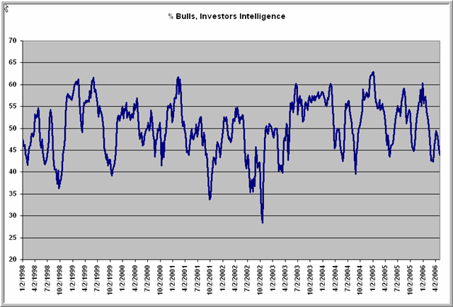
Here is the % bulls from the Investors Intelligence survey from 1998 to the present. Dips below 40% have been great buying opportunities; returns have been subnormal when we've exceeded 60%. We briefly hit that 60% mark at the beginning of the year, but look at how bullishness has tailed off even as large caps have been making new highs. Once again, it's a sign of more worry than complacency in this market.
Tuesday, May 09, 2006
A Market That Isn't Looking Complacent

I'm pleased to announce that my new book, Enhancing Trader Performance, is coming along well and will be out this fall.
Here's an investigation that extends a finding from an earlier study. That posting found market underperformance when flat markets were accompanied by falling VIX values, rather than a rising VIX. In that study, I looked at the most recent market day and what happened subsequently. Now we'll look at two-day patterns, given that we've been relatively flat in SPY for the past two days with a VIX that has risen over 3%.
Since March, 2003 (N = 801), when SPY has been up or down within a .10% range over the past two sessions (N = 74), the next day in SPY has been down by an average -.07% (36 up, 38 down). That is weaker than the average one day change for SPY (.06%) for the sample overall.
When the flat two-day period in SPY has occurred during a rising VIX (N = 37), the market has averaged a gain of .07% (19 up, 18 down)--not greatly different from its average performance. When the flat two-day period in SPY has occurred during a falling VIX (N = 37), the market has averaged a loss of -.20% (17 up, 20 down), much weaker than average.
Once again, we see that flat periods tend to be associated with subnormal returns, but that this is particularly the case when VIX levels (investor fear levels) are falling. When investors are more skittish--as they might be prior to the Fed news in the current situation--outcomes are much more normal.
Interestingly, over the past 10 trading sessions, we're up well over 1% in SPY, but VIX levels are higher now than back then. I find this lack of complacent sentiment interesting, particularly given the fact that we're at bull highs in the large caps.
Monday, May 08, 2006
Rest Day After Strength: What Comes Next?
Monday's market took a pause after Friday's vigorous rally, with some of the narrowest trade since the bull market began in 2003. What happens after we get such a rest day after market strength?
I went back to March, 2003 (N = 800) and identified all occasions in which the most recent trading day in SPY had a narrow range of .50% or less (N = 53). The next day in SPY averaged a loss of -.13% (21 up, 32 down), much weaker than the average gain of .06% (446 up, 354 down) for the sample overall.
When the narrow day followed two days in which SPY had been up more than .50% (N = 25) (such as is the case at present), the results were even more bearish. The next day in SPY averaged a loss of -.16% (9 up, 16 down), with weakness extending three days out (-.28%; 9 up, 16 down).
It thus appears that a narrow day after a market rise is not a pause that refreshes, but rather may indicate an exhaustion of the rally. Incredibly, 10 of the last 11 times this pattern has occurred (since 2/05), the market (SPY) has been down three days later.
I went back to March, 2003 (N = 800) and identified all occasions in which the most recent trading day in SPY had a narrow range of .50% or less (N = 53). The next day in SPY averaged a loss of -.13% (21 up, 32 down), much weaker than the average gain of .06% (446 up, 354 down) for the sample overall.
When the narrow day followed two days in which SPY had been up more than .50% (N = 25) (such as is the case at present), the results were even more bearish. The next day in SPY averaged a loss of -.16% (9 up, 16 down), with weakness extending three days out (-.28%; 9 up, 16 down).
It thus appears that a narrow day after a market rise is not a pause that refreshes, but rather may indicate an exhaustion of the rally. Incredibly, 10 of the last 11 times this pattern has occurred (since 2/05), the market (SPY) has been down three days later.
Sunday, May 07, 2006
Five Straight Up Weeks in the Dow: What Comes Next
We have had five consecutive up weeks in the Dow Jones Industrial Average, gaining over 4% during that time. Recalling the last blog post, let's focus on that unusual event and see what happens next.
It turns out that the event is quite unusual: it's only occurred 69 times since January, 1978 (N = 1474 weeks). During that time, the average five-week change in the Dow has been 1.03% (910 up, 564 down). When the Dow has been up five weeks in a row, the *next* five weeks have averaged a gain of only .02% (39 up, 30 down).
Just out of curiosity, I looked at what happens after we have five consecutive *down* weeks in the Dow. That is an even more unusual event (N = 24). Five weeks later, the Dow averages a healthy gain of 2.0% (18 up, 6 down).
In short, buying into five consecutive weeks of strength has led to underperformance five weeks later; buying into five consecutive weeks of weakness has led to outperformance.
But wait, there's more:
It turns out that the event is quite unusual: it's only occurred 69 times since January, 1978 (N = 1474 weeks). During that time, the average five-week change in the Dow has been 1.03% (910 up, 564 down). When the Dow has been up five weeks in a row, the *next* five weeks have averaged a gain of only .02% (39 up, 30 down).
Just out of curiosity, I looked at what happens after we have five consecutive *down* weeks in the Dow. That is an even more unusual event (N = 24). Five weeks later, the Dow averages a healthy gain of 2.0% (18 up, 6 down).
In short, buying into five consecutive weeks of strength has led to underperformance five weeks later; buying into five consecutive weeks of weakness has led to outperformance.
But wait, there's more:
- Between 1978 and 1982, we had five periods of five consecutive up weeks in the Dow only five times. Four of those times, the Dow was down five weeks later.
- Between 1985 and 1987, we had 11 periods of five consecutive up weeks in the Dow. Eight of those times, the Dow was up five weeks later.
- Between 1995 and 1998, we had 19 periods of five consecutive up weeks in the Dow. 17 of those times, the Dow was up five weeks later.
- Between 1999 and 2002, we had 10 periods of five consecutive up weeks in the Dow. 9 of those times, the Dow was down five weeks later.
You get the idea: We're more likely to have five consecutive up weeks in the Dow during bull markets than bear ones, but when we do get five up weeks in a row in those blue chips, the odds of being up the *next* five weeks are much greater in bull markets than bear ones.
Which brings us to the 2003 - 2006 period. We've had seven periods of five consecutive up weeks in the Dow during that time; five of those periods, the Dow was up five weeks later.
But the last two occasions have been the two times when the Dow has fallen after five consecutive up weeks.
The bottom line: If this is truly an extension of the bull market, we should see the market hold its recent gains. If we return to the recent trading range that we broke from on Friday, I'm willing to entertain the notion that the bull is aging. I'll be tracking this on my personal site; also check out my column for Trading Markets on Monday.
Saturday, May 06, 2006
Three Pieces of Market Wisdom
Here are three pieces of market wisdom that I hope will hold you in as good stead as they have served me:
1) The market provides its greatest edges following unusual recent market occurrences;
2) To determine your edge, investigate what the market has done in the past following such unusual occurrences;
3) To investigate what the market has done in the past following such unusual occurrences, investigate past time periods that have been similar to the present period. Don't use bear market data to investigate an event occurring in a bull market, etc.
Following up on a comment from Paul, who by the way has an excellent blog himself, I'd like to illustrate these principles.
Friday's response to the economic news was unusual. We opened on SPY higher than the highest high of the past five days. That has only occurred 57 times since March, 2003 (N = 799 trading days).
To determine if there was an edge after such a robust open, I looked at those 57 occurrences and found that the market, from the strong open to the close, averaged a loss of -.20% (27 up, 30 down). This is much weaker than the average open to close change of .02% (425 up, 374 down) for the sample overall.
But, wait. I noticed that 30 of the 57 occurrences took place in 2003 alone. That was the most robust period of the bull market, so it makes sense that we'd have a number of strong opens. But that was also the least typical part of the bull market, because of the higher volatility and trending during that time.
So, in accordance with the third principle, we look at only those occurrences of opens that are above the high from the previous five days since 2004 (N = 27). Lo and behold, we find that the average change from open to close was .07% (18 up, 9 down). And, from the open to the *following* day's close, we averaged a strong gain of .30% (18 up, 9 down)--much stronger than the average open to next day's close of .08% (438 up, 361 down) for the sample overall.
There are two lessons here:
1) Look for your edge in places where other traders aren't looking: when unusual events are occurring, but might be recognized as unusual at the time.
2) When you think you've found your edge, delve deeper. Sometimes the edge you think is there has gone away and, more recently, has been replaced by a very different pattern.
On my personal site tonight, I will post an entry to the Trader Performance page that elaborates some of these issues.
1) The market provides its greatest edges following unusual recent market occurrences;
2) To determine your edge, investigate what the market has done in the past following such unusual occurrences;
3) To investigate what the market has done in the past following such unusual occurrences, investigate past time periods that have been similar to the present period. Don't use bear market data to investigate an event occurring in a bull market, etc.
Following up on a comment from Paul, who by the way has an excellent blog himself, I'd like to illustrate these principles.
Friday's response to the economic news was unusual. We opened on SPY higher than the highest high of the past five days. That has only occurred 57 times since March, 2003 (N = 799 trading days).
To determine if there was an edge after such a robust open, I looked at those 57 occurrences and found that the market, from the strong open to the close, averaged a loss of -.20% (27 up, 30 down). This is much weaker than the average open to close change of .02% (425 up, 374 down) for the sample overall.
But, wait. I noticed that 30 of the 57 occurrences took place in 2003 alone. That was the most robust period of the bull market, so it makes sense that we'd have a number of strong opens. But that was also the least typical part of the bull market, because of the higher volatility and trending during that time.
So, in accordance with the third principle, we look at only those occurrences of opens that are above the high from the previous five days since 2004 (N = 27). Lo and behold, we find that the average change from open to close was .07% (18 up, 9 down). And, from the open to the *following* day's close, we averaged a strong gain of .30% (18 up, 9 down)--much stronger than the average open to next day's close of .08% (438 up, 361 down) for the sample overall.
There are two lessons here:
1) Look for your edge in places where other traders aren't looking: when unusual events are occurring, but might be recognized as unusual at the time.
2) When you think you've found your edge, delve deeper. Sometimes the edge you think is there has gone away and, more recently, has been replaced by a very different pattern.
On my personal site tonight, I will post an entry to the Trader Performance page that elaborates some of these issues.
Friday, May 05, 2006
What's Really Happened While the Dow Made New Highs
As the Dow has made new highs, the broad market has been weaker. On Thursday, for example:
We had 41 new 52-week highs in the S&P 500 Index, down from 80 two weeks ago.
We had 61 new 52-week highs in the S&P 600 Index of small cap stocks, down from 100 two weeks ago.
We had 36 new 52-week highs in the S&P 400 Index of mid cap stocks, down from 62 two weeks ago.
We had 1 new 52-week high in the Dow 30 Industrials, down from 5 two weeks ago.
As the Dow made new highs on Thursday, momentum among stocks in the major averages was down, as well:
We had 62% of S&P 500 stocks above their 20-day exponential moving average, down from 80% two weeks ago.
We had 63% of S&P 600 small cap stocks above their 20-day EMA, down from 78% two weeks ago.
We had 56% of S&P 400 mid cap stocks above their 20-day EMA, down from 70% two weeks ago.
We had 70% of Dow 30 Industrial stocks above their 20-day EMA, down from 90% two weeks ago.
Growth stocks have underperformed value stocks during the recent Dow strength:
Since April 19th, value stocks within the S&P 500 have outperformed growth stocks.
Since April 19th, value stocks within the Russell 2000 small cap stocks have outperformed growth stocks.
As the Dow has made new highs, sectors have moved in different directions:
Real estate stocks (IYR) are down more than 5% since March.
Retail stocks (RTH) are down about 3% since March.
Semiconductor stocks (SOX) are down about 4% since March.
Housing stocks (HGX) are down over 8% since March.
Defense stocks (DFX) are up about 5% since March.
Oil stocks (XOI) are up nearly 10% since March.
Gold and silver stocks (XAU) are up over 20% since March.
In short, we've been seeing sector rotation out of growth and into value hard assets as interest rates have risen, energy prices have climbed, and the dollar has declined. The market seems to be betting against the consumer and against a robust economy.
Thursday, May 04, 2006
Narrow Ten Day Closing Range: What It Means
The range of closing prices in the S&P 500 Index (SPY) over the last ten days has been less than one percent, one of the lowest readings we've had since March, 2003 (N = 790 trading days). Overall, the average gain for SPY during that period has been .61% (488 up, 302 down).
When we divide the sample in half based on closing trading ranges, however, a pattern shows up. When the ten-day range has been narrow (N = 395), the next ten days in SPY have averaged a gain of only .26% (228 up, 167 down). When the ten-day range has been wide (N = 395), the next ten days in SPY have averaged a rise of .95% (260 up, 135 down).
In general, narrow ten-day ranges have led to subnormal returns ten days later.
When we divide the sample in half based on closing trading ranges, however, a pattern shows up. When the ten-day range has been narrow (N = 395), the next ten days in SPY have averaged a gain of only .26% (228 up, 167 down). When the ten-day range has been wide (N = 395), the next ten days in SPY have averaged a rise of .95% (260 up, 135 down).
In general, narrow ten-day ranges have led to subnormal returns ten days later.
Wednesday, May 03, 2006
Rumblings Beneath the Market Surface
I hope to pursue this topic in greater detail shortly, but thought I'd start the ball rolling this morning. Since April 21, we are up in the Dow stocks to bull market highs. Since April 21, both the S&P small cap and mid cap stocks are down. For quite a while, we've seen smaller cap issues outpacing the big caps. Now, recently, we're seeing the reverse.
But it doesn't end there. *Within* the small cap universe since that April date, the value stocks are outperforming the growth issues. And within the mid caps, we're seeing the same dynamic.
In other words, we're seeing a flight to perceived safety: toward blue chips, toward value and away from more volatile, growth-oriented issues.
Might that have something to do with rising interest rates, rising energy prices, and a falling dollar? And might it account for the fact that, on a day where the Dow made a new high, we had 790 stocks making 20-day lows, compared with 930 making new highs? Or that more stocks are below their 7-day moving average than above? Hardly signs of broad strength.
More like a repositioning of assets. And it's not the repositioning you'd expect to see if investors were expecting a vibrant economy.
Methinks tectonic plates are shifting below the market earth.
But it doesn't end there. *Within* the small cap universe since that April date, the value stocks are outperforming the growth issues. And within the mid caps, we're seeing the same dynamic.
In other words, we're seeing a flight to perceived safety: toward blue chips, toward value and away from more volatile, growth-oriented issues.
Might that have something to do with rising interest rates, rising energy prices, and a falling dollar? And might it account for the fact that, on a day where the Dow made a new high, we had 790 stocks making 20-day lows, compared with 930 making new highs? Or that more stocks are below their 7-day moving average than above? Hardly signs of broad strength.
More like a repositioning of assets. And it's not the repositioning you'd expect to see if investors were expecting a vibrant economy.
Methinks tectonic plates are shifting below the market earth.
Tuesday, May 02, 2006
New S&P Highs But Many New Lows: What Up?
Recently we've been seeing the market make new highs, but with persistently large numbers of stocks making fresh 52 week new lows. Going back to March, 2003 (N = 793), I found 260 occasions in which the S&P 500 cash Index ($SPX) made a five-day closing high. Five days later, the S&P was up by .14% (146 up, 114 down), weaker than the five-day average gain of .30% (454 up, 339 down) for the sample overall.
Interestingly, when we conduct a median split of the data based on the number of stocks making new 52 week lows, a pattern emerges. When new lows are elevated and the S&P makes a five-day high (N = 260), the next five days average a gain of only .04% (63 up, 67 down). When new lows are restrained and the S&P makes a five-day high (N = 260), the next five days average a gain of .25% (83 up, 47 down).
Clearly, when many stocks are weak and the S&P is making highs, returns are subnormal. I'll be factoring that into decision making in the current market, in which new lows have been especially elevated.
Interestingly, when we conduct a median split of the data based on the number of stocks making new 52 week lows, a pattern emerges. When new lows are elevated and the S&P makes a five-day high (N = 260), the next five days average a gain of only .04% (63 up, 67 down). When new lows are restrained and the S&P makes a five-day high (N = 260), the next five days average a gain of .25% (83 up, 47 down).
Clearly, when many stocks are weak and the S&P is making highs, returns are subnormal. I'll be factoring that into decision making in the current market, in which new lows have been especially elevated.
Strong Open After a Weak Close
Quick note for this morning. We closed at the bottom end of the day's range yesterday, with SPY down by more than half a percent. Since March, 2003 (N = 796), we've had 26 occasions in which this has occurred and the market the next day has opened up more than .25%. By the close of the day *following* the up open, the market has been up by an average of .29% (16 up, 10 down), much stronger than the average open to next day close of .08% (434 up, 362 down) for the sample overall. Interestingly, however, I don't show any edge for the open to close move the same day as the strong open.
Monday, May 01, 2006
Flat Market, Rising VIX: What Happens Next?
In the past three trading sessions, the S&P 500 Index (ETF) has been flat, while the VIX measure of option volatility has risen by over 6%. So I decided to look at what typically happens when fear has entered the marketplace during a period of relatively flat prices.
Since March, 2003 (N = 795), we've had 101 sessions in which SPY has been up or down within a range of .20% from its previous day's close. When the flat SPY day has occurred during a rising VIX (N = 50), the next three days in SPY have averaged a gain of .18% (29 up, 21 down). When the flat SPY day has occurred during a falling VIX (N = 51), the next three days in SPY have averaged a decline of -.12% (22 up, 29 down).
It appears that, in this context, fear--which generates increased option volatility--is more bullish for the market's short-term performance than complacency. Perhaps Mr. Bernanke was doing the market a favor, after all.
Since March, 2003 (N = 795), we've had 101 sessions in which SPY has been up or down within a range of .20% from its previous day's close. When the flat SPY day has occurred during a rising VIX (N = 50), the next three days in SPY have averaged a gain of .18% (29 up, 21 down). When the flat SPY day has occurred during a falling VIX (N = 51), the next three days in SPY have averaged a decline of -.12% (22 up, 29 down).
It appears that, in this context, fear--which generates increased option volatility--is more bullish for the market's short-term performance than complacency. Perhaps Mr. Bernanke was doing the market a favor, after all.
Sunday, April 30, 2006
Five Defining Features of Market Pros
Upon thinking about the differences between the highly successful traders I recently talked with and their less successful counterparts, five features stand out. Pretty much everything else follows from these five:
1) The less successful traders are anticipating market movement and trading accordingly. The highly successful traders are identifying asset class mispricings and trading off those.
2) The less successful traders are trading particular instruments and pretty much stick to those. The highly successful traders recognize that any combination of trading instruments can be considered an asset class and appropriately priced (and gauged for mispricing).
3) The less successful traders think of their market as *the* market. The highly successful traders focus on interrelationships among markets that cut across nationalities and asset classes.
4) The highly successful traders place just as much emphasis on understanding markets as predicting them. The less successful traders don't ask "why" questions.
5) The less successful traders are convinced they have proprietary information of value that they must not disclose to anyone. The highly successful traders use their proprietary information to selectively share with other highly successful participants, thereby gaining a large informational edge.
If I had to use one phrase to capture the essence of the highly successful traders, it would be analytical creativity. These traders are creative in their thinking about markets and rigorous in their pursuit of this creativity.
1) The less successful traders are anticipating market movement and trading accordingly. The highly successful traders are identifying asset class mispricings and trading off those.
2) The less successful traders are trading particular instruments and pretty much stick to those. The highly successful traders recognize that any combination of trading instruments can be considered an asset class and appropriately priced (and gauged for mispricing).
3) The less successful traders think of their market as *the* market. The highly successful traders focus on interrelationships among markets that cut across nationalities and asset classes.
4) The highly successful traders place just as much emphasis on understanding markets as predicting them. The less successful traders don't ask "why" questions.
5) The less successful traders are convinced they have proprietary information of value that they must not disclose to anyone. The highly successful traders use their proprietary information to selectively share with other highly successful participants, thereby gaining a large informational edge.
If I had to use one phrase to capture the essence of the highly successful traders, it would be analytical creativity. These traders are creative in their thinking about markets and rigorous in their pursuit of this creativity.
Saturday, April 29, 2006
How Professional Traders Differ From Amateurs
I very recently had the pleasure of meeting with a group of professional traders who have been very successful, but who are also looking to maintain and extend their success. Many of these are traders who can make or lose a million dollars or more--in a single day. How do such traders differ from the average independent trader who is trying to make a living? Several differences between the professionals and amateurs struck me:
1) Resources - These professionals had a wealth of analytic resources at their fingertips--and they used these resources. They had a keen eye for how their market should be priced and took advantage of occasions when it moved from that benchmark.
2) Information Networks - The pros knew other pros and constantly talked with them to find out what was going on in the marketplace. This network was an important edge for many of the traders.
3) Strategy - Every trader I talked with could enunciate his or her specific edge in the marketplace and, in some fashion, could quantify that. I could not find a pure gut trader in the bunch.
4) Adaptation - Each of the pros knew details of his or her P/L, but also detailed trading statistics such as Sharpe ratios. When the stats veered off course, they were quick to make adjustments.
5) Complexity - The professional traders employed complex trading strategies that relied on trading different instruments and timeframes, all to exploit a single idea. Many of these strategies involved hedges that managed risk, even as they aggressively pursued their ideas. The idea of buying/selling a single thing and exiting it never arose in my conversations with them.
The most striking difference is that the professional traders viewed their work not only as a career, but as a profession. They were in this for the long haul, and many had long years of experience. They almost always had advanced (often graduate) education in finance or related fields and understood the complexity of markets. They also possessed tools to quantify risk and reward that extend far beyond the popular trading literature.
The bottom line? Knowledge matters. Whether you're a carpenter, artist, or trader, it is very difficult to obtain professional results without professional tools and training.
For more on the development of expertise, check out the articles on my personal site: How Expert Traders Make Decisions; Parts 1 and 2.
1) Resources - These professionals had a wealth of analytic resources at their fingertips--and they used these resources. They had a keen eye for how their market should be priced and took advantage of occasions when it moved from that benchmark.
2) Information Networks - The pros knew other pros and constantly talked with them to find out what was going on in the marketplace. This network was an important edge for many of the traders.
3) Strategy - Every trader I talked with could enunciate his or her specific edge in the marketplace and, in some fashion, could quantify that. I could not find a pure gut trader in the bunch.
4) Adaptation - Each of the pros knew details of his or her P/L, but also detailed trading statistics such as Sharpe ratios. When the stats veered off course, they were quick to make adjustments.
5) Complexity - The professional traders employed complex trading strategies that relied on trading different instruments and timeframes, all to exploit a single idea. Many of these strategies involved hedges that managed risk, even as they aggressively pursued their ideas. The idea of buying/selling a single thing and exiting it never arose in my conversations with them.
The most striking difference is that the professional traders viewed their work not only as a career, but as a profession. They were in this for the long haul, and many had long years of experience. They almost always had advanced (often graduate) education in finance or related fields and understood the complexity of markets. They also possessed tools to quantify risk and reward that extend far beyond the popular trading literature.
The bottom line? Knowledge matters. Whether you're a carpenter, artist, or trader, it is very difficult to obtain professional results without professional tools and training.
For more on the development of expertise, check out the articles on my personal site: How Expert Traders Make Decisions; Parts 1 and 2.
Friday, April 28, 2006
SPY Up, QQQQ Weak: What Next?
Friday we saw the S&P 500 (SPY) up on the day by over .40%, but the NASDAQ 100 Index (QQQQ) down by more than -.90%.
Since March, 2003 (N = 794), we've only had eight occasions in which QQQQ has been down more than -.75% but SPY has been up in a single day. Three days later, SPY was down by an average -.45% (3 up, 5 down). That is much weaker than the average three-day change of .18% for the sample overall. Conversely, when QQQQ is weak and SPY is also weak on the day, the next three day change in SPY is distinctly bullish. More to come this weekend...
Since March, 2003 (N = 794), we've only had eight occasions in which QQQQ has been down more than -.75% but SPY has been up in a single day. Three days later, SPY was down by an average -.45% (3 up, 5 down). That is much weaker than the average three-day change of .18% for the sample overall. Conversely, when QQQQ is weak and SPY is also weak on the day, the next three day change in SPY is distinctly bullish. More to come this weekend...
Wednesday, April 26, 2006
Three Day High and Low VIX: What It Means
We made a three day high on the Dow on Wednesday with a VIX reading below 12. So I decided to investigate what happens three days later.
Since March, 2003 (N = 792 trading days), when the Dow has made a three-day high and the VIX has been 12 or higher (N = 268), the next three days in the Dow have averaged a gain of .22% (163 up, 105 down).
When the Dow has made a three-day high and the VIX has been under 12 (N = 69), the next three days in the Dow have averaged a loss of -.03% (37 up, 32 down).
Once again, we see that a low VIX is associated with subnormal short-term returns.
Since March, 2003 (N = 792 trading days), when the Dow has made a three-day high and the VIX has been 12 or higher (N = 268), the next three days in the Dow have averaged a gain of .22% (163 up, 105 down).
When the Dow has made a three-day high and the VIX has been under 12 (N = 69), the next three days in the Dow have averaged a loss of -.03% (37 up, 32 down).
Once again, we see that a low VIX is associated with subnormal short-term returns.
The VIX is a Great Measure of Daytrading Opportunity
I want to thank Dave Mabe of Stock Tickr for taking the time to post an interview with me on his site. You'll notice Stock Tickr is one of the Trader Development resources that I list on my personal site. It's a unique concept, allowing users to scan other traders' watchlists and follow their performance.
Thanks also to Woodie of Woodie's CCI Club for posting my online session with club members.
It turns out the VIX is a pretty good measure of market opportunity for intraday traders. Since March, 2003 (N = 793), the average high/low range in SPY has been 1.06%, and the absolute value of the average move from open to close has been .54%.
When VIX has been below 12 (N = 132), the average high/low range has been .80% and the average move from open to close has been .38%. When VIX has been above 20 (N = 89), the average range has been 1.72% and the average open to close move has been .92%.
Here's another way of viewing the data: The odds of getting a 1% range in SPY are about 28% when VIX <> 20. Such information is helpful in gauging profit targets and might well prove helpful in forecasting the likelihood of trending or breakout moves.
Thanks also to Woodie of Woodie's CCI Club for posting my online session with club members.
It turns out the VIX is a pretty good measure of market opportunity for intraday traders. Since March, 2003 (N = 793), the average high/low range in SPY has been 1.06%, and the absolute value of the average move from open to close has been .54%.
When VIX has been below 12 (N = 132), the average high/low range has been .80% and the average move from open to close has been .38%. When VIX has been above 20 (N = 89), the average range has been 1.72% and the average open to close move has been .92%.
Here's another way of viewing the data: The odds of getting a 1% range in SPY are about 28% when VIX <> 20. Such information is helpful in gauging profit targets and might well prove helpful in forecasting the likelihood of trending or breakout moves.
Low VIX: What It Means for the Next Day(s)
A couple of VIX observations for today's market:
We were down about -.40% on SPY during Tuesday's session. Since March, 2003 (N = 791), when we've been down between -.20% and -.40% in a single session with a VIX below 12 (N = 14), the next day's change in SPY has averaged -.10% (7 up, 7 down). That's weaker than the average one-day change of .06% (441 up, 350 down) for the sample overall. Indeed, when SPY has been down between -.20% and -.40% in a session (N = 105), the next day's returns have been slightly bearish.
In general, when VIX has been below 12 (N = 129), SPY has averaged a loss of -.12% (60 up, 69 down) over the next three days. That is much weaker than the average three-day gain of .18% (462 up, 329 down) for the sample overall. Similar results are found when we isolate VIX readings between 11 and 12.
It appears that a low VIX has been bringing subnormal near term returns. Worth keeping in mind the rest of this week.
We were down about -.40% on SPY during Tuesday's session. Since March, 2003 (N = 791), when we've been down between -.20% and -.40% in a single session with a VIX below 12 (N = 14), the next day's change in SPY has averaged -.10% (7 up, 7 down). That's weaker than the average one-day change of .06% (441 up, 350 down) for the sample overall. Indeed, when SPY has been down between -.20% and -.40% in a session (N = 105), the next day's returns have been slightly bearish.
In general, when VIX has been below 12 (N = 129), SPY has averaged a loss of -.12% (60 up, 69 down) over the next three days. That is much weaker than the average three-day gain of .18% (462 up, 329 down) for the sample overall. Similar results are found when we isolate VIX readings between 11 and 12.
It appears that a low VIX has been bringing subnormal near term returns. Worth keeping in mind the rest of this week.
Tuesday, April 25, 2006
Breadth of Market Moves: Creating a New Indicator
I'm at work creating an indicator that tracks upside and downside momentum within a basket of large cap issues as a way of gauging overall market strength. The basket contains 17 stocks that are highly weighted within the S&P 500 average and/or that represent key sectors of the S&P 500. These include consumer stocks, cyclical issues, financial companies, and technology shares. I have found in the past that tracking the number of stocks within the basket that make new highs or new lows in a given intraday time period (e.g., the past 2 hours) is very useful in detecting valid breakouts vs. false ones. The total number of stocks making new short-term highs minus new short-term lows, plotted as a cumulative total, also works well as an intraday trend measure.
My new project takes the methodology from the Demand/Supply Index (summarized each day on the Trading Psychology Weblog) and applies it to the basket of 17 issues. Thus, at the end of each day, I count the number of stocks in the basket displaying positive vs. negative short-term price momentum. At the end of Monday's trade, for instance, we had 8 stocks with positive momentum and 9 with negative. I will begin reporting this statistic on the Weblog as well, with the idea of eventually testing it for historical patterns here on this blog.
While the specific composition and sector weighting of my basket remains proprietary, my hope is that this work encourages readers to monitor more than the individual stocks or indices that they are trading. The breadth of market moves plays an important role in their continuation or reversal. An alternative to my basket would be a close monitoring of sector ETFs, their new highs/lows, momentum, etc.
My new project takes the methodology from the Demand/Supply Index (summarized each day on the Trading Psychology Weblog) and applies it to the basket of 17 issues. Thus, at the end of each day, I count the number of stocks in the basket displaying positive vs. negative short-term price momentum. At the end of Monday's trade, for instance, we had 8 stocks with positive momentum and 9 with negative. I will begin reporting this statistic on the Weblog as well, with the idea of eventually testing it for historical patterns here on this blog.
While the specific composition and sector weighting of my basket remains proprietary, my hope is that this work encourages readers to monitor more than the individual stocks or indices that they are trading. The breadth of market moves plays an important role in their continuation or reversal. An alternative to my basket would be a close monitoring of sector ETFs, their new highs/lows, momentum, etc.
Monday, April 24, 2006
Profiting From Historical Studies of Individual Stocks
Most of my posts on this blog have focused on the S&P 500 Index, which is what I predominantly trade. There is no reason, however, why historical studies can't be applied to individual equities. Indeed, such research might have even greater promise than modeling the indices, since stocks can be chosen according to their volatility and trending properties.
Today's trade offered a perfect opportunity in Google (GOOG). The stock rose over 5% on Friday on volume that was 1.83 times its 20-day average. Stocks that have made large moves are especially good candidates for study, because volatility tends to carry over from day to day. On average, a stock that has moved well on strong volume will offer good movement the next day. If there is also a directional bias to this movement, a good trade idea is born!
It turns out that, since April 2005 (N = 254 trading days), we've had 14 instances of a one-day rise in GOOG that exceeds 3% on relative volume of 1.5 times average or greater. The next day, GOOG was up by an average 1.6% (11 up, 3 down). That's much more bullish than the average one-day gain in GOOG of .34% (149 up, 106 down).
Sure enough, when we got selling in GOOG during the morning--but could not make new lows vis a vis Friday--the trade idea paid off well. I'll have an article in Trading Markets shortly outlining the trade and some lessons from it.
The moral of the story, however, is that it pays to be flexible in what one trades. Even in a low volatility S&P market, there can be excellent trading opportunities in individual stocks and, of course, outside the equity universe.
Today's trade offered a perfect opportunity in Google (GOOG). The stock rose over 5% on Friday on volume that was 1.83 times its 20-day average. Stocks that have made large moves are especially good candidates for study, because volatility tends to carry over from day to day. On average, a stock that has moved well on strong volume will offer good movement the next day. If there is also a directional bias to this movement, a good trade idea is born!
It turns out that, since April 2005 (N = 254 trading days), we've had 14 instances of a one-day rise in GOOG that exceeds 3% on relative volume of 1.5 times average or greater. The next day, GOOG was up by an average 1.6% (11 up, 3 down). That's much more bullish than the average one-day gain in GOOG of .34% (149 up, 106 down).
Sure enough, when we got selling in GOOG during the morning--but could not make new lows vis a vis Friday--the trade idea paid off well. I'll have an article in Trading Markets shortly outlining the trade and some lessons from it.
The moral of the story, however, is that it pays to be flexible in what one trades. Even in a low volatility S&P market, there can be excellent trading opportunities in individual stocks and, of course, outside the equity universe.
Sunday, April 23, 2006
Trader Development
I've updated my Trader Development page, adding quite a few new links to worthwhile blogs, services, and websites. Also included are links to two of my audio sessions for Woodie's CCI Club. My goal is to make this a central repository for services that educate and train traders. If you have suggestions for further links, don't hesitate to let me know either through the comment feature on the blog or through the email address on my bio page. Thanks!
The Major Movement Below the S&P 500 Surface
Here is what has happened over the past 25 trading sessions:
S&P 500 (SPY): Up .09%
Long Bond (TLT): Down -4.85%
Real Estate Stocks (IYR): Down -3.72%
Financial Stocks (XLF): Down -.18%
Consumer Staples Stocks (XLP): Down -2.82%
Retail Stocks (RTH): Down -2.80%
Energy Stocks (XLE): Up 9.62%
Gold (GLD): Up 14.20%
You get the idea. The S&P has gone nowhere, but this masks considerable movement beneath the surface. Energy stocks and precious metals are soaring, while bonds fall (interest rates rise). This is taking a toll on consumer and retail stocks, as well as real estate issues. Financial stocks are not feeling a similar pinch at this juncture. Because they are the most highly weighted group within the S&P 500 Index, they are a major prop for the bull market. It is difficult for me to see how sustained energy price increases, coupled with rising interest rates--a continuation of the weak dollar vs. commodities phenomenon--will not, over time, so weigh on consumers that an economic slowdown, if not a recession, becomes a reality.
S&P 500 (SPY): Up .09%
Long Bond (TLT): Down -4.85%
Real Estate Stocks (IYR): Down -3.72%
Financial Stocks (XLF): Down -.18%
Consumer Staples Stocks (XLP): Down -2.82%
Retail Stocks (RTH): Down -2.80%
Energy Stocks (XLE): Up 9.62%
Gold (GLD): Up 14.20%
You get the idea. The S&P has gone nowhere, but this masks considerable movement beneath the surface. Energy stocks and precious metals are soaring, while bonds fall (interest rates rise). This is taking a toll on consumer and retail stocks, as well as real estate issues. Financial stocks are not feeling a similar pinch at this juncture. Because they are the most highly weighted group within the S&P 500 Index, they are a major prop for the bull market. It is difficult for me to see how sustained energy price increases, coupled with rising interest rates--a continuation of the weak dollar vs. commodities phenomenon--will not, over time, so weigh on consumers that an economic slowdown, if not a recession, becomes a reality.
Saturday, April 22, 2006
Sector Correlations You Should Know About
With the big moves in oil and gold and crosscurrents in the stock indices, it's worth taking a look at how sectors move relative to one another. We can do this by measuring the correlations of their daily changes. From November, 2004 to the present (N = 358 trading days), here are some correlations of daily price changes:
S&P 500 Index and Energy Stocks (SPY/XLE): .52
S&P 500 Index and Consumer Stocks: .84
S&P 500 Index and Gold (SPY/GLD): .08
Energy Stocks and Gold (XLE/GLD): .29
Energy Stocks and Consumer Stocks (XLE/CMR): .24
Gold and Consumer Stocks (GLD/CMR): -.03
Since the start of 2006, we've seen two interesting developments in the correlations:
Energy Stocks and Gold (XLE/GLD): .54
Energy Stocks and Consumer Stocks: .15
What this may be telling us is the following:
1) Consumer stocks are very weakly correlated with movements in energy and gold--much less so than other components of the S&P 500 Index.
2) Energy stocks and gold have increased their correlation with each other, in what I view as a "weak dollar vs. commodities" phenomenon.
3) Fully 25% of the variation in the S&P 500 Index (the square of the correlation) is attributable to moves in energy issues. Over two-thirds of the variation in the S&P 500 Index is attributable to moves in consumer stocks.
4) Sectors that benefit from the growing "weak dollar vs. commodities" phenomenon are more likely to outperform sectors that rely on consumer purchasing power, which may be doubly taxed by higher interest rates/mortgage payments and higher energy prices--at least until fiscal and monetary policy addresses dollar weakness. Such crosscurrents make it difficult to sustain overall strength in the S&P 500 Index, which is a hybrid of companies that benefit from and are hurt by high commodity prices.
5) My personal conjecture is that we won't see an outright bear market until higher interest rates--needed to attract capital to dollar denominated assets--weigh on a majority of stock sectors.
S&P 500 Index and Energy Stocks (SPY/XLE): .52
S&P 500 Index and Consumer Stocks: .84
S&P 500 Index and Gold (SPY/GLD): .08
Energy Stocks and Gold (XLE/GLD): .29
Energy Stocks and Consumer Stocks (XLE/CMR): .24
Gold and Consumer Stocks (GLD/CMR): -.03
Since the start of 2006, we've seen two interesting developments in the correlations:
Energy Stocks and Gold (XLE/GLD): .54
Energy Stocks and Consumer Stocks: .15
What this may be telling us is the following:
1) Consumer stocks are very weakly correlated with movements in energy and gold--much less so than other components of the S&P 500 Index.
2) Energy stocks and gold have increased their correlation with each other, in what I view as a "weak dollar vs. commodities" phenomenon.
3) Fully 25% of the variation in the S&P 500 Index (the square of the correlation) is attributable to moves in energy issues. Over two-thirds of the variation in the S&P 500 Index is attributable to moves in consumer stocks.
4) Sectors that benefit from the growing "weak dollar vs. commodities" phenomenon are more likely to outperform sectors that rely on consumer purchasing power, which may be doubly taxed by higher interest rates/mortgage payments and higher energy prices--at least until fiscal and monetary policy addresses dollar weakness. Such crosscurrents make it difficult to sustain overall strength in the S&P 500 Index, which is a hybrid of companies that benefit from and are hurt by high commodity prices.
5) My personal conjecture is that we won't see an outright bear market until higher interest rates--needed to attract capital to dollar denominated assets--weigh on a majority of stock sectors.
Friday, April 21, 2006
Strong Dow, Weak Russell: What Next?
Yesterday's market was unusual in that the Dow (DIA) was up more than half a percent, but the Russell 2000 (IWM) was down more than half a percent. Since March, 2003 (N = 788), that has only occurred once. In fact, we've only had six occasions in which the Dow has been up more than .30% in a single day when the Russell has been down by -.30 or more on that same day. FWIW with such a small sample, the Dow was down the next day on four of those six occasions, but by three days out was up on five of the occasions.
When we widen out the parameters and look at occasions when the Dow was up by more than .10%, but the Russell down by more than -.10% (N = 45), the next day in the Dow is also bearish, with an average loss of -.19% (18 up, 27 down). That is much weaker than the average Dow daily gain of .05% (429 up, 359 down).
When we widen out the parameters and look at occasions when the Dow was up by more than .10%, but the Russell down by more than -.10% (N = 45), the next day in the Dow is also bearish, with an average loss of -.19% (18 up, 27 down). That is much weaker than the average Dow daily gain of .05% (429 up, 359 down).
Thursday, April 20, 2006
A Trading Psychology Checklist
Note: The Web seminar for Woodie's CCI Club will be at 4 PM Central Time and is free for all participants. The link to the online room is on the CCI Club home page.
How do you know if your trading psychology problem is really just about trading or is a sign of larger problems? Here is a quick checklist:
A) Does your problem occur outside of trading? For instance, do you have temper and self-control problems at home or in other areas of life, such as gambling or excessive spending?
B) Has your problem predated your trading? Did you have similar emotional symptoms when you were young or before you began your trading career?
C) Does your problem spill over to other areas of your life? Does it affect your feelings about yourself, your overall motivation and happiness in life, and your effectiveness in your work and social lives?
D) Does your problem affect other people? Do you feel as though others with whom you work or live are impacted adversely by your problem? Have others asked you to get help?
E) Do you have a family history of emotional problems and/or substance use problems? Have others, particularly in your immediate family, had treated or untreated emotional problems?
If you answered "yes" to two or more of the above items, consider that you may not be alone. More than 10% of the population qualifies with a diagnosable problem of anxiety, depression, or substance abuse. Tweaking your trading will be of little help if the problem has a medical or psychological root. A professional consultation if you answered "yes" to two or more checklist items might be your best money management strategy.
Wednesday, April 19, 2006
Question Common Wisdom!
Note: Tomorrow (Thursday, 4/20) at 4 PM CT I will be doing a free online lecture for Woodie's CCI Club. Their chat room link is on their home page.
A while ago, I got another one of those breathless advertisements announcing how the currency markets offer such great trending instruments. Since I work at a professional trading firm and have watched both the currency markets and traders trade those markets, my doubts got the better of me. I conducted an analysis of the Euro/Dollar futures and found that, in fact, the contract is quite poor as a trending instrument. What happens is that the contract has episodes of extremely high volatility, which create very large gains and losses. On a chart, it looks as though the market is trending up or down. The actual period-to-period movement, however, is quite choppy--not at all trendy.
It pays to question common wisdom.
So here's another piece of common wisdom that periodically comes my way: The S&P 500 Index tends to close near its high or low for the day. Notice that this is one way of saying that, on a day timeframe, the S&P behaves in a trending fashion. My doubts on that topic are already a matter of public record on my personal site. Still, let it not be said that I lack an open mind. I decided to consult the data.
Since January, 1999 on SPY (N = 1834 trading days), we have closed in the top 10% of the day's range on 146 occasions. We've closed in the bottom 10% of the day's range on 143 occasions. Note that by chance, we should have closed in the top and bottom 10% of the range approximately 183 times each.
Over that same time period, we closed in the top 20% of the day's range 261 times and in the bottom 20% of the day's range 235 times. By chance, we would expect to close in the top and bottom 20% of the range about 367 times each.
Stated otherwise, we close in the middle 60% of the day's range 1338 out of 1834 times or 73% of the time. If anything, this suggests a tendency to *not* close at extremes.
Since January, 2005 (N = 326), we closed in the top 20% or bottom 20% of the day's range 81 times. This means that we closed in the middle 60% of the range 75% of the time.
It pays to question common wisdom.
A while ago, I got another one of those breathless advertisements announcing how the currency markets offer such great trending instruments. Since I work at a professional trading firm and have watched both the currency markets and traders trade those markets, my doubts got the better of me. I conducted an analysis of the Euro/Dollar futures and found that, in fact, the contract is quite poor as a trending instrument. What happens is that the contract has episodes of extremely high volatility, which create very large gains and losses. On a chart, it looks as though the market is trending up or down. The actual period-to-period movement, however, is quite choppy--not at all trendy.
It pays to question common wisdom.
So here's another piece of common wisdom that periodically comes my way: The S&P 500 Index tends to close near its high or low for the day. Notice that this is one way of saying that, on a day timeframe, the S&P behaves in a trending fashion. My doubts on that topic are already a matter of public record on my personal site. Still, let it not be said that I lack an open mind. I decided to consult the data.
Since January, 1999 on SPY (N = 1834 trading days), we have closed in the top 10% of the day's range on 146 occasions. We've closed in the bottom 10% of the day's range on 143 occasions. Note that by chance, we should have closed in the top and bottom 10% of the range approximately 183 times each.
Over that same time period, we closed in the top 20% of the day's range 261 times and in the bottom 20% of the day's range 235 times. By chance, we would expect to close in the top and bottom 20% of the range about 367 times each.
Stated otherwise, we close in the middle 60% of the day's range 1338 out of 1834 times or 73% of the time. If anything, this suggests a tendency to *not* close at extremes.
Since January, 2005 (N = 326), we closed in the top 20% or bottom 20% of the day's range 81 times. This means that we closed in the middle 60% of the range 75% of the time.
It pays to question common wisdom.
Tuesday, April 18, 2006
Ten Lessons I Have Learned From Traders
Note: This article is taken from the reading for my free Web lecture on 4/20 for Woodie's CCI Club. The lecture is scheduled for 4 PM CT.
1) Trading affects psychology as much as psychology affects trading – This was really the motivating factor behind my writing the new book. Many traders experience stress and frustration because they are trading poorly and lack a true edge in the marketplace. Working on your emotions will be of limited help if you are putting your money at risk and don’t truly have an edge.
2) Emotional disruption is present even among the most successful traders – A trading method that produces 60% winners will experience four consecutive losses 2-3% of the time and as much time in flat performance as in an uptrending P/L curve. Strings of events (including losers) occur more often by chance than traders are prepared for.
3) Winning disrupts the trader’s emotions as much as losing – We are disrupted when we experience events outside our expectation. The method that is 60% accurate will experience four consecutive winners about 13% of the time. Traders are just as susceptible to overconfidence during profitable runs as underconfidence during strings of losers.
4) Size kills – The surest path toward emotional damage is to trade size that is too large for one’s portfolio. We experience P/L in relation to our portfolio value. When we trade too large, we create exaggerated swings of winning and losing, which in turn create exaggerated emotional swings.
5) Training is the path to expertise – Think of every performance field out there—sports, music, chess, acting—and you will find that practice builds skills. Trading, in some ways, is harder than other performance fields because there are no college teams or minor leagues for development. From day one, we’re up against the pros. Without training and practice, we will lack the skills to survive such competition.
6) Successful traders possess rich mental maps - All successful trading boils down to pattern recognition and the development of mental maps that help us translate our perceptions of patterns into concrete trading behaviors. Without such mental maps, traders become lost in complexity.
7) Markets change – Patterns of volatility and trending are always shifting, and they change across multiple time frames. Because of this, no single trading method will be successful across the board for a given market. The successful trader not only masters markets, but masters the changes in those markets.
8) Even the best traders have periods of drawdown – As markets change, the best traders go through a process of relearning. The ones who succeed are the ones who save their money during the good times so that they can financially survive the lean periods.
9) The market you’re in counts as much toward performance as your trading method – Some markets are more volatile and trendy than others; some have more distinct patterns than others. Finding the right fit between trader, trading method, and market is key.
10) Execution and trade management count – A surprising degree of long-term trading success comes from getting good prices on entry and exit. The single best predictor of trading failure is when the average P/L of losing trades exceeds the average P/L of winners.
1) Trading affects psychology as much as psychology affects trading – This was really the motivating factor behind my writing the new book. Many traders experience stress and frustration because they are trading poorly and lack a true edge in the marketplace. Working on your emotions will be of limited help if you are putting your money at risk and don’t truly have an edge.
2) Emotional disruption is present even among the most successful traders – A trading method that produces 60% winners will experience four consecutive losses 2-3% of the time and as much time in flat performance as in an uptrending P/L curve. Strings of events (including losers) occur more often by chance than traders are prepared for.
3) Winning disrupts the trader’s emotions as much as losing – We are disrupted when we experience events outside our expectation. The method that is 60% accurate will experience four consecutive winners about 13% of the time. Traders are just as susceptible to overconfidence during profitable runs as underconfidence during strings of losers.
4) Size kills – The surest path toward emotional damage is to trade size that is too large for one’s portfolio. We experience P/L in relation to our portfolio value. When we trade too large, we create exaggerated swings of winning and losing, which in turn create exaggerated emotional swings.
5) Training is the path to expertise – Think of every performance field out there—sports, music, chess, acting—and you will find that practice builds skills. Trading, in some ways, is harder than other performance fields because there are no college teams or minor leagues for development. From day one, we’re up against the pros. Without training and practice, we will lack the skills to survive such competition.
6) Successful traders possess rich mental maps - All successful trading boils down to pattern recognition and the development of mental maps that help us translate our perceptions of patterns into concrete trading behaviors. Without such mental maps, traders become lost in complexity.
7) Markets change – Patterns of volatility and trending are always shifting, and they change across multiple time frames. Because of this, no single trading method will be successful across the board for a given market. The successful trader not only masters markets, but masters the changes in those markets.
8) Even the best traders have periods of drawdown – As markets change, the best traders go through a process of relearning. The ones who succeed are the ones who save their money during the good times so that they can financially survive the lean periods.
9) The market you’re in counts as much toward performance as your trading method – Some markets are more volatile and trendy than others; some have more distinct patterns than others. Finding the right fit between trader, trading method, and market is key.
10) Execution and trade management count – A surprising degree of long-term trading success comes from getting good prices on entry and exit. The single best predictor of trading failure is when the average P/L of losing trades exceeds the average P/L of winners.
A (Partial) Vote of Dr. Brett's Committee
Quick update since my posting: a look at up:down volume in NYSE is bullish for the next day; check out the most recent Weblog posting.
The firmness noted in yesterday's Weblog really carried over to today's trade, fueled by the prospect that the Fed is done tightening. Meanwhile, let's look at what happens after similar strong days in the S&P 500. What I'm going to do is present several analyses, much as I do prior to each trading session. Each analysis is considered an "expert" on historical patterns and gets one vote. My leaning for the coming day's trade is determined by the net vote of my "committee of experts". This post will present only a few committee members. I generally consult a committee of at least a dozen participants.
Committee member one consists of price alone. Since March, 2003 (N = 786), we've had 49 days in which SPY has risen by more than 1.2% in a single day. There is no edge one way or another for the next day of trading, but the average three-day gain of .34% (33 up, 16 down) is much stronger than the three-day average gain of .18% (459 up, 327 down) for the sample overall. So Committee member #1 is bullish three-days out.
Committee member two consists of price and time. Basically I want to see if the recent occurrences fall into a different pattern than the older ones. When we've recently had a day that has been up by 1.2% or more in SPY (N = 24), the next two days in SPY have averaged a loss of -.01% (13 up, 11 down). When we've had a strong up day prior to December, 2003 (N = 25), the average two-day change in SPY has been a gain of .43% (18 up, 7 down). What that tells us is that upside momentum following an up day occurred early during the current bull market, but has not occurred since. Two-day returns since 2004 have been subnormal after a strong day. Committee member #2 is bearish two-days out.
Committee member three consists of price and the NYSE TRIN. When the TRIN on a strong SPY day has been very low (meaning that much volume was concentrated in rising stocks; N = 24), the three-day change in SPY thereafter has been .16% (15 up, 9 down). When the TRIN has been high on a strong day (N = 25), the three-day change in SPY has been .52% (18 up, 7 down). Tuesday was a very low TRIN day, so count Committee member #3 bearish three days out.
Committee member four consists of price and the number of stocks advancing on the day. When we've had a high number of advancers (N = 24), the next day change in SPY has been .20% (17 up, 7 down). When advancers have been relatively low (N = 25), the next day change in SPY has been -.11% (14 up, 11 down). Tuesday was a strong day for advancers, so Committee member #4 is bullish one day out; no edge three days out.
Committee member five consists of price and the price change from the prior five trading sessions. When the strong SPY day has occurred after five days of strength (N = 24), the next three-day change has been .18% (16 up, 8 down). When the strong SPY day has occurred after five days of weakness (N = 25), the next three-day change has been .50% (17 up, 8 down). Tuesday occurred after a weak five days; committee member #4 is bullish three days out.
The next Committee members consist of price, time, and those other variables. Because the most recent occurrences differ from the older ones, I see if there is any pattern in the most recent results. These members are tricky to interpret because their N is smaller and more susceptible to influence by one or two outliers. Suffice it to say that there are no distinct edges, other than a bearish pattern one day out when the strong S&P day follows five days of weakness (as on Tuesday).
So what do we have? The Committee is pretty much deadlocked. I am not going into Wednesday's trade with a strong opinion, and I am not likely to commit a large portion of my capital to any intraday setup if I'm not exploiting a longer-term, historical edge. Getting a deadlocked result and trading the next day with an open mind and smaller size is not sexy, but it's an essential aspect of money management. When the Committee is close to unanimous, that's the time to be aggressive.
Traders who survive worry about the return of their capital as well as the return on their capital.

The firmness noted in yesterday's Weblog really carried over to today's trade, fueled by the prospect that the Fed is done tightening. Meanwhile, let's look at what happens after similar strong days in the S&P 500. What I'm going to do is present several analyses, much as I do prior to each trading session. Each analysis is considered an "expert" on historical patterns and gets one vote. My leaning for the coming day's trade is determined by the net vote of my "committee of experts". This post will present only a few committee members. I generally consult a committee of at least a dozen participants.
Committee member one consists of price alone. Since March, 2003 (N = 786), we've had 49 days in which SPY has risen by more than 1.2% in a single day. There is no edge one way or another for the next day of trading, but the average three-day gain of .34% (33 up, 16 down) is much stronger than the three-day average gain of .18% (459 up, 327 down) for the sample overall. So Committee member #1 is bullish three-days out.
Committee member two consists of price and time. Basically I want to see if the recent occurrences fall into a different pattern than the older ones. When we've recently had a day that has been up by 1.2% or more in SPY (N = 24), the next two days in SPY have averaged a loss of -.01% (13 up, 11 down). When we've had a strong up day prior to December, 2003 (N = 25), the average two-day change in SPY has been a gain of .43% (18 up, 7 down). What that tells us is that upside momentum following an up day occurred early during the current bull market, but has not occurred since. Two-day returns since 2004 have been subnormal after a strong day. Committee member #2 is bearish two-days out.
Committee member three consists of price and the NYSE TRIN. When the TRIN on a strong SPY day has been very low (meaning that much volume was concentrated in rising stocks; N = 24), the three-day change in SPY thereafter has been .16% (15 up, 9 down). When the TRIN has been high on a strong day (N = 25), the three-day change in SPY has been .52% (18 up, 7 down). Tuesday was a very low TRIN day, so count Committee member #3 bearish three days out.
Committee member four consists of price and the number of stocks advancing on the day. When we've had a high number of advancers (N = 24), the next day change in SPY has been .20% (17 up, 7 down). When advancers have been relatively low (N = 25), the next day change in SPY has been -.11% (14 up, 11 down). Tuesday was a strong day for advancers, so Committee member #4 is bullish one day out; no edge three days out.
Committee member five consists of price and the price change from the prior five trading sessions. When the strong SPY day has occurred after five days of strength (N = 24), the next three-day change has been .18% (16 up, 8 down). When the strong SPY day has occurred after five days of weakness (N = 25), the next three-day change has been .50% (17 up, 8 down). Tuesday occurred after a weak five days; committee member #4 is bullish three days out.
The next Committee members consist of price, time, and those other variables. Because the most recent occurrences differ from the older ones, I see if there is any pattern in the most recent results. These members are tricky to interpret because their N is smaller and more susceptible to influence by one or two outliers. Suffice it to say that there are no distinct edges, other than a bearish pattern one day out when the strong S&P day follows five days of weakness (as on Tuesday).
So what do we have? The Committee is pretty much deadlocked. I am not going into Wednesday's trade with a strong opinion, and I am not likely to commit a large portion of my capital to any intraday setup if I'm not exploiting a longer-term, historical edge. Getting a deadlocked result and trading the next day with an open mind and smaller size is not sexy, but it's an essential aspect of money management. When the Committee is close to unanimous, that's the time to be aggressive.
Traders who survive worry about the return of their capital as well as the return on their capital.
Monday, April 17, 2006
NASDAQ and S&P 500 Performance: After a Big Move
It turns out my Trading Markets article was more topical for today's trade than I could have planned...Thanks for the many positive comments I received on the piece.
On the heels of today's weakness in the NASDAQ 100 (QQQQ), I decided to look at what happens in the S&P 500 following one-day moves in the NASDAQ.
Since March, 2003 (N = 785), when we've had a one-day rise in QQQQ of 1% or more (N = 141), SPY has averaged a gain of .02% (72 up, 69 down) over the next two days. That is weaker than the average two-day change of .17% (426 up, 359 down) for the entire sample.
When--as today--we've had a 1% or greater drop in QQQQ in a single day (N = 123), the next two days in SPY average a gain of .26% (70 up, 53 down)--stronger than average.
We've thus tended to reverse large moves in QQQQ over the short-term, with subnormal returns in SPY after QQQQ rises and superior returns after QQQQ declines.
I'll have more on the Trading Psychology Weblog about the weakness in today's market.
On the heels of today's weakness in the NASDAQ 100 (QQQQ), I decided to look at what happens in the S&P 500 following one-day moves in the NASDAQ.
Since March, 2003 (N = 785), when we've had a one-day rise in QQQQ of 1% or more (N = 141), SPY has averaged a gain of .02% (72 up, 69 down) over the next two days. That is weaker than the average two-day change of .17% (426 up, 359 down) for the entire sample.
When--as today--we've had a 1% or greater drop in QQQQ in a single day (N = 123), the next two days in SPY average a gain of .26% (70 up, 53 down)--stronger than average.
We've thus tended to reverse large moves in QQQQ over the short-term, with subnormal returns in SPY after QQQQ rises and superior returns after QQQQ declines.
I'll have more on the Trading Psychology Weblog about the weakness in today's market.
Sunday, April 16, 2006
Crude Oil and Stocks: Another Changing Relationship
To more directly assess the impact of crude oil prices on stocks, I took a look at West Texas Intermediate cash crude prices vs. the cash S&P 500 Index. Going back to March, 2003 (N = 784), I examined two-day performance in crude vs. near-term subsequent performance in SPX.
When crude rose by 4% or more in a two-day period, next day S&P performance was not affected, but performance over a three-day period averaged .04% (39 up, 36 down). That's weaker than the average three-day gain of .18% (447 up, 337 down) for the sample overall.
When crude fell by 4% or more in a two-day period, next day S&P performance also was not affected. Performance over the next three days, however, averaged .46% (41 up, 23 down), stronger than the average gain for the sample.
It thus appears that short-term weakness in oil is associated with a bounce in stocks, and short-term strength in oil is associated with stock underperformance.
Once again, however, there is a caveat. Since June, 2005, these relationships have not held. The S&P three-day performance has been tepid following two-day periods of oil strength *and* weakness. My interpretation is that stocks of late have been less reactive to oil price changes than they had been earlier in the bull market. Perhaps this is a sign that we have adapted to what earlier were seen as dangerously elevated oil prices.
In any event, I continue to find evidence that intermarket relationships are changing, creating a shift in dynamics from the early phase of the bull market. New regimes are emerging, and those who jump aboard the new relationships early might be well positioned to profit.
When crude rose by 4% or more in a two-day period, next day S&P performance was not affected, but performance over a three-day period averaged .04% (39 up, 36 down). That's weaker than the average three-day gain of .18% (447 up, 337 down) for the sample overall.
When crude fell by 4% or more in a two-day period, next day S&P performance also was not affected. Performance over the next three days, however, averaged .46% (41 up, 23 down), stronger than the average gain for the sample.
It thus appears that short-term weakness in oil is associated with a bounce in stocks, and short-term strength in oil is associated with stock underperformance.
Once again, however, there is a caveat. Since June, 2005, these relationships have not held. The S&P three-day performance has been tepid following two-day periods of oil strength *and* weakness. My interpretation is that stocks of late have been less reactive to oil price changes than they had been earlier in the bull market. Perhaps this is a sign that we have adapted to what earlier were seen as dangerously elevated oil prices.
In any event, I continue to find evidence that intermarket relationships are changing, creating a shift in dynamics from the early phase of the bull market. New regimes are emerging, and those who jump aboard the new relationships early might be well positioned to profit.
Saturday, April 15, 2006
Energy Sector and the S&P: Changing Relationships?
How does stock performance in the energy sector affect short-term performance in the S&P 500 Index? It's a relevant question, given recent interest in the new WTI crude oil ETF (USO).
I went back to March, 2003 (N = 784) to see what happens after two-day rises and declines in the energy sector (XLE). When XLE is up 2% or more in two days (N = 113), SPY averages a gain of .01% (59 up, 54 down) the next day. This is weaker than the average one-day gain of .06% (436 up, 348 down) for the sample overall.
Conversely, when XLE is down 2% or more in two days (N = 83), SPY averages a gain of .16% (47 up, 36 down) the next day. Even more impressive, SPY's gain over the next three days averages .47% (54 up, 29 down) when we have two-day weakness in XLE--much stronger than average (.17%; 457 up, 327 down).
It thus appears that strength in XLE is associated with subnormal performance in SPY and weakness in XLE leads to outperformance. Since 2005, however, this pattern has remained only partially intact. XLE strength leads to SPY underperformance (average gain of .00; 31 up, 34 down) the next day, but XLE weakness has also lead to SPY underperformance (average gain of .00 (27 up, 27 down).
I will need to follow this up with an analysis of oil prices themselves vs. the S&P. My sense is that, for energy as for interest rates, stocks are no longer responding the way they did earlier in the bull market. These shifting intermarket relationships strike me as extremely significant.
I went back to March, 2003 (N = 784) to see what happens after two-day rises and declines in the energy sector (XLE). When XLE is up 2% or more in two days (N = 113), SPY averages a gain of .01% (59 up, 54 down) the next day. This is weaker than the average one-day gain of .06% (436 up, 348 down) for the sample overall.
Conversely, when XLE is down 2% or more in two days (N = 83), SPY averages a gain of .16% (47 up, 36 down) the next day. Even more impressive, SPY's gain over the next three days averages .47% (54 up, 29 down) when we have two-day weakness in XLE--much stronger than average (.17%; 457 up, 327 down).
It thus appears that strength in XLE is associated with subnormal performance in SPY and weakness in XLE leads to outperformance. Since 2005, however, this pattern has remained only partially intact. XLE strength leads to SPY underperformance (average gain of .00; 31 up, 34 down) the next day, but XLE weakness has also lead to SPY underperformance (average gain of .00 (27 up, 27 down).
I will need to follow this up with an analysis of oil prices themselves vs. the S&P. My sense is that, for energy as for interest rates, stocks are no longer responding the way they did earlier in the bull market. These shifting intermarket relationships strike me as extremely significant.
Friday, April 14, 2006
Gold and the S&P: Is There a Relationship?
Does the price behavior of gold affect the future behavior of the S&P 500 (SPY)? I thought you'd never ask.
I went back to November, 2004 (N = 347) with the relatively new gold ETF (GLD) and examined three-day moves in GLD vs. the next three days in SPY.
When GLD was up by more than 2% in a three-day period (N = 46), SPY was higher three days later by an average .28% (29 up, 17 down). That is stronger than the average three-day gain of .08% (198 up, 149 down) for the sample overall.
When GLD was down my more than 1.5% (N = 38), SPY was higher three days later by a surprising .53% (26 up, 12 down), much stronger than average.
Interestingly, when we get large directional moves in GLD, the next three days in SPY tend to outperform their averages. It seems as though gold speculation has not been bad for stocks, and it may even capture a general positive speculative interest among traders. The tendency for stocks to rise after falls in gold is especially worth watching.
I went back to November, 2004 (N = 347) with the relatively new gold ETF (GLD) and examined three-day moves in GLD vs. the next three days in SPY.
When GLD was up by more than 2% in a three-day period (N = 46), SPY was higher three days later by an average .28% (29 up, 17 down). That is stronger than the average three-day gain of .08% (198 up, 149 down) for the sample overall.
When GLD was down my more than 1.5% (N = 38), SPY was higher three days later by a surprising .53% (26 up, 12 down), much stronger than average.
Interestingly, when we get large directional moves in GLD, the next three days in SPY tend to outperform their averages. It seems as though gold speculation has not been bad for stocks, and it may even capture a general positive speculative interest among traders. The tendency for stocks to rise after falls in gold is especially worth watching.
Reminder: Upcoming Online Seminar
Notice: This coming Thursday (April 2oth) at 4:00 PM Central Time (5:00 PM Eastern), I will be conducting a free live web seminar for Woodie's CCI Club. Woodie's site will be posting a reading prior to the seminar to kick off the discussion.
On a separate matter, here is the Trading Markets article on psychological risks of trading. That will also be a topic in the Woodie's seminar, along with ideas about improving trader performance.
On a separate matter, here is the Trading Markets article on psychological risks of trading. That will also be a topic in the Woodie's seminar, along with ideas about improving trader performance.
Thursday, April 13, 2006
Interesting Pattern: Interest Rates and Equities
Note: IMHO, one of my best Trading Markets articles is scheduled for Friday publication. It deals with the psychological risks inherent in trading, even when you have a solid edge and good risk management.
In the wake of continuing rises in interest rates, I decided to look at what happens following two-day moves in the rate of the 10-year T Note. Going back to March, 2003 (N = 784), I found 116 instances of two-day periods in which the 10-year rate rose 2% or more. Three days later, the S&P 500 Index (SPY) was up by an average .26% (76 up, 40 down). This is stronger than the average three-day gain for SPY (.17%; 457 up, 327 down).
Interestingly, when the interest rates drop more than 2% in a two-day period (N = 102), the next three days in SPY average .03% (50 up, 52 down). This is distinctly weaker than average.
It thus appears that SPY tends to rise following drops in notes (rises in rates) and fall after rises in notes (drops in rates).
BUT - ever since we've started making new highs in interest rates, this relationship has broken down. Of the last six rises of 2% or more in rates, we've seen a weaker S&P three days later on five of those occasions. This suggests that the equity market may be responding to rising rates differently than it had from 2003-2005.
In the wake of continuing rises in interest rates, I decided to look at what happens following two-day moves in the rate of the 10-year T Note. Going back to March, 2003 (N = 784), I found 116 instances of two-day periods in which the 10-year rate rose 2% or more. Three days later, the S&P 500 Index (SPY) was up by an average .26% (76 up, 40 down). This is stronger than the average three-day gain for SPY (.17%; 457 up, 327 down).
Interestingly, when the interest rates drop more than 2% in a two-day period (N = 102), the next three days in SPY average .03% (50 up, 52 down). This is distinctly weaker than average.
It thus appears that SPY tends to rise following drops in notes (rises in rates) and fall after rises in notes (drops in rates).
BUT - ever since we've started making new highs in interest rates, this relationship has broken down. Of the last six rises of 2% or more in rates, we've seen a weaker S&P three days later on five of those occasions. This suggests that the equity market may be responding to rising rates differently than it had from 2003-2005.
Wednesday, April 12, 2006
Dow Utilities and S&P Reversals
Recently I've been looking at two and three-day sector performance to gauge lead/lag relationships with the S&P 500 Index. In keeping with recent posts, I took a look at the Dow Utilities and how their two-day performance influences SPY over a three-day horizon.
Going back to March, 2003 (N = 783), the average three-day gain for SPY has been .18% (457 up, 326 down). When the Utilities have been up 1.5% or more over a two-day period (N = 79), the next three days in SPY have averaged a loss of -.03% (46 up, 33 down).
When the Utilities have been down by 1.5% or more over a two-day period, the average three-day gain in SPY has been .52% (43 up, 18 down). That's quite an edge.
What we see is that extreme two-day outcomes in the Utilities lead reversals in SPY. Let's see if that pattern holds for other sectors.
Going back to March, 2003 (N = 783), the average three-day gain for SPY has been .18% (457 up, 326 down). When the Utilities have been up 1.5% or more over a two-day period (N = 79), the next three days in SPY have averaged a loss of -.03% (46 up, 33 down).
When the Utilities have been down by 1.5% or more over a two-day period, the average three-day gain in SPY has been .52% (43 up, 18 down). That's quite an edge.
What we see is that extreme two-day outcomes in the Utilities lead reversals in SPY. Let's see if that pattern holds for other sectors.
Tuesday, April 11, 2006
Three-Day Broad Weakness: What Next?
Yesterday's Weblog entry noted that we were at a tipping point with stocks at multiweek lows; oil, gold, and interest rates at or near highs. Well, the market tipped as oil rose--and that puts us down 1.7% in SPY over a three-day period. So I decided to look at what happens after days like today, in which we're down more than 1% in SPY on a three-day basis, with total declines exceeding total advances by more than 4000 issues.
Interestingly, since March, 2003 (N = 779), we've only had 10 such occasions. It is also interesting that there is only a modest bullish bias to this small sample. Three days later, the market is up on average by .27% (6 up, 4 down). This compares to the average gain of .18% (457 up, 332 down) for the sample overall. The reason we're not getting more bullish readings is that broad market declines tend to continue in the near term before reversing. More in tonight's Weblog.
Interestingly, since March, 2003 (N = 779), we've only had 10 such occasions. It is also interesting that there is only a modest bullish bias to this small sample. Three days later, the market is up on average by .27% (6 up, 4 down). This compares to the average gain of .18% (457 up, 332 down) for the sample overall. The reason we're not getting more bullish readings is that broad market declines tend to continue in the near term before reversing. More in tonight's Weblog.
The Best Sector Predictors in a Flat Market
I took a look at the best sector predictors of two-day S&P outcome after a flat day in the S&P. Since March, 2003 (N = 781), when SPY is neither up nor down on the day more than .20% (N = 192), two days later the average price change in SPY has been .22% (118 up, 74 down).
The sector predictors I looked at included the Dow Jones Industrial Average, the Dow Transports, the Dow Utilities, the NASDAQ 100 Index, the Semiconductor Index (SMH), the Banking Index (BKX), and the Russell 2000 Index (IWM).
The two best predictors were the NASDAQ 100 Index (QQQQ) and the Dow Utilities.
I split the sample of flat SPY days in half and looked at when the QQQQ was strong vs. weak. Two days after a strong QQQQ/flat SPY day, SPY was up by an average .33% (61 up, 35 down). After a weak QQQQ/flat SPY day, SPY was up by an average .12% (57 up, 39 down). Strength in QQQQ thus appears to lead strength in SPY.
The best predictor, however, were the Dow Utilities. Two days after a strong Utilities/flat SPY day, SPY was up on average .09% (54 up, 42 down). Two days after a weak Utilities/flat SPY day, SPY was up on average .36% (64 up, 32 down). Weakness in Utilities thus appears to lead strength in SPY.
I will have more on the Utilities later today and on my personal site.
The sector predictors I looked at included the Dow Jones Industrial Average, the Dow Transports, the Dow Utilities, the NASDAQ 100 Index, the Semiconductor Index (SMH), the Banking Index (BKX), and the Russell 2000 Index (IWM).
The two best predictors were the NASDAQ 100 Index (QQQQ) and the Dow Utilities.
I split the sample of flat SPY days in half and looked at when the QQQQ was strong vs. weak. Two days after a strong QQQQ/flat SPY day, SPY was up by an average .33% (61 up, 35 down). After a weak QQQQ/flat SPY day, SPY was up by an average .12% (57 up, 39 down). Strength in QQQQ thus appears to lead strength in SPY.
The best predictor, however, were the Dow Utilities. Two days after a strong Utilities/flat SPY day, SPY was up on average .09% (54 up, 42 down). Two days after a weak Utilities/flat SPY day, SPY was up on average .36% (64 up, 32 down). Weakness in Utilities thus appears to lead strength in SPY.
I will have more on the Utilities later today and on my personal site.
Monday, April 10, 2006
Dow Utilities and the S&P 500
We were narrowly higher in the S&P 500 Index, with SPY up .15%. The Dow Utilities were stronger, up over half a percent. I went back to March, 2003 (N = 781) and found 144 days in which SPY was up on the day, but less than .30%. Two days later, SPY averaged a gain of .23% (89 up, 55 down).
When I broke the sample in half based on the change in the Dow Utilities, however, a pattern emerged. When the Utilities were strong (N = 72), the two-day gain in SPY averaged .11% (42 up, 30 down). When the Utilities were weak (N = 72), the two day gain in SPY averaged .36% (47 up, 25 down).
We thus tend to see strength when Utilities underperform SPY; underperformance when Utilities are stronger than SPY. I'll be looking further at the Utilities as a possible market barometer.
When I broke the sample in half based on the change in the Dow Utilities, however, a pattern emerged. When the Utilities were strong (N = 72), the two-day gain in SPY averaged .11% (42 up, 30 down). When the Utilities were weak (N = 72), the two day gain in SPY averaged .36% (47 up, 25 down).
We thus tend to see strength when Utilities underperform SPY; underperformance when Utilities are stronger than SPY. I'll be looking further at the Utilities as a possible market barometer.
Sunday, April 09, 2006
Volatility Spike: What Comes Next?
Friday's weak market raised the VIX, the measure of implied option volatility on the S&P 500 Index, by 8.79%. I went back all the way to January, 1990 (N = 4099 trading days) to see what happens after such a one-day volatility spike. Looking at the Dow Jones Industrial Average, I found an interesting pattern. For the group of volatility spike days (N = 329), the first hour of trading on the next day tended to be down and that next day tended to underperform the sample average. By three days out, however, there was no underperformance. Interestingly, however, since 2003 (N = 48) the first hour of trade after the volatility spike day has been up in price (29 up, 19 down), but the day overall has underperformed (-.04% vs. .04% for the sample overall). Three days out, this underperformance has largely disappeared--although I'm not seeing the three-day outperformance with the Dow that I noticed earlier in the S&P. It may well be that, after a very broad decline, it is the very broad market (not the large caps) that snaps back the most.
Finally, a reader asked about Fridays in particular. As the reader suspected, when the volatility spike day occurs on Friday, Monday has tended to be much weaker in the first hour, but largely recovers by the end of the day. This pattern has not been especially strong since 2003.
In general, broad weakness is associated with underperformance in the very short run, but reversal thereafter. This trade concept will frame my expectations for the start of the week, as I'll outline in tonight's Weblog.
ADDENDUM: I notice that, when you break the sample of volatility spike days down by the resulting VIX level, the three day outcomes for low VIX occasions (such as at present) are actually bearish. When the VIX after the spike is less than 15, the next three days in the Dow average a loss of -.17% (26 up, 31 down)--much less than the average gain of .12% (2260 up, 1849 down) for the sample overall. The results are even more bearish when we just look at the findings since 2003 (N = 22). Three days later, the Dow is down by an average .40% (8 up, 14 down). For me, such findings are a heads-up, warning of the dangers of being too complacent in bottom fishing. Such heads-up findings proved hugely profitable last October, when weakness led to further weakness for quite a few days.
Finally, a reader asked about Fridays in particular. As the reader suspected, when the volatility spike day occurs on Friday, Monday has tended to be much weaker in the first hour, but largely recovers by the end of the day. This pattern has not been especially strong since 2003.
In general, broad weakness is associated with underperformance in the very short run, but reversal thereafter. This trade concept will frame my expectations for the start of the week, as I'll outline in tonight's Weblog.
ADDENDUM: I notice that, when you break the sample of volatility spike days down by the resulting VIX level, the three day outcomes for low VIX occasions (such as at present) are actually bearish. When the VIX after the spike is less than 15, the next three days in the Dow average a loss of -.17% (26 up, 31 down)--much less than the average gain of .12% (2260 up, 1849 down) for the sample overall. The results are even more bearish when we just look at the findings since 2003 (N = 22). Three days later, the Dow is down by an average .40% (8 up, 14 down). For me, such findings are a heads-up, warning of the dangers of being too complacent in bottom fishing. Such heads-up findings proved hugely profitable last October, when weakness led to further weakness for quite a few days.
Saturday, April 08, 2006
Broad Weakness: What Comes Next?
Friday showed unusually broad weakness in the market, with 2662 NYSE issues trading down for the day and only 625 advancing. Since March, 2003 (N = 780), when we've had more than 2400 issues declining in a day (N = 38), the next day has averaged 1561 advances and 1717 declines (versus 1697 and 1557 for the sample overall). We thus see some carryover of weakness the following day in the broad market.
Three days after the broad decline, however, the average price change in SPY is .47% (27 up, 11 down), much stronger than the average gain of .18% (457 up, 323 down) for the sample overall. This sets up a possible strategy for next week of exploiting near-term weakness for a reversal and bounce. More on this tonight in the Trading Psychology Weblog.
Three days after the broad decline, however, the average price change in SPY is .47% (27 up, 11 down), much stronger than the average gain of .18% (457 up, 323 down) for the sample overall. This sets up a possible strategy for next week of exploiting near-term weakness for a reversal and bounce. More on this tonight in the Trading Psychology Weblog.
Friday, April 07, 2006
A Sobering Look at Very Short-Term Trading
It was quite a trading day, illustrating a number of the principles recently discussed on the Trading Psychology Weblog. I'll summarize in tonight's Weblog entry.
Here's an interesting finding regarding very short-term intraday opportunity. I went back to March 1, 2006 for the ES futures using one-minute data (N = 9311). When the one-minute volume was greater than 6000 (N = 622), the average range over the next three minutes was 4.82 ticks. When the one-minute volume was less than 2000 (N = 5271), the average range over the next three minutes was 3.53 ticks.
Notice that almost 60% of all one-minute periods fell into this low volume category. Notice also that a range of 3.53 ticks, when little volume likely trades at the top and bottom ticks, means that it is almost impossible to successfully scalp the market over 60% of the time. This has greatly changed the trading game for very short-term traders.
Here's an interesting finding regarding very short-term intraday opportunity. I went back to March 1, 2006 for the ES futures using one-minute data (N = 9311). When the one-minute volume was greater than 6000 (N = 622), the average range over the next three minutes was 4.82 ticks. When the one-minute volume was less than 2000 (N = 5271), the average range over the next three minutes was 3.53 ticks.
Notice that almost 60% of all one-minute periods fell into this low volume category. Notice also that a range of 3.53 ticks, when little volume likely trades at the top and bottom ticks, means that it is almost impossible to successfully scalp the market over 60% of the time. This has greatly changed the trading game for very short-term traders.
Market Participation and Follow Through
Interesting observation: We moved to five-day highs on the S&P futures, with new highs in interest rates. The number of stocks in my basket of 17 large caps making five-day highs: 2. Tough to sustain gains in a weighted index if some of the most highly weighted components aren't participating. I consistently find that the likelihood of follow through on market moves is a function of the degree of participation.
Brett
Brett
Thursday, April 06, 2006
A Fundamental Trading Reality
If I had to identify one fundamental trading reality of stock index trading, it would be this: Who is in the market and how active they are will determine the nature and extent of market movement. A greater number of large traders conducting a larger number of trades leads to greater volatility and greater likelihood of breakout, trending moves.
One reason this is so important is that current activity and volatility are well correlated with near-term future volatility. In my Trading Markets article scheduled for Friday publication, I show how traders can use information from the first 45 minutes of trading to predict opportunity for the remainder of the day. I will follow up on the topic in the Trader Performance section of my personal site this weekend.
There are many other applications of this information, as well. Figuring out exits--how much you can reasonably expect to take out of a trade--is a function of volatility. Whether or not to even participate in the marketplace might be a function of expected movement. The past is not a perfect predictor of the future, but it does provide meaningful guidelines.
One reason this is so important is that current activity and volatility are well correlated with near-term future volatility. In my Trading Markets article scheduled for Friday publication, I show how traders can use information from the first 45 minutes of trading to predict opportunity for the remainder of the day. I will follow up on the topic in the Trader Performance section of my personal site this weekend.
There are many other applications of this information, as well. Figuring out exits--how much you can reasonably expect to take out of a trade--is a function of volatility. Whether or not to even participate in the marketplace might be a function of expected movement. The past is not a perfect predictor of the future, but it does provide meaningful guidelines.
Afternoon Trading: Mean Reversion
Here's an intraday version of some research I've done with daily data. I went back to the beginning of 2005 (N = 314) and calculated the average price for the morning in the ES contract. The average price was simply the average of the open-high-low-close for the period 9:30 AM - 11:59 AM EST. I then looked at how often we touch that average price level during the afternoon trade. The results are very similar to the daily trade data: we return to the average price on about 2/3 of all occasions (66%). The odds exceed 70% when there is below average volume for the afternoon. This fits with the mean reversion/non-trending theme from previous research.
Wednesday, April 05, 2006
Intraday Analysis: Early Morning Range
For the most part, the historical analyses I post to the blog are ones lasting one to several days. To support my trading, however, I also rely on large numbers of intraday analyses. In the coming days, I will post several intraday market results to provide examples of the kinds of insights we can gain with short-term data.
For this analysis, we're using 5 minute data with the ES futures, and we're going back to January 3, 2005 (N = 314 trading days).
I'm looking at the range of the first 45 minutes of trading (9:30 AM - 10:15 AM EST) and how that is related to the range for the remainder of the morning (10:15 AM - 12:00 Noon). In other words, does a narrow range in the first 45 minutes predict a narrow range for the rest of the morning? This would be helpful for traders to know with respect to profit targets--and the gauging of likely opportunity.
When the high-low range of the first 45 minutes is .40% or greater (N = 101), the range for the remainder of the morning averages .51%. When the range for the first 45 minutes is .25% or less (N = 66), the range for the rest of the morning averages .37%.
Here's a different way of looking at it:
When the range of the first 45 minutes is wide, about 44% of the time we'll see a range for the rest of the morning that exceeds .50%. When the range of the first 45 minutes is narrow, we will see a rest-of-morning range in excess of .50% only about 14% of the time.
Why do we see this relationship? When the range of the first 45 minutes is wide, the average five-minute volume for the *entire* morning averages 13,672. When the range of the first 45 minutes is narrow, the average five-minute volume from open to noon averages 8957. A narrow early period in the market is telling us about *who* is in the marketplace and *how much* business they're doing.
For this analysis, we're using 5 minute data with the ES futures, and we're going back to January 3, 2005 (N = 314 trading days).
I'm looking at the range of the first 45 minutes of trading (9:30 AM - 10:15 AM EST) and how that is related to the range for the remainder of the morning (10:15 AM - 12:00 Noon). In other words, does a narrow range in the first 45 minutes predict a narrow range for the rest of the morning? This would be helpful for traders to know with respect to profit targets--and the gauging of likely opportunity.
When the high-low range of the first 45 minutes is .40% or greater (N = 101), the range for the remainder of the morning averages .51%. When the range for the first 45 minutes is .25% or less (N = 66), the range for the rest of the morning averages .37%.
Here's a different way of looking at it:
When the range of the first 45 minutes is wide, about 44% of the time we'll see a range for the rest of the morning that exceeds .50%. When the range of the first 45 minutes is narrow, we will see a rest-of-morning range in excess of .50% only about 14% of the time.
Why do we see this relationship? When the range of the first 45 minutes is wide, the average five-minute volume for the *entire* morning averages 13,672. When the range of the first 45 minutes is narrow, the average five-minute volume from open to noon averages 8957. A narrow early period in the market is telling us about *who* is in the marketplace and *how much* business they're doing.
An Amazing String of Market Events
How often does today's market touch yesterday's average price? Since March, 2003, we've hit the prior day's average price 65% of the time in SPY. Since February, 2006, however, we've touched the prior day's average price 76% of the time. That shows we've been much more rangebound day to day.
Now for the amazing string: We've hit the prior day's average price 13 days running. Every day during that period, all you've needed to do near the open is see if the market is above or below its previous day's average price and fade the strength or weakness.
My numbers tell me that, while the string of 13 is unusual, the tendency of such occasions to cluster is not unusual. Rangebound markets tend to stay that way for a while, thanks to persistence of (low) volatility. Lots of good trade ideas just from that concept.
Now for the amazing string: We've hit the prior day's average price 13 days running. Every day during that period, all you've needed to do near the open is see if the market is above or below its previous day's average price and fade the strength or weakness.
My numbers tell me that, while the string of 13 is unusual, the tendency of such occasions to cluster is not unusual. Rangebound markets tend to stay that way for a while, thanks to persistence of (low) volatility. Lots of good trade ideas just from that concept.
Tuesday, April 04, 2006
When Days Are Flat: What Comes Next?
Here's a followup on the volatility theme, with a shout out to Paulo de Leon, whose comments on the postings are always insightful. What we're doing is looking at the open-to-close movement of SPY as a fraction of the day's high-low range. Very positive or very negative values show markets closing near their highs or lows for the day; values near zero indicate very little net movement on the day. The sample extends from March, 2003 to present (N = 777).
When the day's movement as a fraction of the day's range has been within plus or minus 10% (N = 80), the next three days in SPY have averaged .33% (48 up, 32 down). This compares favorably with the average three-day gain for the sample overall (.18%; 455 up, 322 down).
When I broke down the low net movement days in half based upon the day's volatility (range), however, a pattern emerged. When the market was volatile but closed near its open (N = 40), the next three days averaged a gain of .56% (27 up, 13 down). When the market was nonvolatile and closed near its open, the next three days averaged a gain of only .09% (21 up, 19 down).
Flat performances on the day thus have a different meaning based on the day's volatility. Non-volatile markets that are flat from open to close appear to lead to subnormal returns in the near term. Flat but volatile markets have much more bullish near-term prospects.
When the day's movement as a fraction of the day's range has been within plus or minus 10% (N = 80), the next three days in SPY have averaged .33% (48 up, 32 down). This compares favorably with the average three-day gain for the sample overall (.18%; 455 up, 322 down).
When I broke down the low net movement days in half based upon the day's volatility (range), however, a pattern emerged. When the market was volatile but closed near its open (N = 40), the next three days averaged a gain of .56% (27 up, 13 down). When the market was nonvolatile and closed near its open, the next three days averaged a gain of only .09% (21 up, 19 down).
Flat performances on the day thus have a different meaning based on the day's volatility. Non-volatile markets that are flat from open to close appear to lead to subnormal returns in the near term. Flat but volatile markets have much more bullish near-term prospects.
First Half Hour as a Volatility Indicator
Interesting finding: I went back to 11/29/05 and hourly data in SPY. When the first half-hour in SPY is nearly unchanged (neither rising nor falling more than .05%; N = 33), the median range for the rest of the day is .61%, with only 13 of the 33 occasions hitting a range of .70%. When the first half-hour in SPY rises or falls more than .05% (N = 54), the median range for the remainder of the day has been approximately .75%, with 31 of the 54 occasions reaching .70% or greater. A slow half-hour appears to be a warning sign of low volatility for the remainder of the day. More on this topic shortly.
Monday, April 03, 2006
An Additional Note On Low 10 Day Volatility
The ten-day high-low range in SPY of only 2.08% is well below the average range of 3.72% since March, 2003 as noted earlier. When the ten-day range has been below 2.5% (N = 136), the next ten days in SPY have averaged a loss of -.18% (70 up, 66 down). This is much weaker than the average ten-day gain of .61% (471 up, 298 down).
As with the data for the opening SPY numbers, we see that low 10-day volatility leads to subnormal performance in the intermediate term.
As with the data for the opening SPY numbers, we see that low 10-day volatility leads to subnormal performance in the intermediate term.
Low Ten-Day Volatility: What Next?
We are seeing quite low volatility in the S&P 500 Index (SPY) over the past ten days. The high-low range during that period has been only about 2%. Since March, 2003 (N = 769), the average ten-day high-low range has been 3.72%.
Even more striking are the opening and closing prices for the index. Both have been within a 1% range for the ten-day period. Only one other occasion, early in March of this year, has been so non-volatile since March, 2003. In short, where the market has opened has been in a narrow band and where it has closed it has been in a narrow band. Movement in between (the high-low range) has been narrow as well.
I looked at those occasions when the opening SPY price over a 10-day period was within a 1.3% range (N = 46). Ten days later, the market was down by an average of -.39% (20 up, 26 down). This is *much* weaker than the average 10-day gain of .61% (471 up, 298 down) for the sample overall. In short, openings within a narrow band have been bearish for stocks over the intermediate term.
Here's another interesting finding. When I looked at the absolute value of the moves following 10 day narrow opens, the average size of the next 10-day moves was 1.25%. That is considerably smaller than the size of the average 10-day move (1.74%). It appears that narrow ten day periods generate smaller price changes over the next ten days, as well as more bearish ones.
Oddly, this pattern does not hold for closes in a narrow range. When the closes are within a 1.3% range over ten days (N = 33), the average size of the move over the next 10 days is still small (1.07% vs. 1.74% for the sample). There is no significant directional edge over the next ten days, however.
I'm going to need to do some deep thinking (more Intelligentsia coffee, s'il vous plait) and further investigating as to why a pattern might be present for opening prices but not others.
Addendum (10 minutes and 1 cup of coffee later):
I figured it out. The reason the narrow opens are significant is because the S&P open is highly sensitive to events from overseas markets. The fact that the opens have been in a very narrow range suggests that we have also seen low volatility worldwide, and that appears to be associated with underperformance 10 days out.
Even more striking are the opening and closing prices for the index. Both have been within a 1% range for the ten-day period. Only one other occasion, early in March of this year, has been so non-volatile since March, 2003. In short, where the market has opened has been in a narrow band and where it has closed it has been in a narrow band. Movement in between (the high-low range) has been narrow as well.
I looked at those occasions when the opening SPY price over a 10-day period was within a 1.3% range (N = 46). Ten days later, the market was down by an average of -.39% (20 up, 26 down). This is *much* weaker than the average 10-day gain of .61% (471 up, 298 down) for the sample overall. In short, openings within a narrow band have been bearish for stocks over the intermediate term.
Here's another interesting finding. When I looked at the absolute value of the moves following 10 day narrow opens, the average size of the next 10-day moves was 1.25%. That is considerably smaller than the size of the average 10-day move (1.74%). It appears that narrow ten day periods generate smaller price changes over the next ten days, as well as more bearish ones.
Oddly, this pattern does not hold for closes in a narrow range. When the closes are within a 1.3% range over ten days (N = 33), the average size of the move over the next 10 days is still small (1.07% vs. 1.74% for the sample). There is no significant directional edge over the next ten days, however.
I'm going to need to do some deep thinking (more Intelligentsia coffee, s'il vous plait) and further investigating as to why a pattern might be present for opening prices but not others.
Addendum (10 minutes and 1 cup of coffee later):
I figured it out. The reason the narrow opens are significant is because the S&P open is highly sensitive to events from overseas markets. The fact that the opens have been in a very narrow range suggests that we have also seen low volatility worldwide, and that appears to be associated with underperformance 10 days out.
Sunday, April 02, 2006
Mid Caps Outperform Large Ones: What Next?
Here's an interesting development: In the past eight trading sessions, the Dow (DIA) is down by -.89%, but the Midcap stocks (MDY) are up 2.39%. Going back to March, 2003 (N = 770), I could only find 13 occasions in which the Dow was down more than a half percent on an eight-day basis, but Midcaps were up by more than one percent.
I then looked at what happened in the Dow and Midcaps eight days later. The Dow was up by an average of .31% (8 up, 5 down)--not far off its average eight-day gain of .41% (441 up, 329 down). The Midcaps, however, were down by an average of -.36% (4 up, 9 down)--much weaker than their average eight-day gain of .74% (484 up, 286 down).
What this suggests is that when mid caps have outperformed large caps on an intermediate-term basis, the large caps have tended to outperform eight days hence. We're thus seeing reversal not only among individual trading instruments, but among the relationships between these. This may be relevant information for long/short (spread) trade ideas.
I then looked at what happened in the Dow and Midcaps eight days later. The Dow was up by an average of .31% (8 up, 5 down)--not far off its average eight-day gain of .41% (441 up, 329 down). The Midcaps, however, were down by an average of -.36% (4 up, 9 down)--much weaker than their average eight-day gain of .74% (484 up, 286 down).
What this suggests is that when mid caps have outperformed large caps on an intermediate-term basis, the large caps have tended to outperform eight days hence. We're thus seeing reversal not only among individual trading instruments, but among the relationships between these. This may be relevant information for long/short (spread) trade ideas.
Saturday, April 01, 2006
NYSE TICK Extremes: An Intermediate-Term View
I decided to take a longer-term look at the daily high and low NYSE TICK values and what they mean for future returns. For this analysis, I looked at the number of trading days in a 10-day moving period in which the low value of the day's TICK was less than -1000. This covered the period March, 2003 to the present (N = 768).
I found 29 occasions in which we had either five or six days in a ten-day period in which the low TICK was under -1000. Ten days later, SPY was up by a very large 1.47% (24 up, 5 down). That is quite an edge compared to the average 10-day gain of .61% (474 up, 294 down) for the sample overall.
I also examined 10-day occasions in which we had no daily TICK readings below -1000. If those occurred in 2003, the average gain in SPY over the next 10 days was an eye-popping 1.51% (86 up, 34 down). Since 2004, however, the average gain in SPY over the next 10 days has been an anemic .18% (76 up, 63 down).
In short, a clustering of selling pressure days have yielded superior upside returns. An absence of selling pressure was quite bullish during the earliest phase of the bull market, but since then has produced subnormal returns. Indeed, since August, 2005 (N = 27), a lack of selling pressure has led to higher prices only 7 times. Fading an absence of selling has been a fruitful strategy of late.
I found 29 occasions in which we had either five or six days in a ten-day period in which the low TICK was under -1000. Ten days later, SPY was up by a very large 1.47% (24 up, 5 down). That is quite an edge compared to the average 10-day gain of .61% (474 up, 294 down) for the sample overall.
I also examined 10-day occasions in which we had no daily TICK readings below -1000. If those occurred in 2003, the average gain in SPY over the next 10 days was an eye-popping 1.51% (86 up, 34 down). Since 2004, however, the average gain in SPY over the next 10 days has been an anemic .18% (76 up, 63 down).
In short, a clustering of selling pressure days have yielded superior upside returns. An absence of selling pressure was quite bullish during the earliest phase of the bull market, but since then has produced subnormal returns. Indeed, since August, 2005 (N = 27), a lack of selling pressure has led to higher prices only 7 times. Fading an absence of selling has been a fruitful strategy of late.
Subscribe to:
Posts (Atom)


 Posts
Posts


