Saturday, December 31, 2005
S&P Emini Premium to Cash
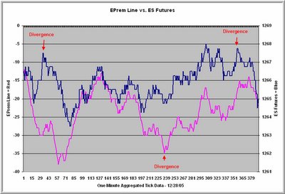
Recently on my site, I mentioned the S&P emini premium to cash as a valuable market indicator reflecting program trading activity. Below is a chart from the 12/28/05 market that tracks the emini premium relative to separate buy program and sell program levels through the day. When the line is rising, it means that there is buying pressure in the ES as gauged by pricing relative to the buy level criteria. A falling line means the reverse. As we can see from the chart above, divergences between the Premium Line (red) and price (blue) are of interest to the short-term trader. I'll post further details on the Weblog.
Friday, December 30, 2005
Selloff In the Last Hour: What Next?
Once you develop a large, deep, and clean intraday database, historical analyses can be conducted on intraday patterns in real time. This allows quantitative traders to track shifting odds through the trading day. For example, you can look at what typically happens after the market opens up, but then retraces this rise in the first 15 minutes of trading. Or you could look at a day like Friday and ask, "What typically happens after the market sells off in the last hour and makes a new low for the day?"
It turns out that this has occurred 14 times in the past 250 trading sessions (which goes back to late December, 2004). After this selloff, the market (ES futures) has opened up the next day 6 times, opened down 6 times, and opened unchanged twice for an average gain of .07%. No real edge there.
By the end of the first hour of the next day of trading, however, the market has been up 11 times, down twice, and unchanged once for an average gain of .17%. This compares favorably to the average gain of .07% (141 up, 106 down, 3 unchanged) for the first hour of trade across the entire sample.
This bullish bias in the first hour of trade after a selloff dissipates through the remainder of the trading day (i.e., there is no edge holding on beyond that first hour).
In short, late selloffs have tended to be at least partially reversed during the first hour of trade the next day.
Once you start thinking of the morning, midday, and afternoon market hours as separate trading sessions, lots of intraday analyses become possible. A few are even meaningful... :-)
Thursday, December 29, 2005
Narrow Trading Range Periods
My upcoming Trading Markets article will examine narrow trading ranges over a 20-day period, going back to 1990. I was inspired to take this look after receiving a number of emails from readers suggesting that we were headed for a major (upside) breakout move due to the extended narrow range that we've been in.
So my question was: Do narrow, rangebound markets lead to future price volatility and a directional edge in prices?
The gist of my findings was that low volatility 20-day periods in the S&P 500 Index tend to be followed by below-average volatility 20-day periods and high volatility periods tend to be followed by above-average volatility. Interestingly, the recent 20-day period is one of the lowest volatility periods we've seen since the early-to-mid 1990's--in fact, it's in the lowest 1% of all 20-day periods in my sample.
Compared to high volatility 20-day periods, low volatility ones were just as likely to be up vs. down over the next 20 days, but the average sizes of gains are greater following high volatility periods.
In short, historical analysis does not support the idea that narrow, low volatility markets lead to high volatility breakouts or that there is a distinct price direction edge associated with extended low volatility. My website does mention reasons for concern regarding weakness in the current intermediate-term picture, but this is a consideration specific to this market. History is not on the side of those who expect large, extended directional moves to emerge from low volatility markets.
Wednesday, December 28, 2005
Inside Day After A Fall
Wednesday traded much more like a holiday session than Tuesday, remaining in a narrow range. After Tuesday's decline, Wednesday gave us an inside day. So, I decided to take a look at what happens after inside days that follow weakness vs. strength.
Since January, 2003 (N = 752), we've had 100 inside days. In general, returns following inside days are nothing to write home about. Two days later, the market (SPY) averages no change (47 up, 53 down), compared with a gain of .09% (402 up, 350 down) for the sample overall.
When the inside day follows strength (an up day; N = 50), the next two days in SPY average a loss of -.11% (23 up, 27 down). When the inside day follows weakness (a down day; N = 50), the next two days in SPY average a gain of .12% (24 up, 26 down). Interestingly, when the inside day follows a very weak session (down by more than 1%; N = 17), such as the present situation, the next two days average a gain of .40% (9 up, 8 down).
In general, inside days following strength tend to be weaker than inside days following weakness, but there are no decisive edges in the data. It's a bit like poker: knowing when you have a hand that gives you no real odds is not exciting, but--to a pro--it's information. In time you'll draw the nuts; mucking your hand when you have nothing helps you keep your winnings. Today we've drawn 4, 8 unsuited.
Tuesday, December 27, 2005
Up Open, Down Day
Tuesday's market (SPY) opened up, but then closed down over 1% on the day. Since January, 2003 (N = 750), we've had 80 days in which SPY has fallen by 1% or more. The next day, the market is up on average by .24% (50 up, 30 down), which is stronger than the average gain of .05% (415 up, 335 down).
Interestingly, however, when the down day in SPY started the day by opening to the upside (N = 23), the average change the next day is -.02% (13 up, 10 down). When the down day opened down and stayed weak (N = 57), the average next day change is .35% (37 up, 20 down). It thus appears that days that start strong (such as Tuesday), but become weak are more likely to show followthrough weakness the next day that markets that are weak throughout the day. One way of looking at this is that markets opening up are trapping the buyers, while markets that open down trap the sellers the following day.
Monday, December 26, 2005
Dow Industrials and Utilities
While traders marvel over the performance of GOOG and AAPL, the Dow Utilities have quietly doubled in value over the past three years--not bad for a collection of stocks once thought for widows and orphans. Accordingly, I thought it would be interesting to see how the Dow Utilities fared as a predictor of the Industrials.
Over the past seven trading sessions, the Industrials have been essentially unchanged, but the Utilities have declined by about 1.2%. Going back to January, 2003 (N = 745), I decided to look at flat periods when the Industrials were up or down within .30% over a seven-day period (N = 93). Seven days later, the Industrials averaged a loss of -.30% (44 up, 49 down), worse than the average seven-day change for the entire period (.23%; 412 up, 333 down).
A median split based upon the Utilities, however, reveals a pattern. When the Utilities have been strong while the Industrials have been flat over a seven-day period(N = 47), the Industrials have lost an average -.60% (20 up, 27 down) over the next seven sessions. When the Utilities have been weak during flat seven-day periods in the Industrials, the next seven days in the Industrials have averaged .02% (24 up, 22 down).
In short, when the Industrials have showed relative strength compared to the Utilities on a seven-day basis (as they have recently), they have performed better over the next seven days than if they show relative weakness. While there is no upside edge in the pattern at present, neither is there a significant downside one.
Sunday, December 25, 2005
The Coming Holiday Week
My upcoming Trading Markets article will look at expected market action during the holiday week between Christmas and New Years. Not surprisingly, since 1990 over 80% of all days during these holiday weeks trade below their 200 day moving averages for both volume and volatility (N = 63). There is an upward bias to price change during the holiday weeks, with 39 trading days up and 24 down and an average price change of .14%. This compares favorably with the .04% average daily gain for the 1990-2004 period overall. My work, however, suggests that the bulk of these bullish days occur during high volatility markets. There is no seasonal edge during low volatility times, such as the current one.
Saturday, December 24, 2005
TRIN and the Flat Eight-Day Period
The S&P 500 cash index has been relatively flat over the past eight trading sessions, but we've seen more volume in advancing issues than declining ones, leaving us with an eight-day TRIN below 1.0. I decided to look at what occurs eight days following flat eight-day periods.
Overall, there's no edge following a flat eight days in the market. Since January, 2003 (N = 744), I found 55 instances of eight-day periods in SPX where the market was up or down within .20%. Eight days later, the average price change was .21% (31 up, 24 down). This compares to an average eight-day change of .37% (440 up, 305 down) for the sample overall.
A median split of the flat eight day periods based on the eight-day TRIN shows an interesting pattern. When the TRIN was high (more volume in declining issues), the average price change eight days out was .77% (17 up, 11 down; N = 28). When TRIN was low (more volume in advancing issues, such as we've had recently), the average price change eight days later was -.36% (14 up, 13 down).
This appears to be another instance in which a technical indicator shows particular value during periods of neutral price change in the markets. When there is strong market selling during a neutral eight-day period, the next eight days tend to be stronger than when there is strong buying in such a period. Once again, we see where buying over the last several days is not generating further upside expectations.
Friday, December 23, 2005
Four Consecutive Up Days - What Next?
We've had four consecutive up days in SPY, but that's not the most unique feature of recent action. Rather, of the 66 instances of four consecutive days that we've had since 2003 (N = 748), this most recent episode is the weakest of all in terms of percentage price change. On average, when we have four consecutive up days in SPY, the average price change is 2.61%. The past four days, we've seen a rise of only .84%.
In general, there is no edge over the next four days when we look at four consecutive up days in SPY. The average four-day change for the sample overall (N = 748) is .18% (424 up, 324 down). After four up days, the average four-day change is .13% (40 up, 26 down).
When we perform a median split on the sample of consecutive four-day rises, however, a pattern emerges. The strongest four-day periods in the sample (average price change = 3.5%; N = 33) average .32% over the next four days (22 up, 11 down). The weakest four-day periods in the sample (average price change = 1.72%; N = 33) average -.05% over the next four days (18 up, 15 down).
What we see, then, is a momentum effect: Four consecutive rises that produce a strong price gain show some upside continuation over the next four days. There is no such upside continuation when the four consecutive rises do not produce strong price change, such as has been the case over the last four days. This does not provide us an edge to the downside; rather, it suggests that there is no significant upside edge despite the short-term uptrend.
Thursday, December 22, 2005
What Happens After a Strong Inside Day?
What I like to do with modeling is look for what is distinctive or unusual about the day's trading and then see what tends to happen subsequently. On Thursday we traded higher, following the pattern noted on Wednesday. Even though SPY was up over half a percent, however, it was still an inside day. That led me to wonder what happens after inside days and especially after strong ones.
Since January, 2003 (N = 748), we've had 99 inside days in SPY. The average three-day change in SPY for the sample overall is .14% (436 up, 312 down). After an inside day, the average three-day gain is only .02% (53 up, 46 down).
When the inside day is up by half a percent or more, however (N = 21), the average three-day change is .32% (13 up, 8 down). The remaining inside days average a three-day loss of -.06% (40 up, 38 down).
I sliced and diced the data other ways, but the modest conclusion is that outcomes are more bullish following strong inside days than weak ones. There is certainly nothing in the data to support fading a strong inside day.
Wednesday, December 21, 2005
Up On the Day, Down From the Open
Note: Some people are trying to post spam to the comments section of the site, so I've gone to moderated mode where I have to approve comments before they're posted. Please excuse the delay that this entails. Rest assured that I welcome comments and will do my best to respond to all legitimate ones. Thanks.
Well, Wednesday was interesting in that it followed the recent posts on this blog. We did see strength after the flat day in a downtrend, and we did see weakness following an up open.
One other thing interesting about Wednesday: We were up for the day, but down from the open. Looking back to January, 2003 (N = 747), I found 60 days in SPY that were up days, but which closed below their opening prices. Two days later SPY averaged an impressive gain of .57% (43 up, 17 down). All other occasions averaged a two-day gain of .05% (356 up, 331 down). If you go back to earlier posts on breadth, you'll also see favorable forecasts arising from relatively flat days that had strong breadth (such as Wednesday).
An up day that finishes below its open sounds weak on the surface and might lead to expectations of weakness the next day. Such expectations have not panned out since 2003.
Tuesday, December 20, 2005
After a Flat Day: Context Matters
Tuesday was a flat day in the S&P 500. I looked at all days since January, 2003 (N = 746) and found 96 days where the market was neither up nor down more than .10% on the day. Two days following the flat day, SPY averaged a gain of .12% (56 up, 40 down). This compares with a two-day average gain of .09% for the sample overall. Clearly there is no meaningful edge associated with a flat day.
When, however, we look at the *context* in which the flat day occurs, a pattern emerges. Based on a median split of the data, I looked at how the market had behaved during the two days prior to the flat day. When the prior days were weaker (N = 48), the next two days in SPY averaged a gain of .32% (31 up, 17 down). When the two prior days were stronger (N = 48), the next two days in SPY averaged a loss of -.07% (25 up, 23 down).
In other words, a flat day after a decline (such as we had Tuesday) appears to have a more favorable two-day forecast than a flat day following a rise. The lesson here is that context matters: all short-term patterns are embedded in longer-term ones that may be important to the edge going forward.
QQQQ: What Happens After the Open
Psychologists tell us that we tend to place undue emphasis upon the most recent events when anticipating the future. When we see a market open the day strong, it is only natural to think, "This is a strong market," and anticipate future gains. But do strong openings predict strong day sessions?
I looked at the QQQQ (NASDAQ 100 ETF) from January, 2003 to the present (N = 749). The average price change from yesterday's close to today's open was .07%. The average price change from today's open to today's close was only .01%. Interestingly, this suggests that the majority of the bull market in the NASDAQ has occurred during the overnight hours, and that the day sessions have had little directional bias. The correlation between price change from close to open and open to close was -.10, suggesting that there is no tendency for strength or weakness at the open to persist during the day.
Indeed, when I conducted a median split, it was clear that market moves at the open--if anything--tend to be reversed. When the market opens strong (N = 375), the day session in QQQQ averages -.11% (180 up, 195 down). When the market opens weak (N = 374), the day session in QQQQ averages .13% (203 up, 171 down).
Moreover, when QQQQ opens strong, the day session in SPY averages -.07% (181 up, 194 down), but when QQQQ opens weak, the day session in SPY averages .11% (214 up, 160 down).
These are modest tendencies, but they highlight the danger in assuming momentum: that recent moves will necessarily persist.
Sunday, December 18, 2005
Technical Indicators: Valuable or Worthless?
What I continue to find in my data explorations is that many market indicators are highly correlated with price change, but that this is because of high correlations at either end of the distribution. In other words, when price change is either very strong or very weak, the indicators also tend to be extreme, so that they don't provide additional information. When, however, price change is small (up or down only a little), the correlations with indicators is quite a bit less and the indicators have more unique predictive value. What this suggests to me is a strategy of modeling large price-change days/weeks with price based predictors and modeling small price-change days/weeks with alternate predictors (sentiment, breadth, etc.). I will be trying this strategy out when I return on Tuesday.
On the heels of my last analysis, I decided to look at strong versus weak closes in daily SPY data going back to January, 2003 (N = 744). Over the entire sample, the correlation between where the market closes within its daily range and its price change for the day is a very high .77. Among days when price change was small, however, (up or down less than .20%; N = 170), the correlation between where the market closes within its range and price change is only .35. Performing a median split on the small price-change days, I found that SPY averaged a next-day gain of .18% (55 up, 30 down) when it closed near the lows for the day, but only a gain of .04% (45 up, 40 down) when it closed near its daily highs.
This modest reversal effect dissipates after one day. It will be interesting to track in other markets, including individual stocks. At this juncture, however, the basic strategy of modeling strong up days, neutral days, and strong down days separately is what is most important. Those who assert that technical indicators are valuable and those who assert they are worthless may both be right: they seem to be helpful within particular ranges of price-change distributions.
Neutral Trading Weeks
This past week, the S&P 500 barely budged. I went back to January, 1996 (N = 516 trading weeks) and examined what happens after SPY is neither up nor down more than .20% during the week (N = 34 occasions). The following week, SPY was up by an average of .03% (15 up, 19 down), certainly no bullish edge relative to the sample overall (.17%; 280 up, 236 down). Three weeks out, however, was more positive. After a neutral week, SPY averaged a three-week price change of .89% (22 up, 12 down), compared with .51% (287 up, 229 down) for the sample.
As we saw in yesterday's posting, how the market traded during the period of analysis made a difference. When the neutral SPY week closed nearer its week's lows (N = 17), its next week's change averaged -.38% (5 up, 12 down) but three weeks out it averaged 1.18% (12 up, 5 down). When the neutral SPY week closed nearer its week's highs (N = 17), its next week's change averaged .43% (10 up, 7 down) and three weeks out it averaged .59% (10 up, 7 down).
Overall, after a neutral week in SPY, there is no directional edge going forward the next week, but some indication of strength three weeks out. This is especially true for neutral markets that close weak (such as this past one). They tend to see weakness spill over into the following week before reversing and closing stronger three weeks out.
I will be exploring more intraday and intraweek patterns relative to how we open and close. The above finding is interesting, but clearly not based on a huge sample. And, of course, it will be interesting to see how markets other than the S&P test out.
Saturday, December 17, 2005
Reversal Days
Friday was interesting in that we traded about 1% above the open in SPY before reversing, going negative, and closing near the day's lows. I went back to January, 2003 (N = 744) and found 104 trading days where we closed in the bottom quarter of the day's range. Three days later in SPY, the market averaged a gain of .47% (73 up, 31 down), much better than the .14% for the sample overall (435 up, 309 down). It appears that days that close near their lows tend to reverse to show strength over the next three days. I found that smaller range days tended to reverse sooner than larger range days (such as Friday), which often saw weakness spilling into the next day's trade. By three days out, however, the size of the range on the weak day had no impact: results were uniformly bullish.
Here's the interesting thing, however. I performed a median split on the weak days based on how high above the day's open they traded. Friday, for instance, traded very solidly above its opening price before reversing. Other days start weak out of the gate and close near their day's lows. The days that traded higher above their opens were stronger three days out than days that did not trade significantly above their opens. Specifically, when we traded strongly above the open (N = 52), SPY three days out was up 41 times, down 11 (!) for an average gain of .72%. When we did not trade strongly above the open (N = 52), SPY over the next three days averaged a gain of .22% (32 up, 20 down).
In sum, days that close near their lows have been bullish three days out and days that trade well above their opens before closing near their lows have been especially bullish three days out. This will provide an interesting context to early trading this coming week.
Friday, December 16, 2005
Selling In Both Broad Market and Large Caps
On Thursday, we had solid selling pressure through the day. My Adjusted TICK ended at -379, and my Institutional Composite (a similar measure akin to the TIKI, or Dow TICK) finished at -356. Since July, 2003 (N = 615 trading days), when these have both closed below -300 but above -500 (N = 33), the market has been up the next day 20 times, down 13 for an average gain of .25%. The sample overall shows an average next day gain of .04% (338 up, 277 down).
This weekend I will begin compiling the few basic patterns that this site will monitor on an ongoing basis for trading edge 1-3 days out.
Thursday, December 15, 2005
SP Up, The Others Down: Unexpected Result
Well, here's a piece of humility for the doc. The last eight days in SPY have been up by about .75%. During that same time, the NASDAQ (QQQQ) and Russell 2000 (IWM) have been down. This has only occurred six times since 2003 (N = 737 trading days). I would have bet my bottom dollar that the outlook the next eight days would have been subnormal. Nope.
Eight days later, SPY was up five times, down only once for an average gain of 1.27%. This compares favorably with the overall sample average of .37% (434 up, 303 down). Eight days later, QQQQ and IWM were up by an average 2.03% and 1.86% (4 up, 2 down, both cases). This compares with their sample averages of .56% (412 up, 325 down) and .66% (429 up, 308 down), respectively.
The sample size (N = 6) is far too small for reliable statistical inference, but the point here is that--at least since 2003--a lagging broad market has, if anything, caught up to an outperforming S&P, not the reverse.
Wednesday, December 14, 2005
Selling On an Up Day
The S&P 500 was up Tuesday by over .4%, but my Adjusted NYSE TICK showed greater selling on the day than buying (i.e., more stocks trading on downticks than upticks). This typically occurs when the buying is stronger in the large caps than the rest of the stock universe. It is also not common. Since July, 2003 (N = 609 trading days), it's only occurred 22 times.
Overall, the three-day average change for the sample is .12% (360 occasions up, 249 down). After an up day with net selling, however, the next three days bring an average loss of -.06% (9 occasions up, 13 down). This is one of the reasons why, despite pushing toward new highs, I am not aggressively bullish on this market. Another reason: We registered the highest number of stocks trading in intermediate-term downtrends since November 17th--despite it being an up day, with averages near recent highs.
Tuesday, December 13, 2005
More Price Momentum Patterns
On Monday we looked at 3-day momentum in the S&P 500 and its implications for the next three days. Now we'll do the same for the NASDAQ 100 Index (QQQQ) and the S&P 400 Midcap Index (MDY).
Once again, we're investigating July, 2003 through November, 2005 (N = 616 trading days). When the three-day price change in QQQQ is > 2.1% (N = 80), the next three days on average are up .48% (53 up, 27 down). When the three-day price change in QQQQ is < -1.7% (N = 81), the next three days on average are up .40% (46 up, 34 down). Interestingly--as with SPY--when three-day momentum in QQQQ was moderate (N = 455), the next three days average only .07% (245 up, 210 down). Looking at MDY, when three-day price change is > 1.9% (N = 78), the next three days in MDY average .25% (49 up, 29 down). When three-day price change < -1.45% (N = 81), the next three days in MDY are up .54% (53 up, 28 down). When MDY displays a moderate price change over three days, the next three days average only .16% (264 up, 192 down).
Again, these findings suggest that much of the upside action since 2003 is momentum related, following periods of very strong and very weak price momentum. Let's add this to our stable of market patterns providing a potential trading edge.
Monday, December 12, 2005
Fed Up on Fed Day
I'm taking a day off from exploring price change/momentum patterns in order to look at recent Fed announcement days. (See my Trading Markets article on the topic, which should appear Tuesday AM).
The gist of my findings is that Fed days no longer carry the volatility that they used to. The average daily range for the S&P from January, 2003 to November, 2005 has been 1.09%. On Fed days between January, 2003 and August, 2004, the average daily range has been 1.45%. Since September, 2004, however, the average daily range on Fed days has dropped to .90%.
Between January, 2003 and August, 2004, the average daily range was 1.26%; between September, 2004 and November, 2005, the average daily range has been .88%. Fed Days were modestly more volatile than average in the S&P prior to September, 2004; from that point forward, they were no different from the average market day.
This pattern is even more dramatic in the NASDAQ 100. Between 1/03 and 8/04, the average daily range was 1.83%. On Fed days, however, the average range was 2.31%. After 8/04, the average daily range for the NASDAQ has been 1.23%--but Fed days have only averaged 1.14%.
The same pattern occurs for both the Russell 2000 stocks and the S&P Midcap issues. Both indices were more volatile than average prior to September, 2004 on Fed days, but since that time, the Fed days have been no more volatile than average.
Here's another interesting pattern: Fed days tended to be up days prior to 9/04 (when they were more volatile), but have been down days on average since then. However, the three days following Fed days tended to be weak during the volatile times and recently have tended to be strong. The net message of this pattern is that, if the Fed does not produce a genuine surprise and policy change at its meeting, the intial market reaction to the report tends to reverse over the next three days.
I attribute the volatility change to the increasing transparency and gradualism at the Fed, which has reduced the number of surprises coming from the meetings. If the new Fed chairman continues these policies, we may see continued muted responses on Fed days.
Sunday, December 11, 2005
Price Momentum Patterns I: SPY
OK, now we'll start looking at price momentum patterns. For sake of consistency, I'll look at the period from July, 2003 to the present (N = 615 trading days)--the same period used in the prior analyses. For this particular analysis, we're looking at the past three day price change in the S&P 500 (SPY) and seeing how it is related to the next three days in SPY, QQQQ (NASDAQ 100), and MDY (S&P Midcaps). Both the Qs and MDY have outperformed SPY handily over this period and have also displayed superior volatility. The idea is that these might do a good job of exploiting any momentum patterns.
For the sample overall (N = 615), the average three-day change has been .12% (362 days up, 253 down). When the last three days in SPY have been up by 1.40% or more (N = 80), the next three days in SPY, QQQQ, and MDY respectively have been .29% (58 up, 22 down), .69% (55 up, 25 down), and .48% (58 up, 22 down). Clearly, strong upside three-day price momentum by SPY has been followed by three days of further strength. The greatest followup strength has been seen in QQQQ and MDY, as hypothesized.
When the last three days in SPY have been down by 1.2% or greater (N = 80), the next three days in SPY, QQQQ, and MDY respectively have been .34% (54 up, 26 down), .20% (41 up, 39 down), and .45% (53 up, 27 down). Once again, we see price outperformance by SPY and MDY after three days of strong negative price change--but we don't see the same with QQQQ. Interestingly, QQQQ seems to magnify SPY strength in its reaction the next three days, but also rebounds less following three days of SPY weakness. Findings such as these might help guide traders in selecting what to trade following strength and weakness.
The price-based momentum findings are similar to those obtained with the Supply/Demand momentum measures. Momentum seems much better at forecasting future short-term strength than weakness.
What we can say regarding weakness is that moderate levels of three-day SPY momentum tend to produce subnormal returns three days later. When SPY momentum is moderate (N = 455), the next three-day return in SPY, QQQQ, and MDY respectively are .06% (250 up, 206 down), .07% (247 up, 208 down), and .13% (256 up, 199 down). A possible implication I need to study is that the odds of a trend day in the averages are reduced following periods of moderate momentum.
Next I'll turn the tables and see how the averages perform following price strength and weakness in the QQQQ and MDY.

Saturday, December 10, 2005
Milking Another Pattern: Momentum and Midcaps
Well, before we explore pure price patterns, let's take a look at yesterday's momentum pattern applied to the S&P Midcap (MDY) stocks. We noted earlier that MDY has been a superior trading vehicle to its larger cap counterparts: it is trending better and displays superior volatility. But does it extract greater returns from the momentum pattern?
Once again the analysis looked at daily data from July, 2003 through November, 2005 (N = 608). The average three-day change in MDY during that period was .21% (361 up, 246 down). When Demand (number of stocks trading above their 20 day volatility envelopes) exceeded 500 (N = 78), the next three days in MDY were up by an average .42% (51 up, 27 down). When Demand fell below 140 (N = 83), the next three-day change in MDY was up by .45% (54 up, 29 down). Just as with SPY--but to a greater degree--the market outperforms three days later after upside momentum is either very strong or very weak.
It is interesting to look at the returns in the three-day MDY when momentum is moderate (N = 446). The average change of .13% (256 up, 190 down) is quite modest relative to those strong and weak upside momentum occasions.
Here, too, we see no edge associated with the Supply statistic (the number of stocks trading below their 20 day volatility envelopes). This occurred also with SPY, but not so dramatically. I'm not sure how to explain this, but what seems clear is that upside momentum--its presence or absence--is what matters in the near term. The absence of strength, rather than the presence of weakness, is most predictive. Perhaps this is a pattern associated with bull markets. Might it be different in a bear environment, where Supply would be the essential element? It's an interesting conjecture.
For now, however, we've seen two patterns now: TICK (short-term sentiment) and Momentum (Supply/Demand) that provide an edge when values are strong and weak. Moreover, we've seen that this edge is greater with a superior trading vehicle. Trading the right patterns with the right instruments does indeed appear to be helpful to performance.
Friday, December 09, 2005
Does Momentum Matter?
One by one we're going to take the major indicators and patterns and see what they're worth. At the end of all this we'll have a core group of patterns with a demonstrated edge, and then we'll start seeing which markets best milk those patterns. And then we'll follow them in real time!
Today we're looking at momentum. My measure of momentum is a version of the Demand/Supply Index that I post on my Trading Psychology Weblog each day. To compute Demand and Supply, we construct an N-day standard deviation envelope around price and then look at the number of stocks closing above (Demand) and below (Supply) their envelopes. For this analysis, I used a 20 day envelope, so that a stock would have to have strong momentum to the upside/downside to contribute to the Demand/Supply figures.
Again, I looked from July, 2003 to November, 2005: a total of 608 trading sessions. Demand was more predictive than Supply. In other words, the number of stocks above their envelope seemed to be more important than the number below it--a result I didn't anticipate. When Demand was greater than 500 (N = 78; more than 500 issues above their envelope), the S&P 500 ETF (SPY) was up .26% (54 occasions up, 24 down). This nicely outpaced the average three-day SPY gain of .13% for the entire sample (359 up, 249 down). When Demand was less than 140, the SPY four days later (N = 83) was up by an average of .50% (57 up, 26 down)--much stronger than the sample as a whole, which was up .16% (344 up, 264 down).
Interestingly, the lack of stocks above their volatility envelope was especially predictive of strength several days out.
When Supply was below 145 (meaning that fewer than 145 issues were below their 20-day envelopes; N = 82), the next day's average change was -.03 (42 up, 40 down), modestly weaker than the average gain of .04% for the sample overall (335 up, 273 down). When Supply was greater than 475 (N = 91), the next three days brought an average gain of .25% (56 up, 35 down) to the SPY, stronger than the average gain of .13% for the sample (359 up, 249 down).
High readings for Supply (a large number of issues trading below their envelopes) thus are associated with strength several days out.
Clearly the momentum figures from Demand/Supply are better at forecasting strength than weakness. In general, the market offers only modest bullish edge when Demand is moderate. Very high readings for Demand, very low readings for Demand, and very high readings for Supply all suggest strength several days out.
Next we'll look at simple price momentum.
Thursday, December 08, 2005
Milking a Pattern: NYSE TICK and the Midcaps
Yesterday we looked at how strength and weakness in the NYSE Adjusted TICK were associated with superior and inferior returns 3 and 1 day out in SPY. This made sense because the TICK is capturing short-term market sentiment: the willingness of buyers to lift offers vs. the aggressiveness of sellers in hitting bids. Strong sentiment, when fueling a rising or falling market, does not turn around on a dime: normally buyers will only become bearish after prices retreat and vice versa. What we saw in the SPY data was evidence of price persistence: extremes of sentiment lead to higher prices over 3 days and lower prices over the next day.
Because the NYSE TICK is derived from all NYSE stocks and is unweighted, it should reflect sentiment among small and midcaps just as well as among the large caps. That's exactly what we see with the Midcaps: daily price change in MDY correlates .78 with the Adjusted TICK. However, because--as we saw recently--the Midcaps have been a better trading market (better trending, more volatility), the prospect is there to milk the sentiment pattern even more with MDY than with SPY.
I reran yesterday's analyses using MDY instead of SPY. The same basic pattern emerged:
- After a strong Adjusted TICK day, the next three day gain in MDY was .56%, much higher than the average change of .20% for the entire sample.
- After a weak Adjusted TICK day, the next day change in MDY was -.20%, much weaker than the +.07% for the entire sample.
The interesting thing is that the patterns were present with MDY, but to a greater degree. The average's higher volatility allowed traders to milk this pattern. This suggests that it is not only important to identify market patterns, but also the trading instruments most likely to benefit from the patterns.
Wednesday, December 07, 2005
The NYSE TICK: Does it Matter?
Readers who also follow the Trading Psychology Weblog know that I track each day something called the Adjusted NYSE TICK. This is the number of stocks upticking minus downticking among NYSE issues, adjusted to create a zero mean. I calculate values on an intra-minute basis and then sum all values for the day to create a single daily figure. This daily Adjusted TICK, summarized each day on the Weblog, correlates highly with price change in SPY: about .75.
Since July, 2003, the average value for the Adjusted TICK is 3.26 (because of the adjustment) and the standard deviation is 527. I took a look at what happens after all days that show an Adjusted TICK reading in excess of one standard deviation. When the Adjusted TICK is greater than 600, the average price change over the next three days is .31% (50 occasions up, 22 down), far greater than the .09% (308 occasions up, 227 down) for the rest of the sample.
When the Adjusted TICK is less than minus 600, the average price change over the next day is -.13% (34 up, 40 down), significantly weaker than the average change of .07% (316 up, 217 down) for the remainder of the sample.
This makes sense, because the TICK is capturing short-term market psychology: the aggressiveness of buyers and sellers in lifting offers and hitting bids. But does the TICK predict those more volatile, trending indices we've been talking about, such as the small- and midcaps? We'll look at that shortly.
What Should I Trade?
On the Performance page of my site, I emphasize that trading performance is a function not only of how you trade, but what you trade. When TraderFeed reader Paulo de León pointed out that the NASDAQ averages were losing volatility relative to the rest of the market, it drove home the point that what constitutes the best thing to trade changes over time. I will have an article on the Trading Markets site later this week on the topic.
Here's a dramatic example. Since January, 2000, the S&P 500 Index is down about 13%. The NASDAQ 100 Index is down 55%. In that same period, however, the Russell 2000 average is up 38% and the S&P Midcap Index is up about 69%.
Moreover, volatility of the Russell stocks has been increasing relative to the S&P--unlike what we're seeing in the NASDAQ average. Volume in the MDY exchange traded fund (for midcap issues) has expanded several-fold since 2000. Yet we continue to see far more traders banging their heads against the S&P 500 and NASDAQ 100.
As this blog evolves, I will use it increasingly to identify what to trade, not just when to do it. It is not clear to me from the research I reviewed on my site that the big name stocks are necessarily the best trading--or investment--vehicles.
Tuesday, December 06, 2005
Do the Small Stocks Really Matter?
One of the themes we'll be exploring on this site is the behavior of small stocks, medium cap stocks, and individual stock sectors relative to the large cap issues. Yesterday the S&P 500 declined modestly, but the Russell 2000 Index more than doubled the decline in percentage terms. I went back to January, 2003 and looked at occasions when the SPX declined, but less than half a percent on the day (N = 144). The next day, the SPX averaged a gain of .18%, with 90 occasions up and 54 down. This is consistent with our earlier theme of weakness following strength.
When I divided the sample for weak Russell days (N = 59; down more than half a percent) vs. strong Russell days (N = 85; down less than half a percent or up), a pattern emerged. The next day in the SPX following a weak Russell day was .09% (36 up, 23 down). Following a strong Russell day, the following day in SPX averaged .25% (54 up, 31 down). Clearly the bullish bias that normally follows a down day in the S&P is negated when, like Monday, the Russell underperforms the large caps.
When New Lows are High
Recently, on the Weblog, I noted that the number of stocks making fresh 65 day highs is well below the peaks earlier this year. What I didn't mention is that the number of 65 day lows is higher than we've seen earlier in the bull market. On Thursday, we made a 20 day peak in the number of new 65 day highs at 860; new 65 day lows were 192. The latter is actually in the upper half of values since the bull market began in 2003.
I took a look at what happens the week following a 20 day peak in new 65 day highs (N = 67). Overall, we see an average gain of .13% in SPY, with 40 occasions up, 37 down. When we divide the sample in half based on the number of new lows, however, a pattern stands out. When new lows are few in number, the next five trading days average .31%, with 22 occasions up, 12 down. When new lows are more numerous--as they are now--the next five trading days average -.05% (18 up, 15 down).
A strong market is distinguished not only by the presence of new highs, but also by the absence of new lows. The stickiness of new lows, in addition to waning new highs, moderates expectations following recent strength.
Monday, December 05, 2005
Semiconductor Strength and the Qs
This past week, the QQQQ was up modestly (around half a percent), but the semiconductor stocks (SMH) were up well over 3%. In an article a couple of years ago, entitled the SOX and the Stocks, I showed how outperformance by the semis tended to lead the S&P. Does outperformance by the semis now lead the Qs?
Looking from January, 2003 to now (N = 732 trading days), we find 105 occasions where the QQQQ was up for the week, but not more than one percent. I then performed a median split, looking at modest up weeks in the Qs where SMH was strong vs. modest up weeks in the Qs where SMH was weak. Overall for the sample, the average price change the following week was -.10% for the Qs and -.26% for SMH. This reflects the general tendency we've been seeing for weakness to follow strength. When the SMH has been strong, however, the next five days in the Qs and SMH have averaged .01% and -.05%, respectively. When the SMH has been weak, the next five days in the Qs and SMH have averaged a respective -.21% and -.47%. This suggests that, when the Qs are up modestly and the semis are down, it may be worthwhile to sell SMH.
Interestingly the underperformance following weak SMH weeks has been due to outsized declines during down periods; the absolute proportions of up and down occasions have not significantly differed. In other words, the odds of having an up vs. down week in the Qs and SMH are not impacted by SMH performance. But when SMH is weak relative to the Qs during a modest up week for the Qs, the down occasions are particularly severe.
Outperformance by SMH, such as in the past week, is not enough to give us a positive edge, but pretty much negates any negative edge that we normally see following an up week. Fading strength in the Qs when SMH is even stronger has not been a winning strategy. The lead performance of sectors relative to broad averages is something I will be tracking in upcoming posts.
Sunday, December 04, 2005
Does Volatility Matter?
Here I replicated yesterday's study, but used six-day volatility (the sum of each day's range, with range stated as a % of index value) instead of breadth as the predictor variable. Volatility for the most recent six-day period has been below average (4.51 vs. 5.77).
When volatility during a flat six day period (N = 26) has been below 5.0 (N = 10), the market has been up 8 times, down 2 for a gain over the next six days of .80%. When the volatility has been above 5.0 (N=16), the market has been up 8 times, down 8 for an average loss of -.38%. Once again, this is a modest positive for the current market.
The larger issue here is whether many of the technical indicators might be more predictive during flat markets than during trending ones, given their strong overlap with price in strong and weak markets. I will tackle this issue later today in the Weblog and in a Trading Markets article early this week. Much more research needs to be done over different time frames with different measures. I suspect, however, that there's something here...
Saturday, December 03, 2005
Does Breadth Really Matter?
From January, 2003 to the present, daily advance-decline figures have correlated very highly with price change: about .80. So does breadth really matter, or should we just focus on price?
Our outlook for the week ahead might depend on the answer to that question. The change in the S&P 500 Index over the past six days has been almost zero (.o4%). Advances have led declines over that same period, however, by over 2000 issues--something that has only happened four previous times since 2003.
It turns out that we've had 26 flat six-day periods since 2003, where SPX has been up less than .10% and down by less than -.10%. On average, six days later, the market has been up 16 times, down 10, for an average gain of .02%. No edge there.
If, however, we divide the sample in half (median split) and analyze the 13 strongest breadth flat markets vs. the 13 weakest breadth flat markets, a pattern emerges. The strongest breadth markets averaged a gain of .32% six days later (10 occasions up, 3 down); the weakest breadth markets averaged a loss of -.25% (6 occasions up, 7 down). It turns out that what individual stocks are doing while the large cap average is churning is important. This is what we'd expect if small and midcap stocks tend to lead the large caps.
That has to be rated a modest plus for this coming week. Since 2003, whenever we've had a flat SPX and advances leading declines by more than 1500 issues (N = 6), the market has been up six days later.
Thursday, December 01, 2005
Welcome to TraderFeed
TraderFeed is designed to meet a purpose different from my Trading Psychology Weblog. The Weblog provides free daily summaries of market activity, perspectives on market and trader psychology, and leading edge information on trader performance. TraderFeed brings historical analyses of market trading patterns to the desktops and mobile browsers of short-term equity and stock index traders, providing a potential edge for that day's trading. Traders are encouraged to subscribe to TraderFeed by adding the TraderFeed URL to their newsreader channels. The newsreader I use is FeedDemon; it is software based, highly flexible, and well-organized; also check out FeedBlitz as an update service. (Those using Mozilla's Thunderbird email/RSS reader application should use this TraderFeed URL to enter into Thunderbird). Once you add TraderFeed to your list of favorite news feeds, analyses of popular stocks and equity index futures based on historical data will be waiting for you ahead of the market open. TraderFeed is free and subscription via RSS is anonymous. You will never be subject to solicitations or spam. I appreciate your interest in TraderFeed. If you find it useful, please share with colleagues and consider linking to your site. It's my hope that it provides individual traders with a bit of the edge exploited by institutions.
Subscribe to:
Posts (Atom)