Showing posts sorted by relevance for query cumulative tick. Sort by date Show all posts

Sunday, September 24, 2006

The Cumulative NYSE TICK: A Valuable Measure of Short-Term Sentiment


Readers of my Weblog and the daily morning updates on this blog know that I utilize the NYSE TICK statistics quite extensively in my own trading and analysis.

Why? The NYSE TICK represents, at any given moment, the net number of stocks in the broad market that are trading at their offer prices minus those trading at their bids. When the NYSE TICK becomes very positive, it means that traders are lifting offers in the broad market: buyers are quite aggressive. When the TICK becomes very negative, it means that traders are hitting bids in the broad market: sellers are very aggressive.

The swings in the NYSE TICK during the day, then, represent relative swings in short-term trader sentiment. The beauty of the measure is that it is assessing what bulls and bears are actually doing in the marketplace; not what they report as their sentiment or what they try to fool others into believing.

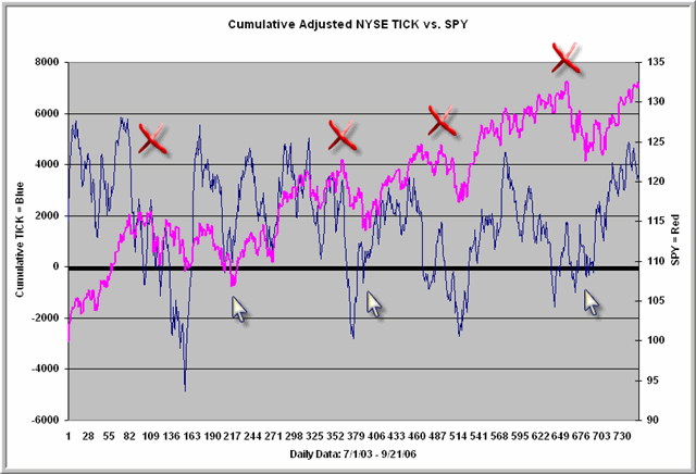
The above chart tracks the Adjusted NYSE TICK (TICK readings rescaled to produce a zero mean and to include high, low, and close readings every minute of each trading day) on a cumulative basis. That means we add the TICK readings to each other (like an advance-decline line) to track the ongoing ebb and flow of trader sentiment.

Let's see what we can learn from the chart.

First, note that--over time--we're getting somewhat lower Cumulative TICK highs and somewhat higher Cumulative TICK lows. I have found in my research a significant correlation between the volatility of the TICK numbers and intraday volatility in the S&P 500 Index. The lower highs and higher lows are telling us that the 2003 - 2006 period tracked is one of declining volatility. I do not think we can confirm that this bull market is over until we see that pattern change: with lower lows in the Cumulative TICK. That would indicate expanding volatility fueling expanded negative trader sentiment.

Second, note the arrows and Xs. It is very common, on a short-term basis, for the Cumulative TICK to top out ahead of the market and to bottom out ahead of the market. The Xs mark price highs unconfirmed by the Cumulative TICK; the arrows point to unconfirmed price lows. In other words, we frequently see shifts in trader sentiment ahead of actual price turns. That makes the Cumulative TICK a useful heads-up when it is above zero and not confirming new price highs and vice versa.

Finally, you can see that short-term market returns are superior when the Cumulative TICK is below zero than when it is above. When the Cumulative Line is above +4000, returns are negative 5-10 days out--a scenario that is unfolding at present. When the Line is below -1000, returns are superior 20+ days out. Relatively consistent high and low (sell and buy) points can be derived by additionally adjusting the line for volatility.

It has been common for the Cumulative TICK to top out well in advance of price during short-term bull swings. Quite often, the measure has regressed toward zero before the ultimate price high was made. I will be watching to see if this pattern plays out in the current market.

Wednesday, December 17, 2008

Constructing and Interpreting the Cumulative Adjusted NYSE TICK

My recent post explained the construction of the NYSE TICK and related measures of short-term sentiment. Most uses of TICK are intraday, as a way of gauging whether buyers or sellers are gaining the upper hand on short-term moves. I've used short-term oscillators of the NYSE TICK of 10-20 minutes as a way of smoothing out one-minute values. I find the peaks and valleys helpful in execution, as I want to buy on countertrend dips in the TICK oscillator and sell on countertrend bounces.

Some years ago, I decided to create a cumulative line of one-minute TICK values as a way of gauging longer-term buying and selling interest. Each one minute reading was the average of that minute's high, low, and close TICK values. I added the one-minute average readings to a cumulative total, as one would do for an advance-decline line.

What I found was that the NYSE TICK, as a distribution, did not have a perfect zero mean. There was a positive bias to the series. That bias has since been reduced by the elimination of the uptick rule for short-selling. Still, at any given time, the mean of TICK values will depart from zero. This gave the cumulative TICK line a bias in slope, particularly over the long-term.

Thus began my efforts to adjust the cumulative TICK to create a zero mean. The solution I arrived at was to calculate the average one-minute TICK reading for the past 20 days (a roughly 7900 period moving average of the one-minute high, low, close average values) and subtract that moving 20-day average from each subsequent one-minute H-L-C TICK value. I called this the Adjusted TICK.

What the Adjusted TICK is telling you is whether the current TICK values are stronger or weaker than the average over the past 20 days. This tells us whether markets are gaining or losing buying/selling interest relative to their recent past. In a sense, we can think of this as relative sentiment: the degree to which short-term sentiment is departing from what we've seen over the past month.

When we cumulate these Adjusted TICK values, the resulting line is quite helpful in providing a picture of changes in market sentiment. If buyers or sellers are quite dominant, we'll see a sharp rise or fall in slope of the line. If we're range bound, we'll tend to see a flattening of the line. Divergences between price and the cumulative line suggest that buying or selling pressure may be waning over time, which has me looking for possible reversal.

I use the day's Cumulative Adjusted TICK (starting each day at zero) as a trend indicator; most my intraday trades will be in the direction of the TICK line. I also use breakouts in the TICK to validate price breakouts from ranges. Many of my past posts illustrate these concepts.

I don't know of any software that charts the Cumulative Adjusted TICK for you. Market Tells follows the indicator closely and utilizes it in its helpful newsletter and intraday trend-following service. For more intrepid sorts, the NeoTicker program enables you to create TICK indicators for any basket of stocks, sector, or index.

My own calculation of the indicator utilizes data from e-Signal, archived and charted within Excel. If the adjustment feature isn't crucial for you, you can simply observe how much time a moving average of TICK spends above and below the zero level during the day as a rough way of eyeballing the trend of sentiment. Together with the indicators I track weekly on the blog and that I post each morning before trading days via Twitter, I find the Cumulative TICK invaluable in keeping me on the right side of the market.
.

Friday, January 23, 2009

When Is There Significant Buying and Selling in the Stock Market?


You just sold the S&P emini futures, the market starts to go your way, and then it spikes upward and returns to your entry level. Is this fresh, significant buying that should lead you to scratch your position, or is it mere short covering that has little import for the general market trend?

One way of addressing this important question is with the NYSE TICK. Recall that the TICK is the number of NYSE issues trading on upticks minus the number trading on downticks. Another way of viewing this is that the TICK assesses the number of stocks trading at their offer price minus the number trading at their bid. When buyers are more aggressive, they will "pay up" to get into the market and the trade will transact when the instrument is trading at its offer price. Conversely, when sellers are desperate to bail out of stocks, they'll "hit the bid" and the instrument will transact at the lower, bid price.

NYSE TICK is helpful, because it is a real time gauge of very short-term sentiment across the broad list of stocks. When we create a cumulative line for the one-minute TICK values during the day, we find that uptrending markets tend to occur during uptrending cumulative TICK lines and vice versa. Gauging the direction of the cumulative TICK as the day unfolds is very helpful in identifying market trends.

Now suppose we have a TICK value that exceeds +1000 or plunges below -1000. That not only means that 1000 more stocks are trading at offer or bid; it means that they are doing so at the same time. This can only occur when institutions execute basket trades to buy or sell large segments of the stock market. An individual trader--or even a large trader at a prop house--cannot make 1000 stocks trade simultaneously at their bid or offer prices. It takes real buying or selling power to do that.

One way of defining significant levels of buying or selling is to look at the distribution of one minute high and low values for TICK and examine the standard deviation of these. Going back to the beginning of October, we find that the average one-minute high value for TICK is around +250 and the average one-minute low value is around -250. The standard deviation is approximately 450. That tells us that, roughly, two-thirds of all TICK values will fall between +700 and -700. About 95% of all TICK values will fall between +1040 and -1040, making values greater than +1000 or less than -1000 rare indeed.

If I've sold the market and, after going my way a bit, it bounces higher on +500 TICK, that by itself will not take me out of the trade. In a purely statistical sense, that is not significant buying. The same is true if I am long the market and we retrace on -500 TICK. It's when we get above +700 or below -700 that I look much more closely at the trade. It's when you start to get a cluster of such readings that you realize that the Cumulative TICK is shifting and that you need to think about an exit. And, of course, if the TICK moves toward or above +1000 or toward or below -1000 when you're short or long, that is very significant sentiment against your position and warrants genuine caution.

Less important than individual TICK readings is the distribution of TICK values over time. In the chart above, we see the first hour of trade for Thursday's market. The center blue horizontal line is placed at zero, and we have horizontal lines at the one- and two standard deviation points to the upside and downside. Click on the chart for a good view and take a look at whether the bars, over time, are distributed more above the zero line or below. Further look at whether more bars exceed the +1 and +2 standard deviation levels or the -1 and -2 levels. Clearly, the net distribution of TICK is skewed negatively, and we're seeing more bouts of significant selling than buying. That keeps me on the seller's side until I see clear evidence of a shift in the distribution of TICK values.

Knowing what is significant and what is not can be the difference between staying in a good trade and getting whipped out of it. Reference lines such as the ones plotted above can help you keep your eye on the true sentiment of the market. For more background on trading with NYSE TICK, the links below should get you up to speed.

.

Monday, October 27, 2008

What the Cumulative Adjusted NYSE TICK Line Is Telling Us


In the chart above, we have a plot of the Cumulative Adjusted NYSE TICK Line (blue line) plotted against the ES futures (pink line). Recall that this line simply adds together the one-minute readings of the adjusted NYSE TICK, much like an advance/decline line (see this post for calculation of the adjusted TICK). As we plunged to intraday lows on October 10th, we made a low in the cumulative TICK line; as we've now moved back to those lows, the line has held at much higher levels in a dramatic divergence. What gives?

The TICK is a measure of stocks trading on upticks versus downticks. It begins its calculations with the start of trading in NY and ends when the NYSE closes. As a result, the TICK does not account for action that occurs overnight, between the U.S. market close and the next day's open.
If we take a look at the S&P 500 Index (SPY) from the start of September, we find that the market lost almost 42 SPY points (approximately 420 ES points). From the start of September up to that October 10th inflection point at which the number of stocks making new lows hit its highest level (see chart), SPY lost 3.29 points between the NY close and the next day's open and lost 34.8 points between the NY open and close. From October 10th forward, SPY has lost 8.46 points during overnight trade and, during the day session, has actually gained 4.8 points.

The cumulative TICK is capturing the fact that buying pressure has been exceeding selling pressure during the day trading sessions from October 10th to the present. Indeed, during that time, the S&P 500 Index--if we look at day session only-- has risen in value. This is a clear shift in regime and suggests that weakness in equity markets from October 10th forward has shifted to the European and Asian markets. That weakness prompts the U.S. market to open lower, but has not led to further net selling initiated in the U.S.

This morning, as of my writing, we're seeing a potential repeat of this same pattern. Markets were very weak in Asia, opened quite weak in Europe, and are trading lower in preopening trading in the U.S. stock index futures. We made new bear market lows overnight in the ES futures but, as I write, are trading about 1.5% above those lows. Should we build value during the regular trading day above these lows, I will be leaning to the long side in my short-term trading, entertaining the hypothesis that, in this change of regime, the day markets in the U.S. have already seen their price lows, even as markets overall (due to overseas/overnight influence) have been weak.

What prompted this little investigation was a simple observation that a growing share of my intraday trading profits was coming from the long side, despite the overall weak market. That makes sense, given that many of my trades attempt to capture swings in the NYSE TICK (i.e., try to follow short-term buying/selling sentiment). I will continue to follow these swings in early action today, with a particular eye toward whether we sustain a positively or negatively sloped cumulative TICK line on the day. That will tell us whether U.S. traders during the day session are using overseas/overnight selling for bargain hunting, or whether they are succumbing to the global market weakness.

P.S. - On a related note, a very recent article just happens to look at overnight stock index futures action as a questionable gauge of day session strength and weakness. The posts below will provide some background on short-term trading and NYSE TICK. I'll send out a Twitter "tweet" during the AM to update how the day's cumulative TICK is behaving. For new visitors to TraderFeed, the Twitter feature provides a blog within a blog containing links to important market themes, news, and indicators. The last five Twitter posts appear on the blog under "Twitter Trader"; the entire list of posts (and automatic, free subscription to the Twitter feed) can be found here.

RELATED POSTS:

Cumulative TICK and Short-Term Sentiment

Trading With the TICK

Trading Breakouts With TICK
.

Wednesday, January 28, 2009

The Dow TICK ($TICKI): Identifying Pullbacks in a Market Trend


Long time blog readers are familiar with my use of the NYSE TICK as a trading tool. As I noted in today's Twitter posts, today's market was a nice example of strong underlying buying interest among NYSE issues, as measured by the Cumulative TICK. As a rule, it pays to trade in the direction of the Cumulative TICK, as that reveals buying vs. selling sentiment across the broad range of NYSE issues.

In e-Signal, the NYSE TICK goes by the symbol $TICK. Closely related is the TICK measurement that is specific to the Dow Industrial stocks, $TICKI. Here we're tracking how many Dow stocks are trading on upticks vs. downticks at any given moment (the figure is updated about 6 times per minute). Because the Dow stocks trade very actively, TICKI moves much more quickly than TICK. Most traders don't understand TICKI, and few utilize the indicator because it seems so noisy.

As I noted in an earlier post, the Dow TICK is sensitive to program trading, because the Dow stocks are frequent constituents of baskets of stocks. This creates an interesting dynamic between $TICKI and $TICK. We can have situations in which there is program selling of large cap issues, for example, but strong underlying demand for stocks overall. That was indeed the case in today's market. As the chart above depicts, the Cumulative TICKI (a cumulative line of the one minute H+L+C values) danced above and below the zero line during the first part of the day's trade, even as the Cumulative TICK was in a strong uptrend.

What that tells us, as a rule, is that program trading is limited and cannot drag down the broad range of stocks. In such an environment, pullbacks in Cumulative TICKI that occur at successively higher Cumulative TICK levels (and successively higher ES prices) often are great entries to follow the trend. You're letting the temporary program selling move the market lower to give you a better entry on the long side. The reverse is true during market declines: bounces in TICKI in a weak Cumulative TICK and price market often provide excellent entries for shorting and riding the downtrend.

I find that plotting a short-term moving average of TICKI (10 periods on a 1-minute chart) helps filter out the noise and helps traders identify whether TICKI is staying mostly above or below the zero line. It's the pullbacks and bounces in this moving average line--in the context of overall price and TICK strength and weakness--that can create short-term opportunities for nimble intraday traders.
.

Tuesday, May 22, 2007

NYSE TICK and the Small Cap/Large Cap Relationship

The NYSE TICK tells us something about sector strength. Long time readers of this blog are familiar with my cumulative Adjusted TICK statistic. This takes the NYSE TICK (the number of stocks trading at offer minus those trading at their bid prices) and subtracts from each one minute value the average one-minute NYSE TICK reading from the prior 20 days. These values are cumulated to give a single end-of-day reading. If the cumulative Adjusted TICK is above zero, it means that we're seeing a tilt toward buying interest (lifting of offers) among the broad list of stocks. If the cumulative Adjusted TICK is below zero, it means that we have net selling sentiment (hitting of bids).

Since 2005 (N = 596 trading days), the cumulated Adjusted TICK has correlated very highly with concurrent daily price change in the S&P 500 Index (SPY; .76) and price change in the Russell 2000 Index (IWM; .80). This is why one of my most effective intraday strategies is to assess shifts in the distribution of the TICK for emerging directional moves in the indices. Shifts in the TICK, including breakouts from ranges, frequently precede or initiate short-term directional moves in the indexes.

But suppose we are interested in answering the question: should I be trading the large cap index (S&P 500 issues) or the small cap index (Russell 2000)? Or suppose we decide to craft a pairs trade in which we'll be long one of those indexes and short the other one. In both cases it turns out that the cumulative Adjusted TICK provides useful guidance.

I went back to 2005 (N = 596) and found that the cumulative Adjusted TICK correlates .60 with the difference in performance between IWM and SPY. Specifically, when the Adjusted TICK is strong, IWM is significantly more likely to outperform SPY than the reverse. When the Adjusted TICK is weak, we see underperformance of IWM relative to SPY.

In fact, when the cumulative Adjusted TICK was above zero (N = 301), IWM outperformed SPY on 212 of those occasions. When the cumulative Adjusted TICK reading was above +300 (N = 144), IWM outperformed SPY on 114 occasions, or about 80% of the time.

When, however, the cumulative Adjusted TICK was below zero (N = 295), SPY outperformed IWM on 196 of those occasions. When the cumulative Adjusted TICK reading was below -300 (N = 139), SPY outperformed IWM on 117 occasions--over 80% of the time.

A strong NYSE TICK not only tells us that there is buying interest in the market, but it's also telling us that the buying interest is extending to the broad list of stocks, including small caps. Similarly, very weak TICK readings tell us that investors are selling off the smallest of stocks along with the larger ones. In strong or weak TICK environments, traders can consider trading long or short positions in IWM or perhaps constructing pairs trades in which they are long IWM/short SPY (or the reverse in a weak TICK setting).

Note that this strategy also suggests that it could be fruitful to monitor custom TICK measures for specific market sectors. (The NeoTicker platform enables the construction of such TICK-specific measures). A range of ETF trading strategies (or pairs trades among ETFs) could follow such an effort--a worthy area to research.

RELATED READINGS:

Trading With the NYSE TICK

NYSE TICK and Short-Term Breakout Moves

Sunday, October 26, 2008

Gauging Intraday Swings With NYSE TICK


If you click on the chart above, you can see the ES futures (blue line) from October 23rd and 24th plotted against a 2 hour moving average of the adjusted NYSE TICK (pink line). I've found this intraday moving average of the NYSE TICK to be helpful in several respects:

1) The slope of the TICK moving average line tells me whether buying or selling interest is increasing or decreasing over the short term, providing a gauge of intraday sentiment;

2) The peaks and valleys of the TICK moving average line act as rough intraday overbought and oversold measures;

3) The degree to which the TICK moving average line spends time above or below the neutral zero line tells me whether the cumulative TICK over the entire period charted is moving up or down; i.e., whether buying or selling sentiment is dominating the period.

Some of the best selling opportunities occur when you get short term overbought readings in the TICK moving average when the cumulative TICK is falling. Good buying opportunities occur when you see short term oversold readings in the moving average when the cumulative TICK is rising. When very oversold readings are followed by very overbought ones and vice versa, we often see a sentiment shift that accompanies a change of trend.

Methodological note: The adjusted TICK is computed by taking the one-minute average high-low-close price for TICK and subtracting from that value the average one-minute TICK reading over the past 20 days. Once I adjust current TICK readings for the 20 day average, I then calculate a 2 hour moving average of those adjusted TICK values. By adjusting TICK readings for a 20-day average, you're measuring with the zero level whether the present level of buying or selling sentiment is greater or lesser than that seen over the last 20 days. This provides a *relative* sense for whether buying or selling pressure is rising or falling.
.

Friday, September 05, 2008

Buying Sentiment Stalls Out: A Look at the Cumulative NYSE TICK


Here we see the Cumulative NYSE TICK from July 1st through Thursday. Recall that the NYSE TICK measures the number of NYSE stocks trading on upticks minus those trading on downticks. This gives us a relative sense for buying vs. selling pressure across the broad range of stocks. The Cumulative TICK adds the one-minute values for the NYSE TICK to a running total, like an advance-decline line. When the Cumulative TICK line is rising, it means that we're seeing more stocks trading on upticks than on downticks: net buying sentiment. When the line is falling, we're seeing more stocks trading on downticks than upticks, which indicates net selling sentiment.

After bottoming out with the general market in mid-July, we saw a dramatic and sustained rise in the NYSE TICK corresponding to a 100 point upward move in the S&P 500 emini futures. Since that time, however, the S&P has had difficulty surmounting the 1300 level and the TICK line similarly stalled out. We can see that the market's most recent attempt to surmount 1300 came at a lower level in the Cumulative TICK and has been followed by concerted selling pressure. That having been said, we're well off the July lows in the Cumulative TICK, and I'm watching this and other indicators for possible divergences on any test of the mid-July price lows.
.

Monday, November 05, 2007

NYSE TICK and Intraday Market Movement

Recently we looked at stock market volume and its relationship to intraday market movement, including the likelihood of hitting particular price targets. In this post, we'll examine the NYSE TICK and its relationship to intraday price behavior.

Recall that the TICK is a moment-to-moment measure of buying and selling sentiment. It measures the number of NYSE stocks that are trading at their offer price minus those trading at their bid. When buyers are eager to own stocks, they're willing to "lift the offer" and the stocks will transact at that offer price. When sellers are eager to bail out on stocks, they're willing to "hit the bid" and the stocks will transact at the bid price. A very positive or negative NYSE TICK number reflects broad buying or selling interest in stocks overall.

My Adjusted TICK measure updates the 20-day average NYSE TICK reading each minute of each trading day and subtracts that average from each new minute's reading. The Adjusted TICK thus tells us if the current TICK readings are above or below their 20-day average. When we add all the Adjusted TICK readings during a market day, we get a single number--the Cumulative Adjusted TICK--that tells us how much buying or selling interest (relative to the 20-day average) we've sustained.

Going back to July, 2003 (which is when I began collecting my Adjusted TICK data; N = 1094 trading days), we've had 299 days in which the Cumulative Adjusted TICK has been above +300; 255 days in which it's been between zero and +299; 251 days in which it's been between -300 and -1; and 289 days in which it's been less than -300. For labeling purposes, I will call these Groups I, II, III, and IV.

Here are the odds of hitting the R1 pivot-derived resistance level for SPY as a function of Group. The second group of numbers (in bold) show the odds of *closing* above R1:

Group I: 238/299 - about 70%; 186/299
Group II: 150/255 - about 60%; 66/255
Group III: 90/251 - about 35%; 20/251
Group IV: 73/289 - about 25%; 4/289

Here are the odds of hitting the S1 pivot-derived support level as a function of Group. The second group of numbers (in bold) show the odds of *closing* below S1:

Group I: 40/299 - about 13%; 4/299
Group II: 80/255 - about 30%; 10/255
Group III: 132/251 - about 55%; 57/251
Group IV: 225/289 - about 80%; 166/289

I also have data on the frequency with which we hit and close above/below the previous day's high and low prices as a function of Group. The data for those look very similar to the above data.

Clearly, the tendency of market participants to hit bids or lift offers during the day is well correlated with directional price movement. We are most likely to close above or below the target R1/S1 levels on very strong or weak Cumulative Adjusted TICK days.

Once again, these are correlational data only; we're looking at how Adjusted TICK is associated with price movement; how today's Cumulative Adjusted TICK correlates with today's price behavior. What we're finding is that volume tells us about how much movement we're likely to have; TICK tells us how much price directionality there's likely to be. The two together, as they unfold during the day, help us understand the type of day we're likely to get. More on that in my next and last post in this series.

RELEVANT POSTS:

Cumulative TICK as a Measure of Sentiment

Identifying Sentiment Trends With TICK
.

Sunday, December 21, 2008

A Different Look at Money Flow


As readers are aware, money flow is typically calculated by calculating the dollar volume of each transaction in a stock and then adding that amount to a cumulative total if the transaction occurs on an uptick; subtracting the amount if the transaction occurs on a downtick. Money flow for an entire index would simply consist of the sum of flow numbers for the component stocks.

I decided to experiment with a different means of calculating money flow for the overall stock market. I generated the dollar volume for each minute's transactions in the ES futures (closing price times volume for that one-minute period) and multiplied that figure by the average NYSE TICK reading for that minute. I then added this figure to a cumulative total, such that the cumulative total increased when average NYSE TICK was positive and decreased when the average one-minute TICK reading was negative.

This creates a cumulative TICK measure that is weighted by dollar volume. The rationale is that the "TICK flow" will increase or decrease greatly when markets are strong/weak on high volume. By weighting NYSE TICK for market participation, we get a sense for whether large buyers or sellers are active in the market.

The chart above shows the ES futures (blue line) plotted against the cumulative TICK flow line (pink) for the past week. Note that, as the S&P 500 Index weakened late in the week, the flow line remained near its peak, suggesting persistent buying interest. This interest showed up particularly among small cap issues.

In coming weeks, I will be investigating the TICK flow measure with historical data to see if it adds value to the cumulative adjusted TICK line that I normally post each Monday AM as part of my sector review. These tweaks of indicators sometimes lead to new observations and insights that prove worthwhile; it was just such a tweaking of a momentum measure that led to my development of the Demand/Supply Index posted each morning before trading via Twitter and summarized in cumulative form in my Monday AM posts.
.

Sunday, June 30, 2019

Looking at the Market Through Different Lenses - 2: NYSE TICK

The first post in this series took a look at cumulative fresh monthly highs minus monthly lows among all listed stocks.  This is a nice way of capturing intermediate term strength and weakness among shares, as we should see more new highs than new lows during solid uptrends and vice versa.  As we saw in the post, the recent strength in the large cap stock indexes has not been confirmed by the cumulative new highs/lows, reflecting breadth weakness, particularly among midcap and small cap shares.

In this post, we examine breadth through a different lens.  Above we see SPY (blue line) plotted against a cumulative line constructed from the five-minute values of the NYSE TICK.  Recall that the TICK ($TICK on most platforms) is a real time measure of the number of NYSE shares trading on upticks minus those trading on downticks.  By adding the values to one another over time, as we do with advance-decline lines, we can gauge whether there is overall more buying or selling pressure in the market.

Note that the cumulative TICK has tended to top out ahead of the market, reflecting growing selling pressure even as SPX makes new highs.  This pattern is seen at present, as the Cumulative TICK is well short of its highs of earlier this year and early in 2018.  Again reflecting relative weakness among the smaller cap components of the NYSE Index, the Cumulative TICK has been particularly weak during this most recent rise in prices.

All of this gives me pause regarding the intermediate-term outlook for stocks.  Price has moved higher, but fewer stocks are participating in the strength.  This pattern has been playing out with a vengeance globally.  If we look at weekly charts of European equities (VGK); global stocks minus the U.S. (EFA); and especially emerging market shares (EEM), we can see significant relative weakness with respect to U.S. stocks.  Those same weekly charts reveal relative weakness across many sectors of the U.S. market, including XLE (energy); smaller cap shares (IWM); financial shares (XLF); homebuilders (XHB); and raw material stocks (XLB).

In the past, lengthy periods of breadth divergence have given way to meaningful bear markets, as many bulls are trapped in their positions and eventually have to protect their profits.  This occurred in 1999-2000 and again throughout 2007-early 2008.  The current divergence from early 2018 through the present is not encouraging in that regard.  I need to see a meaningful pickup in breadth to justify a medium-term exposure to stocks.

Further Reading:

.

Sunday, July 12, 2009

A Look at the Cumulative Adjusted TICK


The Adjusted Cumulative TICK takes each one-minute average TICK value and subtracts from that the 20-day average of previous one-minute values. That tells us in relative terms if more stocks on trading on upticks vs. downticks. The adjusted feature makes the measure sensitive to shifts in momentum--as stocks top or bottom out we'll see less positive or negative TICK values on a relative basis--so that the Adjusted Cumulative TICK should peak and trough ahead of price.

We can see how the Cumulative TICK topped out ahead of price on the market's upmove. Interestingly, the recent move to lows in the S&P 500 futures (red line) have been accompanied by higher lows in the Cumulative TICK. I will be watching this closely to see if this non-confirmation is followed by further signs of indicator strengthening and market bottoming. Thus far, other indicators--such as Technical Strength and new highs/lows--are not showing similar divergences.
.

Monday, March 22, 2010

Catching Market Sentiment Shifts With Cumulative NYSE TICK


Note how we opened the day lower, with more stocks ticking down than up in the first minutes of trading. Within a short period, however, we bounced to positive NYSE TICK readings and stayed above the (blue) zero line. When sellers finally did come into the market, we could not get TICK readings below -500 and could not get the Cumulative TICK back to negative. Unable to sustain selling pressure, we saw buyers come into the market with a vengeance.

I find that it rarely pays to bet against the Cumulative TICK line. When TICK readings are mostly staying above zero and cannot reach significant negative levels (-800 or lower), it's difficult for prices to sustain any retreat.

.

Monday, December 07, 2009

A Look at the Cumulative Delta Indicator


As readers are aware, the Market Delta program tracks the volume transacted at the market's offer price vs. the volume transacted at the market's bid price to gauge short-term sentiment.

By calculating volume at offer minus volume at bid for each time period in the day and then cumulating those numbers, we have a Cumulative Delta indicator that is similar in theory to the cumulative NYSE TICK.

We can see that, for today's trade, the Cumulative Delta line tracked price quite closely. In trending markets, we will see progressively higher or lower values for Cumulative Delta. In non-trending markets, we see the Cumulative Delta line oscillate around a zero level (blue line above).

It is useful to calculate Cumulative Delta as a function of total volume traded; that ratio tends to move toward zero through the day on range days and stays solidly positive or negative on trending days.

Because Cumulative Delta as calculated above is specific to the ES contract, it provides a different look at intraday sentiment than the cumulative NYSE TICK, which tracks all listed NYSE stocks. When we see the Cumulative Delta line diverge meaningfully from the cumulative TICK line, it tells us that there is relative bullish or bearish sentiment in the S&P 500 Index relative to the broad list of stocks.

When Cumulative Delta and cumulative TICK are moving in the same direction, there is strong sentiment affecting stocks; that is worth following.
.

Friday, October 10, 2014

Making Sense of this WTF Market


Traders have been experiencing an understandable case of whiplash the last few days.  More than one person contacting me has commented on the confusing nature of the market action.  To try and make sense of what has been going on, I included two charts above, both of which I find helpful in gauging underlying market trend.

The top chart is the Cumulative NYSE TICK and represents the number of upticks vs. downticks across all NYSE shares each minute of the day.  By cumulating that time series, in the manner of an advance-decline line, we can gain of sense for accumulation or distribution across the broad stock universe.  (Data obtained from e-Signal).  We can see that, throughout the year, the cumulative TICK followed price closely, confirming new price highs with new highs in the cumulative line.  That suddenly stopped after early September, as the later September price peak occurred on a falling cumulative TICK line.  My read at the time was that the broad market had ceased to function in a bull market, due to weakness across small caps and midcaps.

We can see that the decline in Cumulative TICK has continued with the recent market decline, as we're now seeing the weakness among small and midcaps extend to the larger caps.  Of particular note, the Cumulative line has breached its early August lows.

The bottom chart is a bit more sensitive and is based on upside and downside strength.  What we're looking at is also a cumulative line, but this is a net total of the number of stocks each day closing above and below their upper and lower Bollinger Bands, across all NYSE shares.  (Data obtained via Stock Charts).  Here we can see that the cumulative Bollinger Balance line peaked early in July, dramatically underperformed at the August and September peaks and now has fallen off the face of the earth as few shares are trading with strength.  

By cumulating breadth data--I find these measures much more sensitive than the standard advance-decline line gauges--we can see what is happening over time across all stocks, not just the large names that dominate the cap-weighted stock indexes.  It's because of the weakness in these measures that I have not been inclined to buy the market simply because it's oversold.

Further Reading:  Interpreting Market Action With NYSE TICK
.

Saturday, May 10, 2008

What the Cumulative NYSE TICK is Telling Us About Market Psychology


Recall that the NYSE TICK is a measure of very short term sentiment across the broad universe of NYSE issues. When a stock trades at its offer price, that contributes +1 to the NYSE TICK. When a stock trades at its bid price, -1 is added to the TICK. These readings are summed for all NYSE stocks every five seconds. As a result, a TICK reading of +500 means that, at that moment, 500 more stocks are trading at their offer price than at their bid. This means that traders are sufficiently bullish on stocks that they're more willing, on balance, to be paying the offer price than the bid. When sellers are more aggressive, we'll see negative TICK readings, suggesting that traders are sufficiently motivated to get out of stocks that they'll settle for the bid price.

The adjusted TICK takes the raw one-minute TICK values and subtracts from each of them the average TICK one-minute TICK reading over the past 20 trading sessions. As a result, the adjusted TICK tells us whether we're seeing more or less buying sentiment *on a relative basis*: relative to the past four weeks of trading.

If we cumulate these adjusted TICK readings over time, the resulting line (see chart above) provides an excellent picture of how sentiment is unfolding from day to day. Note that sentiment turned sharply positive from mid-March through early April, with the cumulative adjusted TICK trending steadily higher.

Since that time, the S&P 500 Index has moved to new highs, but the cumulative adjusted TICK line has not. Interestingly, we are also seeing weaker money flow readings and fewer stocks making fresh 52-week highs over this same period. Not surprisingly, the index has had difficulty sustaining its move above the 1400 resistance region.

We've had a nice move from the March lows. It will take an influx of buying sentiment to keep that move going, however.

RELATED POSTS:

The Cumulative NYSE TICK

Capturing Trends With NYSE TICK
.

Tuesday, December 16, 2008

A NYSE TICK Primer: How to Assess Intraday Sentiment

Although I've posted details in the past, I decided to respond to recent questions about the construction of the Cumulative Adjusted NYSE TICK with two dedicated blog posts. This post will explain the basics of the NYSE TICK. The second will explain my use of the Cumulative Adjusted TICK. For those interested, here is a link to many past posts on the topic of the TICK, many of which explain how I use the indicator in intraday trading.

So let's start at the start. In an auction market, we have buyers who would like to acquire stock at a relatively low price and sellers who would like to part with their stock at a relatively high price. When all buyers and sellers are assembled in the marketplace, we have an established bid price for the stock (the highest price that buyers will pay) and an established offer price (the lowest price that sellers will accept). The spread between the bid and offer will be quite narrow for actively traded issues; wider for less liquid instruments. Market makers provide liquidity to the market by actively buying bids and selling offers, profiting from the spread.

A patient buyer will work an order in the book below the prevailing price, bidding for the stock or futures contract at a price that he/she considers to be a good value. A patient seller will work an order above the prevailing price, offering the stock at a price that he/she considers to be a good value. As a result, there are always resting orders above and below the market. The number and volume of these orders, arrayed by price, is what is known as depth of market. Market makers and true scalpers (those whose trades last a minute or so or less) often rely on shifts in depth of market to identify when the market is skewed toward buyers or sellers.

If a buyer is not patient and feels that the market is headed higher right now, he/she will not work a bid below the market. Rather, they will "lift the offer": they'll place a market order and accept the best price offered by a seller. When this occurs, the stock or futures contract will typically trade on an uptick, at the offer price in the bid-offer matrix. The motivated seller thinks the market is primed to move lower right now and "hits the bid", accepting the best price offered by a buyer. This transaction will occur on a downtick, at the bid price in the bid-offer matrix.

Over time, we can look at how many transactions across all stocks occur on upticks versus downticks as a way of assessing whether buyers or sellers are more motivated. This statistic is called the NYSE TICK. It is calculated by the exchange 10 times per minute (every six seconds), typically under the symbol $TICK. A TICK value of +500 means that 500 more stocks traded on upticks than downticks in the most recent six second period; -500 would mean that 500 more issues traded on downticks than upticks. We can track changes in the TICK over time to see whether buyers or sellers are becoming more aggressive on a short-term basis.

A different view of very short-term sentiment is Market Delta. Instead of looking across a range of stocks to see how many are trading on upticks versus downticks, it calculates the volume of shares or futures contracts traded at the market bid versus offer for a single instrument. This is very helpful when the instrument may be imperfectly correlated to the broad stock market. Many times, for instance, we can see a neutral Market Delta reading in the ES futures when NYSE TICK is quite positive or negative. Most often, this means that sentiment is neutral among large cap issues, but more positive or negative among the large number of small cap issues that are part of the NYSE TICK universe.

Finally, we can use the same logic as TICK to construct measures of money flow. We multiply the price of the stock or futures contract times the volume traded for each transaction. This gives us the dollar volume of the transaction. If the transaction occurred on an uptick, we add the dollar volume to a cumulative total; if it occurred on a downtick, we subtract the dollar volume from the cumulative total. This money flow measure identifies whether large market participants (those trading larger volumes) are predominantly lifting offers or hitting bids.

These are among my favorite market indicators, because they are grounded in the actual auction market behavior of participants. They do not rely upon esoteric interpretations of chart patterns, oscillator readings, or market waves. The minute-to-minute readings of TICK and Market Delta help intraday traders understand whether markets are becoming stronger or weaker. When we cumulate these readings over time, we can assess sentiment shifts over longer time frames.

In my next post in this series, we'll look at how you can cumulate the NYSE TICK and use the data for an understanding of market trends. Please note that I update the Cumulative Adjusted NYSE TICK every Monday in my weekly indicators post; I post money flow numbers for the Dow stocks each morning prior to the start of trading days via Twitter.
.

Tuesday, December 01, 2009

Measuring the Day's Sentiment With the Cumulative NYSE TICK


Here's a look at trade this morning (Central Time) in the S&P 500 Index (SPY), plotted along with the Cumulative NYSE TICK. The market was hovering in the 111.10 area for quite a few minutes, but it wasn't difficult to play for a quick upside breakout with a target of taking out the morning highs. The Cumulative TICK was showing bullish intraday sentiment throughout the session, despite rangy trade in SPY.

Many breakout moves can be anticipated by seeing how Cumulative TICK has been moving within the market's price range.

I calculate Cumulative TICK by averaging the high, low, and close for each one minute period and then summing those values, with the day starting at zero. Data come from e-Signal; the chart was created in Excel.

For more on NYSE TICK and measuring sentiment, check out this post.
.

Tuesday, December 30, 2008

Head and Shoulders Bottom in the Stock Market?


I was recently asked about the possibility of a reverse head-and-shoulders bottom in the stock market, with the October lows constituting the first shoulder (first blue arrow above); the November lows forming the head (second blue arrow); and now the third blue arrow forming a second shoulder. If this pattern is valid, we should see the market holding at the low to mid 800's in the ES futures, followed by very significant buying that would launch us above the neckline in the low 900s.

I've overlayed the Cumulative NYSE TICK on the ES futures (chart above) to give a somewhat different picture. This is not a cumulative TICK adjusted for its prior 20-day average, as charted in my weekly indicator reviews. Rather, it is a simple cumulative sum of one-minute average TICK values. What this shows us is relative buying and selling pressure. We can see that the Cumulative TICK has been on the rise since the November bottom, but has been rising at a far more gradual pace than it fell during the prior decline.

While I'm open to the possibility of a head-and-shoulders reversal bottom, the actual buying and selling pressure across NYSE issues is equally consistent with a pattern of lower highs and lower lows in a bear market. I would like to see an upside acceleration of the cumulative TICK line before I stick my head and shoulders in a possible bear guillotine.
.

Monday, March 18, 2019

Making Sense of This Stock Market

I've been hearing from many confused traders who have underperformed the overall market during this run from the December lows.  The common refrain is that they are waiting for a pullback to enter the trend--or they are looking for the start of a larger move to the downside.  I heard this late in January, then in February, and now in March.  Aren't we due for a substantial correction?

Let's get a little perspective.  Above I've charted one of my favorite indicators, the cumulative NYSE TICK (red line), versus SPY (blue line).  The cumulative TICK takes the average five minute reading of upticks versus downticks for all NYSE stocks and adds the value for the current five-minute period to the running total.  It thus works similar to an advance-decline line, but is much more sensitive to short-term strength and weakness.

Note how the cumulative TICK line topped out well before the overall market peak last year.  This led me to question the viability of the rising market.   Indeed, the market--and the cumulative measure--fell precipitously during the fourth quarter of 2018.  Then, however, with the dramatic turnaround in Fed policy, we saw a dramatic move higher in stocks--and in the cumulative TICK measure.  As I pointed out earlier this month, this kind of strength is typical of bull market momentum, not a market getting ready to roll over.  Very recently, we've seen some breadth divergences with fewer stocks making fresh one- and three-month highs, but until we see a meaningful expansion of short-term new lows and a sustained turn in the TICK measure, it's difficult to make a case for more than normal pullbacks.

One of the problems that I'm seeing is that traders committed themselves to a bear view late in 2018 and have been fighting the recent rising tide ever since.  That getting locked into a view is a classic case of ego-based trading, where being "right" becomes more important than following the market.  In the recent Forbes article, I summarize fascinating research dealing with dark and light sides of our personalities and their impact on our trading performance.  (Check out the links at the end of the article, which lead you to a free online test that allows you to get feedback on your own light and dark traits!)  An important implication of this perspective is that we need to channel our ego needs in constructive ways so that they don't color our trading.  We don't trade well by making market calls.  We trade well by sensitively following what markets are actually doing.

.