Showing posts sorted by relevance for query sentiment. Sort by date Show all posts

Wednesday, November 08, 2006

What Drives Investor Sentiment?


After my recent post on bullish market sentiment, a reader expressed surprise that we were seeing such protracted optimism. After all, weren't housing prices falling? Isn't the war going poorly? Aren't we reacting to geopolitical problems in North Korea, Iran, and the Middle East more widely?

My response was that, perhaps, sentiment is simply a function of price. We haven't seen a 10% correction in the Dow since the 2003 start of the bull market. Perhaps that's why sentiment has remained elevated. It's not just that bullish sentiment leads people to put their money on stocks; rising stocks also might generate bullish sentiment.

Such a conclusion would fit with the interesting research noted on the excellent CXO Advisory blog, which found that margin debt actually slightly lags stock index price: people borrow money for investment when they see rising prices.

Above we see a chart of weekly data from 2003-present. The red line is a detrended composite measure of sentiment taken from the three surveys from my prior research. The blue line represents weekly 52-week new highs minus new lows in the NYSE, adjusted as a percentage for the number of issues traded. Note that there is a strong correlation between new highs/lows and sentiment. Indeed, from July, 1987 to 2006 (N = 980 weekly periods), the correlation between new highs/lows and sentiment has been .54. When we have many stocks making new highs, sentiment tends to be more bullish; when we have many stocks making annual new lows, sentiment tends to be less bullish.

Viewed another way, we can say that the new highs/lows account for almost 30% of the variance in investor sentiment. That still leaves a chunk of variance unexplained--and room for sentiment to diverge from the new highs/lows.

Might there be trading patterns in such divergence?

When bullish sentiment across the three surveys runs 10% or more above average (N = 124), the next 20 weeks in the Dow Jones Industrials average a gain of 1.46% (70 up, 54 down). That is weaker than the average 20-week gain of 3.67% (682 up, 298 down) for the entire sample. Very bullish sentiment leads to inferior returns in the intermediate term.

But wait! Let's divide the bullish sentiment periods in half based upon the new highs/lows. When new highs are strong *and* we have high bullish sentiment, the next 20 weeks in the Dow average a gain of .28% (28 up, 36 down). When new highs are not strong and there is bullish sentiment, the next 20 weeks in the Dow average a gain of 2.63% (42 up, 22 down).

What that says is that markets yield subnormal returns when lots of stocks are making new highs and investors are very bullish. When investors are bullish in the absence of great strength in new highs, that bullishness is associated with much more normal returns going forward.

How about when sentiment is bearish? When bullish sentiment has been 10% or more below average (N = 114), the next 20 weeks in the Dow average a gain of 7.30% (94 up, 20 down), much stronger than the average 20-week Dow gain. That tells us that very bearish sentiment leads to superior returns in the intermediate term.

When we have weak bullish sentiment *and* a high level of stocks making new lows (N = 57), the next 20 weeks in the Dow average a gain of 9.1% (50 up, 7 down). That's stronger than the performance when we have weak bullish sentiment and a low level of stocks making new lows (5.49%; 44 up, 10 down).

In short, sentiment is highly but not perfectly correlated with price and market strength. It's when sentiment is highly bearish and lots of stocks are making new lows that returns are most favorable for investors.

Saturday, October 08, 2016

Assessing Positioning in the Market: A Measure of Pure Sentiment

Traders are often concerned that their ideas might fail simply because they have become "too consensus".  That is, if many other participants are positioned in the same idea, the risk/reward may become negatively skewed.  There aren't many traders left to move the position further in the desired direction and, should prices start to move the other way, there can be a stampede for the exits quickly putting positions under water.

Sentiment in the stock market is one way of gauging market psychology and whether there may be a bullish or bearish consensus.  Unfortunately, the standard measure for assessing sentiment, the put/call ratio, has several weaknesses.  First, it often mixes together put and call trading for stock index options and for the options on individual equities.  My work shows those are different distributions, with different impacts on markets.  The equity-only put/call measure, where options across all exchanges and all listed issues are included, has been the best measure for sentiment.  A second problem with the standard put/call ratio is that it is itself impacted by past price movement and volatility.  When markets rise, the ratio tends to decline and vice versa.

The pure sentiment measure I created is akin to the pure volatility measure, which adjusts implied volatility for the amount of realized volatility and past price movement.  Pure volatility thus tells us how much movement is being priced into options for a given amount of recent movement and realized volatility.  In other words, it shows us how VIX may be under-reacting or overreacting to recent price behavior.  Similarly, pure sentiment adjusts the put/call ratio for recent price movement and volatility.  The pure sentiment measure (shown above) tells us when we are "too" bullish or "too" bearish, given recent price behavior.

Interestingly, going back to 2014, pure sentiment has been a decent near term predictor of stock index prices--so much so that I added it to the ensemble model recently described.  By a simple median split, when pure sentiment has been high (too bearish for the amount of market movement we've seen), the next ten days in SPX have averaged a gain of +.71%.  When pure sentiment has been too low (too bullish for the amount of recent market movement), the next ten days in SPX have averaged a loss of  -.17%.  The numbers stand out even more at the extremes.

Notice how, in the recent market, we've had quite a few high readings in pure sentiment.  (Friday closed bullish on the pure sentiment measure; the overall ensemble model closed at a flat 0).  We've seen weakening breadth in stocks and many participants have been anticipating a market top, but prices have tended to bounce higher after we've seen selling.  The bearish sentiment/positioning may have something to do with that.  It's a facet of the market I'll be tracking closely in coming days.

Many, many market indicators can be improved by looking at whether and how they anticipate forward price movement once correlated market factors are removed.  It doesn't help to look at 12 different market indicators if they all are significantly correlated.  When we remove the correlations, we come closer to measuring the true factors that move stock prices.

Further Reading:  Pure Volatility
.

Tuesday, February 20, 2007

Identifying the Trend of Market Sentiment With the NYSE TICK: A Best Practice in Trading


Here is a best practice that will help you identify the trend of the market's sentiment in a single glance. It is a simple way of calculating the Adjusted NYSE TICK, as reported daily in the Trading Psychology Weblog.

In past posts, I have described the use of the NYSE TICK as a real-time measure of market sentiment. Because it captures the number of stocks trading at their offer price minus those trading at their bid at each point in time, it illustrates whether buyers are more aggressive in the broad market (they are accepting the offer price to get into stocks) or whether sellers are more urgent (accepting the bid price to get out of stocks). The NYSE TICK, when cumulated over time, is helpful in anticipating momentum effects in the market and in determining whether or not we're likely to hit pivot-based price targets. For this reason, a number of very nice setups can be identified using TICK, price, and volume.

The chart above, taken from e-Signal, is of the NYSE TICK on a 1-minute basis. Notice that the TICK values, displayed in candlestick bars, are accompanied by three horizontal lines. The first line, in red at the center, is the regression line over the past day of trading (i.e., the past 405 bars). This line is the best fit connecting the high-low-closes for each bar over that period. The blue lines above and below the TICK bars represent values that are two standard deviations above and below the regression line. When the TICK exceeds these levels, we know that an unusually large amount of buying or selling is occurring simultaneously among the NYSE stocks. Very often this is because program trading is hitting the market.

Note that, by looking a 3-minute or 5-minute bars, we can adjust the lookback period for the regression line and the standard deviation calculations, since the lines will always be based on the past 405 bars. I generally use a lookback period that corresponds to a relatively flat market condition (e.g., if the market has been flat over the past three trading sessions I'll look at a 3-minute bar of TICK), because that tells me the net buying vs. selling sentiment needed to sustain zero price change. If new TICK values consistently exceed the value represented by the regression line, that signals a shift toward bullish sentiment, and I would be leaning toward buying pullbacks in the TICK (i.e., pullbacks toward the lower blue line). If TICK values consistently fall short of the regression line value, that would indicate a shift toward bearish sentiment, and I would lean toward selling bounces in the TICK (i.e., upthrusts toward the upper blue line). When TICK oscillates evenly around the regression line, we often will have range bound conditions.

The key visual identification is the slope of the regression line for the NYSE TICK. If the slope is positive (the line is rising), we have increasing buying sentiment over time and vice versa. The slope of the regression line--and particularly a change in the slope--informs us of the trend of market sentiment. This is very useful in identifying shifts in the market's trend. In the above example, the slope is steadily rising and that--all other things being equal--would lead me to buy dips in the TICK that do not make fresh price lows. That would be one way to buy pullbacks in an upward trend.

Viewing the NYSE TICK-based sentiment in this fashion, you can filter your own entry signals. For instance, you might identify a bullish configuration in a chart pattern or in a CCI pattern, but only take that trade if the slope of the TICK (the sentiment trend) is positive. Many, many times the TICK distribution--the direction of the line--has kept me out of a bad trade by forcing me to go with the dominant market sentiment (which is set by the large traders). This is why identifying the trend of sentiment is, for me, a best practice.

Tuesday, December 04, 2007

The Stock Index Futures Premium as a Sentiment Measure

A reader recently inquired about my use of the S&P emini stock index futures premium as a market indicator. The premium, which in e-Signal goes by the symbol $EPREM, represents the difference between the S&P 500 emini index and the S&P 500 cash index. When traders are bullish and buying the futures this premium will expand; when they're bearish and selling the futures, the premium collapses.

In practice, there are bounds to how much the premium expands or collapses. If the premium goes too far above (below) fair value, arbitrageurs will sell (buy) the futures and buy(sell) a corresponding basket of stocks to capture the price differential.

The chart above, which depicts the last 90 minutes of trading for Tuesday, December 4, tracks what I call the Adjusted Premium. Here, instead of comparing the current premium value to fair value, I simply subtract a 2 hour moving median of the premium from each subsequent premium value. Hence, a negative number means that the current 1 minute closing premium is below the 120 minute O-H-L-C median; a positive number means that the current closing premium is above the 2-hour median value.

What I look for with the Adjusted Premium is:

a) How much time is spent above vs. below the zero line as an ongoing sentiment gauge. Readers will recognize that this is also how I evaluate the Adjusted NYSE TICK. I'm looking for shifts in sentiment over time--changes in the distribution of the Premium.

b) How strength or weakness in the Adjusted Premium is associated with price movement. Elsewhere, I've referred to this as "efficiency": the degree to which a unit of sentiment can move the market price directionally.

You can see that about midway on the chart, we had sustained positive Adjusted Premium readings followed by a price high that was not confirmed with a strong Adjusted Premium reading. We quickly returned to the prior trading range, suggesting inefficiency: the buying sentiment could not sustain a directional upward move.

The reason for this is that the buying of stock index futures may or may not represent a directional bet on the part of large traders. They might buy the futures because they're bullish on stocks. Alternatively, they could buy the futures (and temporarily raise the premium), but simultaneously sell stocks or specific stock sectors. When the buying or selling of futures does not express directional bets on the part of large traders, we typically won't see a trending move.

That's what happened with about 45 minutes left in Tuesday's session. There was buying in the futures, but the bullish sentiment could not sustain higher prices. We returned to the prior trading range and proceeded to retrace the day's range. As a rule, when we see extreme buying or selling sentiment (whether in the Adjusted Premium or Adjusted TICK) unable to bring the market to new highs or lows, it's worth fading that sentiment, as buyers/sellers are forced to cover their positions.

In a bull market, sentiment pullbacks will occur at successively higher lows. In a bear market, sentiment bursts will occur at successively lower highs. In a range market, such as we saw on Tuesday, we see sentiment bursts and pullbacks at range extremes, but unable to keep the market out of that range. It's those sentiment-based false breakouts from ranges and subsequent returns to the value areas of the Market Profile that make for some of the best countertrend trades.

RELEVANT POST:

S&P eMini Premium and Divergences
.

Thursday, August 14, 2014

Why Ugly Stock Markets Provide Pretty Returns

The recent post on the relative equity put/call ratio highlighted the importance of sentiment in near-term stock market returns.  In this post, let's take a look at the interaction between two factors:  overbought/oversold and sentiment.

First, definitions:  I am using as an overbought/oversold measure the percentage of SPX shares trading above their five-day moving averages.  (Data available from Index Indicators).  For sentiment, I am looking at the put/call ratio for all equities on all exchanges that have listed options.  (Data available from e-Signal).  For this exercise, we'll look at the period from 2010 to the present.

If we just break the market down by a median split on the overbought/oversold measure, what we find is that the next five days in SPX average a gain of .12% when we've been overbought and .38% when we've been oversold.  In general, chasing strength or weakness on the short-term has been a bad idea:  if we waited for several days of "price confirmation" before entering long or short, our near-term results suffered.

Now let's break down the overbought occasions by a median split of daily sentiment readings.  When we've been overbought and sentiment has been bullish, the next five days in SPX have averaged a gain of only .01%.  That is a paltry return, considering the bull market.  (For the sample overall, the average five-day gain was .25%.)  When we've been overbought, but sentiment has been bearish, the next five days in SPX have averaged a gain of .22%--nearer the sample average.  In other words, overbought readings have only led to diminished returns on average when they've been accompanied by bullish sentiment.

Next, we'll break down the oversold occasions by a median split of sentiment.  When we've been oversold but sentiment has been bullish, the next five days in SPX have averaged a gain of only .09%.  When we've been oversold and sentiment has been bearish, the next five days in SPX have averaged a whopping gain of .68%.  In short, the best time to buy stocks is when people have been dumping them and sentiment is bearish--precisely when stocks look their ugliest.  The trader who bought stocks when they were their prettiest earned almost no positive return over the past 4-1/2 years.

One takeaway:  The very same ideas in the stock market yield wildly different returns depending upon how they are executed.  You could have been a bull the last several years and still not made money in U.S. stocks if you needed the reassurance of price confirmation and could not take the heat of short-term price disconfirmation.  Buying when the market has been pretty and selling when it's been ugly has guaranteed losing returns.

Further Reading:  Volume and Volatility in the Stock Market
.

Thursday, January 31, 2008

Tracking Confidence in Financial Stocks: Identifying Short-Term Sentiment


I interviewed with a reporter from a German language magazine recently, and he asked a good question: With all this volatility, how can a short-term trader know whether to be buying or selling? He observed that it seems as though the market is down sharply one day, up sharply the next, and then down again.

There are many short-term sentiment gauges that can be helpful to the intraday trader. These include equity put/call ratios and the TICK (number of stocks traded at the market offer minus the number of those traded at the market bid).

A different way of assessing sentiment, I explained to the reporter, is to gauge whether the market is trading in a confident or frightened mode. We can identify this, I suggested, by tracking the market's most vulnerable issues.

Above we have three stocks that have been quite vulnerable: MBIA (MBI), which is a major insurer of bonds; Citigroup (C), which is dealing with the credit crisis; and Federal National Mortgage (Fannie Mae; FNM), which is reeling from the housing crisis. The trajectories of these shares has been breathtaking to the downside. They are the equivalent of the tech stocks during the 2000-2002 bust.

We have been seeing aggressive steps from the government and central bank to address the economy overall and the concerns affecting these shares specifically. When the market feels confident, it expresses this confidence by picking up financial stocks such as these in hopes of finding bargains. When the market is fearful of credit-related collapse, it dumps these shares.

If we look at the movement in MBI, C, and FNM as a kind of sentiment gauge, we find that sentiment swings have become exaggerated in 2008 thus far. The average size of the daily price changes in MBI, C, and FNM during 2007 were 2.59%, 1.28%, and 1.98% respectively. During 2008, those average daily swings have averaged 11.99%, 2.56%, and 4.30% respectively. It's not just that traders and investors have become more bearish on these shares; the variability of their assessments of the companies has become more volatile. Manic-depressive might not be a bad term for current sentiment regarding these financial stocks.

Why does this matter? It is difficult to imagine sustaining a fresh bull market while investors nurse concerns over the financial system. During 2008 to date, the daily correlation of price changes between the stocks and the S&P 500 Index (SPY) has been:

MBI and SPY: .42
C and SPY: .91
FNM and SPY: .61

That is, when these stocks rise, it's likely that the overall large cap market is rising; when the fall, the entire market tends to be falling. Correlation does not equal causation, but when these financial shares are acting weak, it's generally been a good sign that the market overall is harboring concerns worthy of attention. That was most recently evident when MBI failed to confirm the overall market strength prior to and immediately following the Fed announcement yesterday.

And how about volatility? Here's the day-to-day correlations between the absolute size of daily price moves in MBI, C, and FNM with SPY for 2008 to date:

MBI and SPY: .36
C and SPY: .79
FNM and SPY: .36

In other words, when these financial shares are more volatile--one way of detecting the degree of manic-depression in sentiment--the market as a whole tends to be more volatile. Again, correlation is not causation. Rather, it suggests that variability of sentiment regarding these shares is closely aligned with variability of market sentiment overall.

By tracking strength and weakness in these and similar shares intraday, we can identify confidence and fear regarding the financial system--and especially track the ebbing and flowing of these emotions. Along with the shares of homebuilders and Treasury prices (which reflect flight to quality vs. risk seeking movement out of bonds), these are among the short-term sentiment gauges I'm currently finding most useful.

Thursday, February 14, 2008

NYSE TICK: Using Sentiment to Trade Trend Days


I recently began posting intraday setups for daytraders. This pattern is a setup that is common to trend days, as it capitalizes on persistent sentiment extremes.

The top chart is the five-minute ES futures for today's market. The bottom chart is the five-minute NYSE TICK. Note that we see two important lines on the NYSE TICK chart. The first is the horizontal green line, which is the zero level. When the TICK is above this line, we know that more stocks are trading at their offer price than their bid. That tells us that buying sentiment is dominating: traders are sufficiently eager to enter the market that they'll pay up for the privilege.

When the TICK is below the green zero line, it tells us that selling sentiment is dominant. Traders are sufficiently eager to exit the market that they'll settle for taking the bid price.

In a strong, trending market, we'll see the NYSE TICK trade persistently above or below that green line, as buying or selling sentiment remains extreme through the session. It's when we see the TICK oscillate evenly around the green, zero line that we're most likely to trade in a range.

The blue line is a five-minute H-L-C moving average of the NYSE TICK. Notice that, from the very start of the session, the TICK (and the blue line) was predominantly below the green line. Selling sentiment was dominating right out of the gate. With one exception, we could not generate a +500 or greater reading in the TICK most of the morning.

We started the day anticipating weakness from the historical patterns. We opened below the high price from the overnight session. When the sellers began the session hitting bids in force, I waited for the first positive bounce in the NYSE TICK (to make sure it would remain below the overnight high) and then took my short position. A little after 9 AM CT, a market bounce put my position in the red, but sellers again came in before we could break the overnight high. That led me to add to the short position, with the overnight high as my stop.

From there, I stayed short for the remainder of the session, as the moving average of the TICK stayed chronically below the green line for most the day. The idea is that a trend day will close near its lows, so you don't want to get thrown from your good position unless you see a distinctive shift in sentiment. I find the advance-decline line to be helpful here: if declines are swamping advances, the odds are greater that a trend day to the downside is in force.

Many times traders miss a trend day because they didn't get in early and don't want to "chase" markets. The reality is that, as long as sentiment is staying in its trend, there will be plenty of countertrend bounces (or dips) in the TICK that offer fine short-term entries. The key is identifying the trend day early based on persistent sentiment extremes. Rennie Yang's Market Tells service sends out emails based on this very pattern (and indeed he made a good call on today's move); if you have trouble tracking the TICK on your own, that might be a useful aid.

RELEVANT POSTS:

Identifying Sentiment Trends With the NYSE TICK

Trading With the NYSE TICK - Part One

Trading With the NYSE TICK - Part Two

Trading With the NYSE TICK - Part Three
.

Monday, March 19, 2007

Trading Short-Term Range Breakouts With The NYSE TICK


When stocks trade in a relatively narrow range for 30 minutes or more, we have the opportunity for a meaningful breakout move. The general rule is that the longer the range, the greater the magnitude--and often the duration--of the subsequent breakout move. The challenge for the short-term trader, of course, is determining the ultimate direction of the breakout.

The mistake many traders make is trying to crystal ball the breakout direction, committing their capital before the market shows its hand. Rather than try to pick tops or bottoms within a range, we can let sentiment be our guide. Let's take a look.

Above we have a chart of Friday's morning market. This is taken from my RealTick screen and shows Eastern time. The red candlesticks represent the June ES futures; the blue lines are the NYSE TICK. Both are one-minute values. Note that we have a trading range in the futures from roughly 9:55 AM to 10:30 AM.

Now recall that the TICK is showing us sentiment: the number of stocks that are being traded at their offer price minus those traded at their bids. (For more background on the NYSE TICK, go to Technorati, click on "advanced search" in their search box, enter "NYSE TICK" for the search words, and limit your search to the TraderFeed URL. You'll get a listing of every post that deals with the TICK). The question I ask during the range is: What is the level of sentiment (i.e., the level of TICK) needed to keep this market in a range?

We can see from the chart above that the average TICK level during the range is a bit over 400 (it's actually 433). I also know from my research going into the day that the average TICK level over the past 20 trading sessions was 250.

What is that telling us?

It is taking above average bullish sentiment just to keep the market moving in place. This is the very embodiment of inefficiency: the inability of sentiment to move price. As a rule, uptrends lose efficiency before they turn into downtrends.

Here is where context matters. The trading range is also occurring just above the previous day's high price. If this were a valid breakout move (note that we're viewing the prior day as a trading range in itself), we should be gaining efficiency as we move higher. The loss of efficiency is a nice tell that we're going to at least move back to the middle of the prior day's trading range (its value area). For that reason, I did not have a problem selling the futures with an initial position while we were still in the range. (One of my primary stop-loss exits was a breakout high in TICK. That probably would have invalidated my thesis of inefficiency and waning bullish sentiment).

The second, and more secure, point to enter the trade idea is on the first bounce following a breakout low in the TICK. When the TICK makes a new low relative to the trading range (as we see a little after 10:35 AM) and then bounces back to positive territory, that becomes a high probability entry. It's showing us that sentiment is waning, and--as long as price on the bounce stays below price prior to the TICK breakout--it shows us that we're making lower price highs and lower lows. You won't catch the exact top of the market with this entry, but by letting the market show its hand, you can ride a move already in progress.

As long as the TICK bounces occur at successively lower price highs and your average TICK level is falling, you can stay in the trade. That's telling you that sentiment is becoming more bearish and the market is maintaining or even increasing efficiency to the downside. If your initial profit target was the midpoint from the prior day and you are *still* seeing a bearish tilt to sentiment and downside price efficiency, then you want to leave at least a piece of your position on to hit your further targets: either the low from the prior day or the S1 pivot level, whichever comes first. It's helpful to have those targets written in front of you; that's why I post ES targets to the Trading Psychology Weblog each day. This is especially true if volume is expanding on the decline, given the volume-volatility relationship.

Notice how much information you are integrating over time to make this trade and stay in it. I will have more to say about conceptual integration in an upcoming post. Suffice it to say here that you are integrating patterns of range and value with patterns of efficiency with real-time patterns of shifts in price and sentiment (TICK). It takes a fair amount of experience with these patterns to recognize the trade, make the proper entry, and ride it toward a high probability target.

Perhaps now you understand why I say that the notion that trading is mostly mental/psychological is complete rubbish. A negative frame of mind can interfere with the best of skills and experience, but a positive frame of mind won't provide you with the pattern recognition skills and the conceptual integration to make the above trade. The way you learn short-term trading is by seeing one example of a pattern, after another, after another, after another. Eventually those patterns jump out at you and you can make the proper identifications in real time. A blog like this can jump-start your learning process by showing you some of the patterns to look for. But, ultimately, it's your screen time and your degree of immersion in market patterns that will enable you to truly see markets and make the right trades.

Monday, January 21, 2008

Reading Investor Sentiment From Stock Indexes


One of the most important questions active traders can ask is whether the majority of participants in the market are risk-seeking or risk averse. This basic question of sentiment will be reflected in the relative performance of stocks and stock sectors.

In an environment of relative bullish sentiment, investors will seek growth and will be inclined to pursue riskier stocks in the hopes of greater returns. When the environment is relatively bearish, investors seek safety and move their capital to the largest, most stable issues.

Above we see two versions of the S&P 500 Index: the usual, weighted version (SPY; blue line) and the Rydex unweighted ETF (RSP; pink line).

In an environment of bullish sentiment, we'd expect the unweighted version of the S&P 500 Index to outperform its weighted counterpart. That reflects investor interest in the smaller, more volatile, more growth-oriented components of the Index. When sentiment turns bearish, we'd expect investors to seek the safety of the largest cap, most stable shares. That results in the weighted S&P 500 Index outperforming the unweighted version.

From the above chart, we see that mid-year 2007 marked an important shift in investor sentiment. To that point, the unweighted S&P 500 Index (RSP) was outperforming the standard, weighted version (SPY). Since that time, we've seen the unweighted index consistently underperforming the weighted version. During 2008 alone, RSP has fallen 1% more than SPY.

Such measures of sentiment are more reliable than simple polls of traders and investors, because they reflect the actual market behavior of the institutional investors and traders that dominate the trading of large cap equities. In my next post, we'll look at how the relative behavior of sector indexes also reflects investor and trader sentiment.

RELATED POSTS:

Last Hour of Trading as a Sentiment Gauge

Short-Term Patterns in SPY and RSP
.

Wednesday, May 28, 2008

Stock Market Sentiment and Reversals: The Temporal Anchoring of Expectations

For this investigation, I'm working with two assumptions:

1) That market participants overall are naive trend followers: they ground their expectations in the latest price action. Thus they become most bullish when recent price action has been rising and most bearish when recent price action has been falling. As a result, sentiment shows a marked recency effect.

2) That market participants anchor their perceptions temporally, punctuating market action by the most convenient units of time: the day and the week. As a result, their perceptions of the recent past are especially influenced by what happened over the last day (particularly among daytraders) and what happened over the last week (particularly among swing traders).

When we put these assumptions together, we can infer that traders will tend to have the most bullish expectations when the last day and the last week have been rising in price. Traders will tend to have the most bearish expectations when the most recent day and week have been falling in price.

Because the bullish traders have largely followed their views and expended their capital, we'd expect market returns to be subnormal following a rising day and week. Because bearish traders have followed their sentiment and either exited the market or sold it, we'd expect market returns to be above average following a falling day and week.

Going back to 1990 (N = 2107 trading days), the average five-day price change in the S&P 500 Index (SPY) has been .025% (1109 up 998 down).

When the most recent day and week have been rising (N = 722), the next five days in SPY have averaged a subnormal return of -.27% (351 up, 371 down).

When the most recent day and week have been falling (N = 616), the next five days in SPY have averaged an above average return of .35% (346 up, 270 down).

This temporal anchoring of sentiment has been particularly pronounced since 2007, with the rising days/weeks leading to an average five-day loss of -.56% (55 up, 70 down) and the falling days/weeks leading to an average five-day gain of .48% (61 up, 35 down).

It is precisely because average traders are trend-followers in the near term, anchoring their market expectations to the most recent time periods and price action, that the stock market displays intriguing patterns of reversal. These patterns were noted in part by Connors and Sen in their research and appear to be operative to this day.

RELATED POSTS:

Tracking Sentiment Shifts

NYSE TICK and Sentiment

Trading With Sentiment Bars

Sentiment and Mean Reversion

An Options Sentiment Measure
.

Monday, July 02, 2007

Trading With Sentiment Bars

In my latest entry to the Trader Performance page, I mentioned a unique idea for creating charts developed by Trevor Harnett of Market Delta. The idea is to generate bars based, not on the passage of time, but on the basis of sentiment. In this case, sentiment is assessed by the number of ES contracts traded at the offer minus those traded at the bid. Each time we hit either +3000 net contracts or -3000 net contracts in the chart above, a new bar is drawn.

Here is Trevor's initial posting on the topic, with recommended settings for different markets.

The chart above (click for greater detail) shows how we were trading at the top of the value area (yellow area on right vertical axis) and then could not sustain bullish sentiment. This led to a nice retracement into the value area--a classic "mean reversion" trade.

Reading charts in sentiment bars takes some adjustment, but it helps highlight several factors:

a) When sentiment is skewed toward buyers/sellers;

b) When sentiment is breaking us out of price ranges;

c) When trade is one-sided (the net Delta is a high proportion of total volume for that bar) or two-sided (the threshold net Delta occurs on high volume).

What we see with the sentiment bars is that markets oscillate between periods of directional, one-sided trade and bracketing periods of two-sided trade. Monitoring the sentiment bars as they relate to total volume helps identify transitions between these modes. I will illustrate this principle in future posts.

RELATED POSTS:

Large Trader Behavior During a Market Reversal

A Context for the Market Open

Trading Breakout Moves
.

Monday, February 01, 2010

Catching the Day's Sentiment With the Cumulative NYSE TICK Line


One of my favorite intraday sentiment indicators is a cumulative line of the NYSE TICK. I take an average of the high/low/close TICK readings for each minute and simply add each minute's total to a running sum. Although volume was on the low side for much of the day and the ES futures (blue line above) traded in a range, you can see that buying sentiment dominated on the day, as stocks persistently traded on upticks vs. downticks. That sentiment was finally realized in the late day break to the upside.

Note how successive lows in the ES futures came at higher levels in the Cumulative TICK line. That is one way that I track whether sentiment is shifting toward bears or remains on the side of the bulls. In general, I've found limited success trading against a TICK line that is moving directionally.

.

Tuesday, November 07, 2006

This Market Is Full Of Bull!

In my recent post, I averaged the bullish stock market sentiment from three well-regarded and longstanding surveys and found unprecedented bullishness during the past two years. My latest article for Trading Markets found that the peaks and valleys of sentiment across the three surveys have tracked intermediate-term market swings quite nicely. A chart of those data can be found on the 11/7 Trading Psychology Weblog.

Going back to mid-1987 (N = 1006 weekly periods), I created a composite measure of investor sentiment by averaging the bullish percentages from the American Association of Individual Investors survey, the Investors Intelligence poll, and the survey from Market Vane. Over that period, these measures of sentiment are positively correlated with each other, but do not have huge areas of overlap. The AAII and Investors Intelligence polls are most closely related, with a correlation of .52. Those two polls correlate with the Market Vane measure by only about .26. Altogether, the polls share less than 30% of the total variance in reported sentiment. That suggests to me that the surveys may be tapping different kinds of traders: some shorter-term, some longer-term, some index traders, some traders on individual equities.

By averaging the three surveys and focusing on when they are all bullish or bearish, we can obtain a good sense for when a variety of traders are leaning the same way in the market.

What we find in doing so is that, since 1987, the 2004-2006 is unprecedented in its persistent bullishness. Specifically, the average bullish percentage from 2004-2006 has been 53%. The average bullishness from 1987-2003 has been 43%. To put that into perspective, 71% of all weekly periods since 2004 have seen bullish readings over 50%. Prior to 2004, only 20% of readings exceeded 50%.

But now the big question: Does investor sentiment have an impact upon future price changes?

When composite bullishess has exceeded 55% (N = 108), the next 10 weeks in the Dow Jones Industrial Average have averaged gains of only .57% (60 up, 48 down). That is considerably weaker than the average ten-week gain of 1.70% (640 up, 366 down) for the entire sample. Indeed, when bullishness has exceeded 60% (N = 22), the next ten weeks in the Dow average a loss of -2.51% (7 up, 15 down)--a remarkable finding, given the long-term bullish bias in the Dow over that period.

How about when bullishness has been below 40% (N = 308)? The next ten weeks in the Dow average a robust gain of 3.0% (217 up, 91 down)--much stronger than average.

It does, indeed, appear that investor sentiment possesses some contrary value. Consider the outcomes when we look 20 weeks out: When sentiment is bullish (over 55%), the average gain over the next year is a subnormal 1.44%; when there are relatively few bulls (under 40%), the average gain is a robust 5.34%.

The present market, hovering near that 60% level, has some uncomfortable company in market history, including January, 2000; April, 1998; and August,1987. Not every period of very high bullishness has led to a market crash, but only 6 of the 22 highly bullish periods were higher 20 weeks later. And that's no bull.

Friday, August 11, 2006

Trading With the NYSE TICK - Part Two


In my last post, I suggested that the NYSE TICK was an effective short-term measure of sentiment and illustrated a common trading setup utilizing the TICK. In this post, I'll show you an application of the TICK that you're unlikely to have encountered anywhere else.

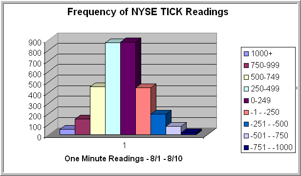
The chart above displays the frequency of closing one-minute NYSE TICK readings for the past eight sessions. I used eight sessions as my lookback period, because the S&P 500 Index has been relatively flat during that period. What that tells me is that this distribution of TICK values (i.e., this distribution of trader short-term sentiment) has been associated with a relatively trendless S&P market.

Note that the median TICK value in the sample is not zero; it is +237. We also tend to have fatter tails on the positive side of the TICK than the negative. (Not shown on the chart are two data points below -1000).

Now how can we use this information to determine the psychology of the market?

My research suggests that, if the relatively flat trading action of the past eight sessions is going to transition to a trending market, we will need to see a shift in the distribution of NYSE TICK values. Such a shift indicates that either buyers are more aggressive in taking offers or in hitting bids. By comparing the distribution of today's TICK readings to the recent distribution, we conduct a running assessment of trader sentiment and whether it is bullish (more positively weighted than the past eight days), bearish (more negatively weighted than the past eight days), or neutral (similar to the past eight days).

It is the distribution of TICK values--and not any single reading in itself--that is significant, indicating shifts in trader sentiment. The beauty of the indicator is that it measures sentiment via trader actions, not their stated beliefs. By viewing TICK distributions in relative terms--comparing today's market to recent markets--we can learn more about those shifts in trader sentiment than we can by focusing on the absolute value of the TICK readings.

A quick and dirty way of accomplishing this is to subtract the median value of the TICK for the lookback period (+237) from each closing one-minute value. If this Adjusted TICK, when cumulated, creates a positive sloping line, you know you have net relative positive sentiment. If the summed values of the Adjusted TICK create a negatively sloping line, you know you have relatively bearish sentiment.

Composite NYSE TICK readings (adjusted for recent lookback periods) are summarized daily on the Trading Psychology Weblog. (Note: the Weblog measure uses 10 second readings of the TICK, not one-minute values). In the third post in this series, I will show how these composite readings make the TICK relevant and useful for longer timeframe traders. The best indicators, I find, are ones that tap into the psychology of the marketplace itself.

Wednesday, May 05, 2010

Core Ideas in Trading Psychology: Reading Market Psychology With Volume and Price


An important theme throughout the TraderFeed blog is that reading the psychology of markets is a core trading skill. Markets, like people, behave in patterns. Those patterns shift over time, with shifts accompanied by markers that accompany changes in state: changes in direction and changes in volatility.

The first important state marker to be able to read is volume. Volume tells us *who* is in the marketplace. Volume also correlates highly with volatility. When volume jumps, it tells us that institutional participants have become more active. When volume dries up, it tells us that the market is dominated by market makers: the liquidity providers. Is a news item or price movement to a new level significant? Volume will typically provide us with an answer: events are significant if they can attract the participation of large traders. It is their revaluation of assets that creates market trends.

What is most important about volume is relative volume: the degree to which current volume diverges from recent volume. If we want to know if the volume from 11 AM to 12 Noon is high or low, we should compare it to the median volume posted during that hour. If we want to know if today's volume is high or low, we should compare it to the most recent median volume. Because relative volume is so closely connected to volatility, reading volume and its shifts provides important clues as to how far markets can go for or against us. That is useful information in setting stop loss points and profit targets.

Equally important, the astute trader wants to see the total volume that transacts at each price over the course of a trading day or week. The range at which the lion's share of volume has transacted defines a market's value area. Many trade ideas--at short and longer time frames--can be formulated by handicapping the odds that a market will return to a value area (if higher or lower prices cannot attract volume) or that a market will accept prices higher or lower than value (if those prices attract volume). The former situation defines a range market in equilibrium; the latter defines a trending market. In the former market, traders make money by fading strength and weakness; in the latter, they make money by going with market direction.

It is the oscillation of price between range and trending modes across a variety of time frames that defines the market's complexity, as market participants reveal their sentiment: either accepting value or redefining it.

The astute trader can also read the psychology of markets by seeing whether volume is dominantly transacted at the market's bid price (suggesting that sellers are willing to take lower prices to get out of their trades) or at the market's offer (suggesting that buyers are willing to pay up for higher prices to get into trades). This measure of sentiment, which is effectively gauged by the Market Delta tools, can be tracked over time to see if buyers or sellers are becoming more or less aggressive.

We can also track market sentiment to see if more transactions across the broad stock market universe are occurring on upticks vs. downticks. When buyers are more aggressive, we will see more transactions occurring on upticks; when sellers are more aggressive, we will see more transactions occurring on downticks. This measure of sentiment, captured in the NYSE TICK, can be tracked over time to reveal whether sentiment in the market is waxing or waning.

When we read these shifts in sentiment over time and combine them with a reading of shifts in relative volume, we can determine whether the largest market participants are becoming more or less bullish. That will tell us if volatility (volume) is expanding with direction (sentiment) and whether moves to new price levels are likely to result in market trends.

Much of the skill of reading these shifts is placing market dynamics at a shorter time frame within the context of the longer time frame. What is a trending market at the short time frame may be a movement within a range at the longer time frame. A breakout at the short time frame may be trend continuation at the longer time frame. Context rules. A great deal of developing a feel for markets is a recognition of the patterns that occur as market participation (volume) and market sentiment (direction) shift, with longer time frames exercising impact over shorter ones.

.

Thursday, April 02, 2009

Tracking Large Traders by Tracking Large Trades


If you click on the chart above, you'll see a unique display that I was using to track weakness in the ES futures during the afternoon. Major props to Trevor Harnett of Market Delta for his assistance in setting this up.

In the top pane, we see the Market Delta "footprint" chart. The numbers inside each of the five-minute bars represent the number of trades--not volume--of 50 contracts or greater at each price. So we're only looking at the trades placed by relatively large traders. That is crucial market information, as I explained in an earlier post.

Actually there are two numbers within each bar, such as 11 x 4. The first number represents the number of large trades that occurred at the market's bid price. The second number represents the number of large trades that occurred at the market's offer price. Thus, in the above example, we have 11 large trades at the bid and 4 at the offer at that price and at that five minute period.

When we have more large trades occurring at the bid, it tells us that professional traders are eager to get out of their positions. Instead of working an order to exit at the market's offer price, they are "hitting the bid" and accepting the lower price as the cost of getting out right away. (They could also be aggressive short sellers initiating positions). Conversely, when we have more large trades occurring at the offer, it tells us that professional traders are eager to get into their long positions or out of their shorts. They are "lifting the offer" and accepting the higher price as the cost of going long or covering a short position right away.

Note how the bars are color coded green if more trades are occurring at the offer price and red if the majority of trades are occurring at the bid price. The total number of large trades at each time and price tells us how active large traders are in the market at any one time--a key insight if we're trying to gauge the market's potential for movement (volatility).

By parceling volume into the number of contracts or shares transacted at the bid vs. offer, we gain insight into the moment-to-moment sentiment of traders. What makes the chart above unique is that we're eliminating all of the small trades and just focusing on the trade location of the largest market participants. I find that this view provides us with a unique perspective on the sentiment of the traders who truly move the markets.

Notice in the chart above how the distribution of large trades shifted dramatically a little after 11:30 AM CT. The bottom pane histogram shows us the net volume of trades at the bid vs. offer during each five-minute period. When the value is positive and color-coded green, we have more volume at the offer (bullish sentiment); when the value is negative and color-coded red, we see more volume transacted at the bid price.

A look within the bars from 11:35 AM CT forward shows us that large traders began hitting bids around 840 in the ES contract. The balance between trades at the bid vs. offer became even more skewed as the market moved lower, showing that large sellers had taken control. This dynamic was clear well before we started seeing significant selling pressure in the NYSE TICK.

While I find the NYSE TICK to be an invaluable measure of general market sentiment, as it assesses the number of stocks trading on upticks minus downticks, the Market Delta numbers--especially filtered for large traders--provide us with a more sensitive assessment of sentiment in a specific trading instrument. We can have large traders hitting bids in the ES futures even as traders overall are not selling the broad market. Locating sentiment for the symbols we're trading and placing it in the context of general market sentiment is quite useful in catching market turns.

And, oh yes. The red line at the bottom of the top pane is VWAP in real time. (Even with the weakness we were trading above the volume-weighted average price for the day). The vertical histogram at right is the distribution of volume at each price, which gives us a Market Profile-like distribution of activity. That is very helpful in detecting the emerging structure of the market day.
.

Monday, October 22, 2007

Extreme Bearish Sentiment and Other Ideas to Start the Week

* Extreme Bearish Sentiment - The NYSE TICK captures intraday sentiment, assessing at each minute the number of stocks trading at their offer price minus those trading at their bids. My Adjusted Cumulative TICK compares the current 1 minute TICK readings with the average 1 minute reading over the last 20 trading sessions and then adds these readings to arrive at a single daily total. When the total is below zero, we have more selling sentiment than the 20-day average; when the total is above zero, we have more buying sentiment than the 20-day average. On Friday, we had a five-day average Adjusted TICK of less than -400. That's only happened on 53 other occasions since 2004 (N = 952 trading days). Five days after the extreme selling sentiment, the S&P 500 Index was down by an average of -.17% (26 up, 27 down). That's notably weaker than the average five-day gain of .19% for the remainder of the sample. Our earlier post noted a bullish edge after five down days, but when the bearish sentiment is extreme, we don't see this bullish edge.

* Time Frame Selection - Trader Mike updates his links with interesting posts on selecting a time frame for trading and recession talk from CAT.

* Trading Education - Chris Perruna with some excellent links re: managing your money and stock market education.

* Market Summaries - The Shark Report tracks market internals and big winners/losers on the day.

* Market Fear - VIX and More tracks the fearfulness of Friday's market.

* Where Are The Earnings? - Bespoke Investment Group tracks earnings by market sector--interesting patterns.

* Frontier Market - Random Roger takes a look at Kazakhstan and sees something interesting.

Thursday, September 11, 2014

Using Put-Call Ratios to Gauge Intraday Stock Market Sentiment

The most recent post took a look at the equity put-call ratio as a way of gauging market sentiment.  Suppose, however, that you are interested in gauging sentiment shifts that occur within the market day.  The figures reported by exchanges are the daily ratios updated throughout the day.  They do not tell you specifically how many put options and call options are traded uniquely during each segment of the day.

If you click on the chart, you'll see figures that don't typically appear with the data services.  I took the number of equity put options traded during each 15 minute segment of the market day and divided them by the number of equity call options traded during each of those segments.  The result is a unique put-call ratio for each 15-minute period, rather than a daily figure updated every 15 minutes.  (Data obtained from e-Signal and ratio calculated and charted in Excel). 

You can see how sentiment has shifted over the course of the last three trading days, with spikes in the put-call ratio at yesterday's market lows and rather bullish sentiment by end of day.  In general, I find value in the sentiment measures at extremes:  when readings are unusually bullish or bearish. 

Further Reading:  Visualizing Social Sentiment
.

Sunday, October 14, 2007

Gold as a Sentiment Measure for Technology

Gold, with its price denominated in U.S. dollars, can be considered a sentiment measure for the dollar. Gold has long been considered a storehouse of value, attractive during times of inflation (falling value of dollar). Some equity sectors also benefit from a weak dollar, including large cap technology, which enjoys multinational sales. As the chart above shows, gold (GLD) and large cap technology (XLK) have both been on the rise over the last few years.

Interestingly, the correlation between daily changes in GLD and XLK was only .02 between late 2004 and 2006. During 2007, however, that correlation has been .32.

I decided to take a look at dollar sentiment and its effect on large cap tech by examining five-day changes in GLD and what happens over the next five trading days in XLK.

When gold has been up on a five-day basis (bearish dollar sentiment; N = 408 trading days), the next five days in XLK have averaged a loss of -.09% (214 up, 194 down). When gold has been down on a five-day basis (bullish dollar sentiment; N = 282 trading days), the next five days in XLK have averaged a gain of .58% (179 up, 103 down).

As with my prior post concerning the relationship between price changes in consumer discretionary and consumer staples stocks, it appears that the price of gold is a kind of sentiment measure that may possess some value as a short-term contrary indicator. It's once again an illustration of the interconnectedness of markets across sectors and asset classes.

RELATED POST:

Making a Friend of the Sentiment Trend
.

Saturday, September 22, 2007

Keeping Tabs on Stock Market Sentiment

I observed a while back that the traffic statistics for this blog seem to be reflective of market sentiment. During the brief March plunge and especially during the August weakness, the traffic to this site expanded significantly. I found that these increases were not related to external sites linking to mine. Indeed, I could even track sensitivity to market conditions hour-by-hour: during very weak intraday periods, traffic for that hour expanded well above its norm.

Conversely, during July--prior to the market decline--I noticed a distinct dropoff in visits to the site. On slow market days such as Friday, I also notice less blog traffic.

Since mentioning these patterns, other market bloggers have contacted me and mentioned that they've observed similar phenomena. It appears that, during periods of high market uncertainty and volatility, one way that traders and investors cope is to seek information. This manifests itself in increased Web surfing of blogs and other sites that post in a timely fashion.

The reason I bring this up is that, even apart from the slow day on Friday, I've noticed that my traffic statistics are looking more like early July and less like August. Traders don't seem to be reaching out for information in the frantic way that they had been doing during the market decline.

I decided to examine the five-day equity put-call ratio (see chart above) and plot it against the S&P 500 Index (SPY). Sure enough, the put/call ratio has also tailed off as the market has turned around. Option-related sentiment is not far off its early July levels. The put-call ratio has closely followed the traffic patterns on the blog.

Does this mean the market is headed for a sustained decline? Not necessarily. What I've found is that the combination of a weakening market (fewer stocks making fresh 20-day highs; fewer stocks trading above their 50 day moving averages; fewer stocks closing above their volatility envelopes; reduced levels of Cumulative Adjusted NYSE TICK) and bullish market sentiment is the setup for a meaningful correction.

Thus far, during the past week, we've seen solid strength in these indicators (which I track daily in my Twitter comments and summarize weekly in my Trading Psychology Weblog). It's when we see sustained divergences that we want to be lightening our exposure to stocks.

RELEVANT POSTS:

Sentiment and Short-Term Cycles

Cumulative TICK as Sentiment Measure

What Drives Investor Sentiment?
.