
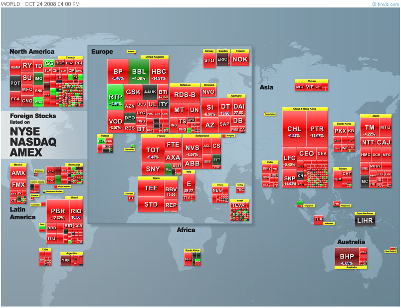
The Futures Heat Map from Barchart shows red across the broad range of markets (above). Looking at a heat map of sectors within the S&P 500 universe from FinViz, as well as a world heat map, we also see losses across the board.
With further anticipations of a global economic slowdown, stocks and commodities have few places to hide. I find the heat maps to be helpful visualizations of what's strong and what's weak, both in absolute and relative terms. This can be extremely helpful in picking up short-term market themes--and shifts among these.
.


